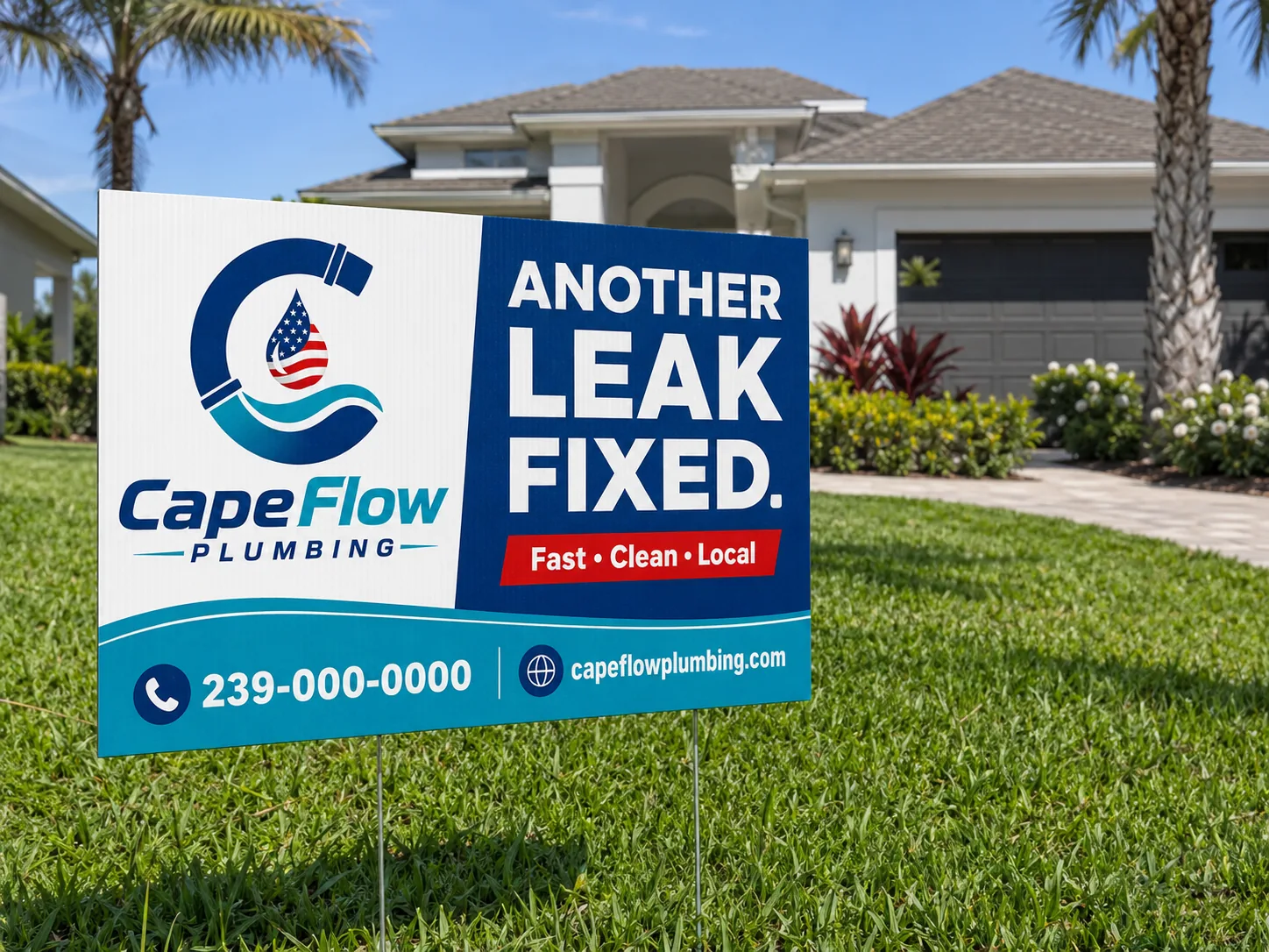
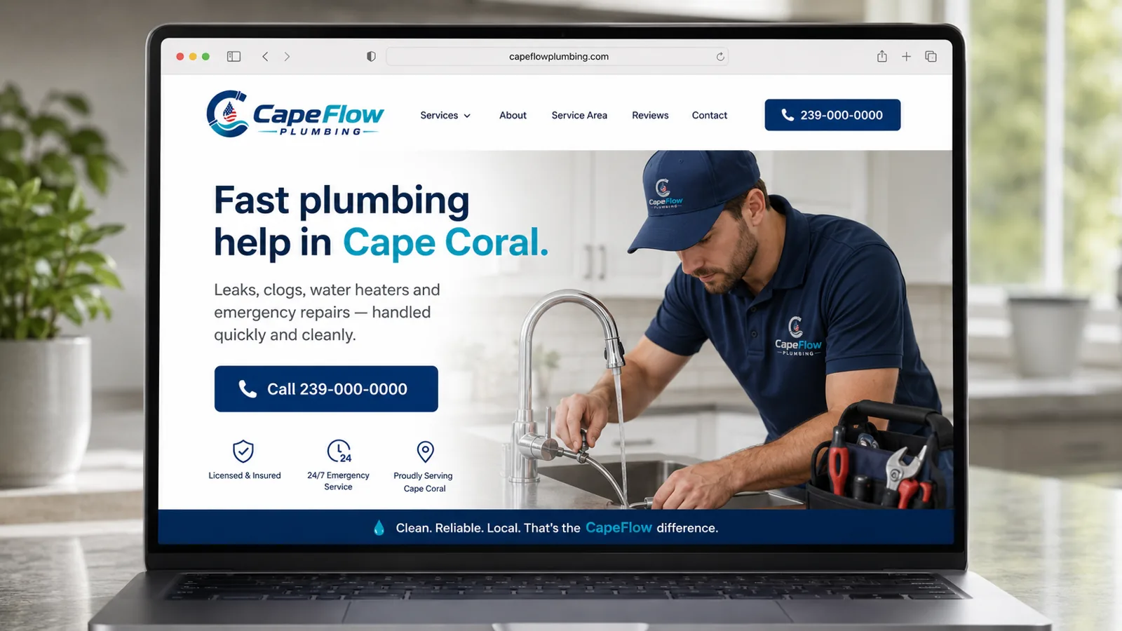
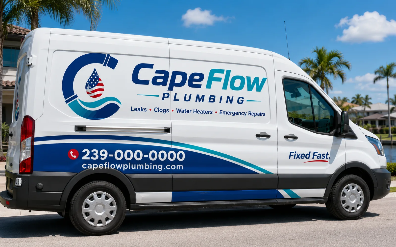
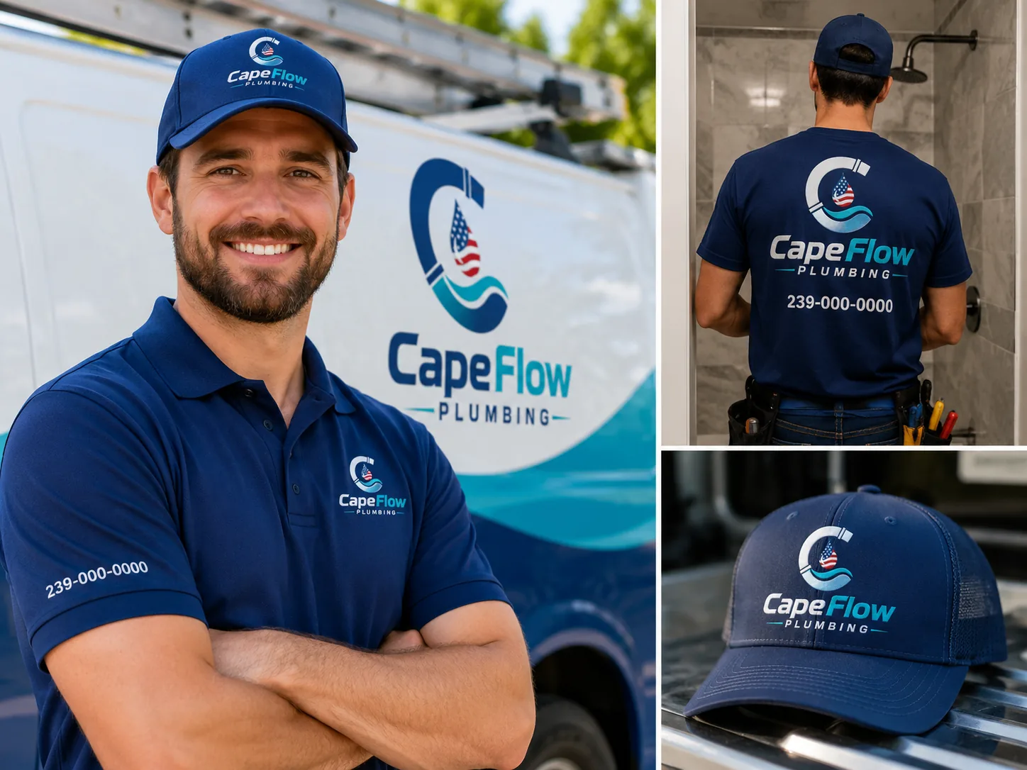
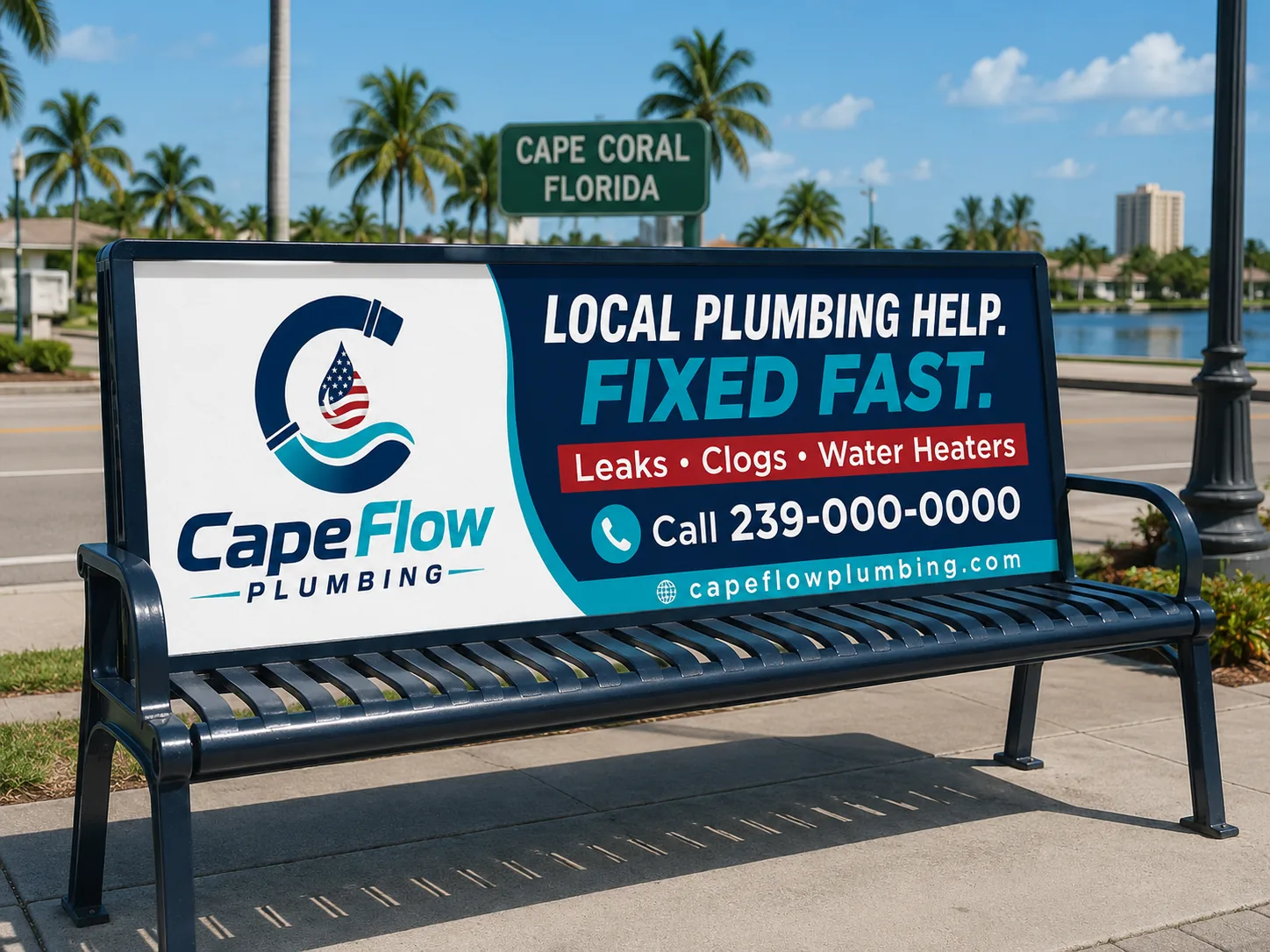
This is what a plumber looks like when every piece says the same thing: fast, clean, local.
From concept to brand.
The process
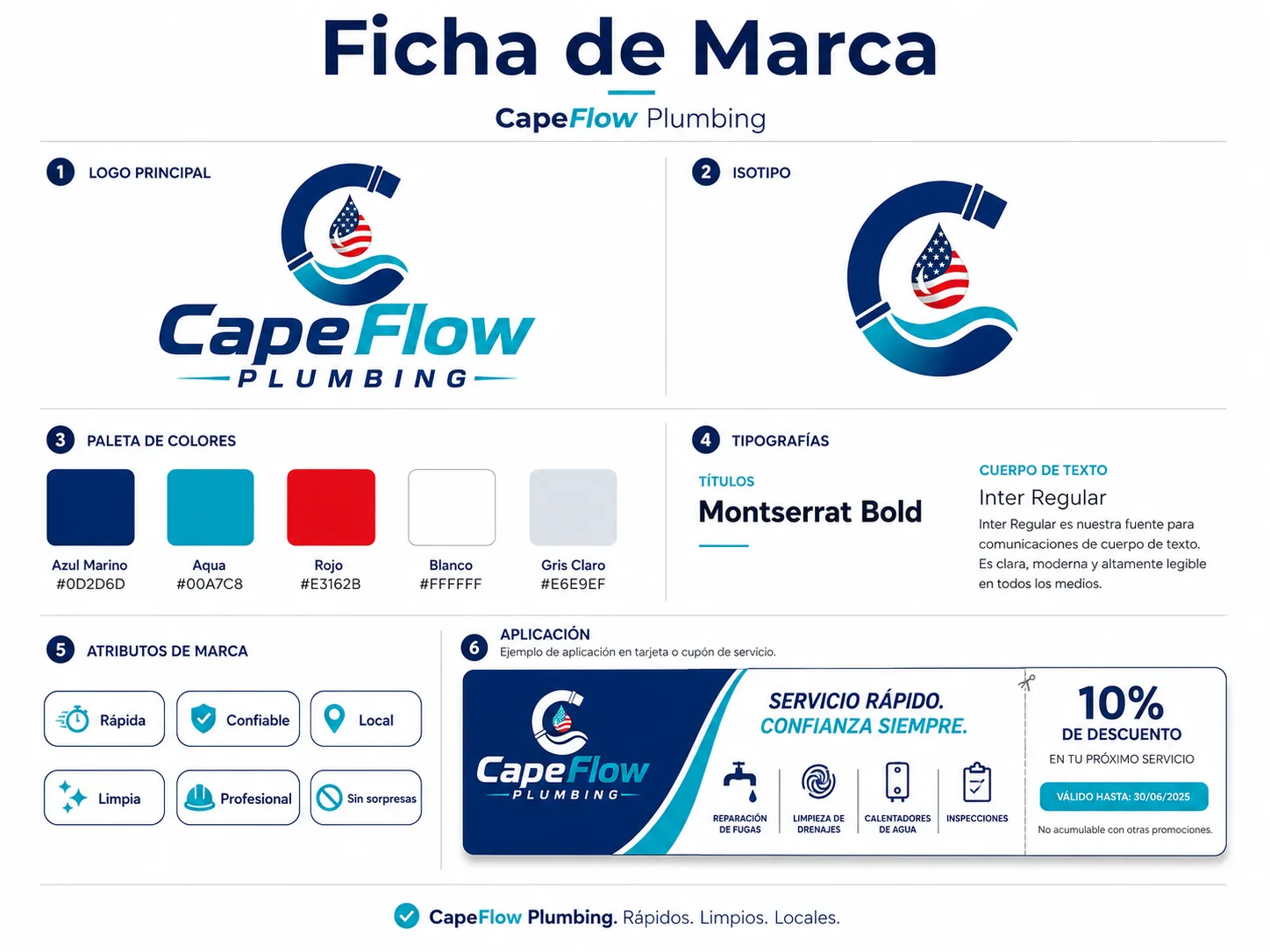
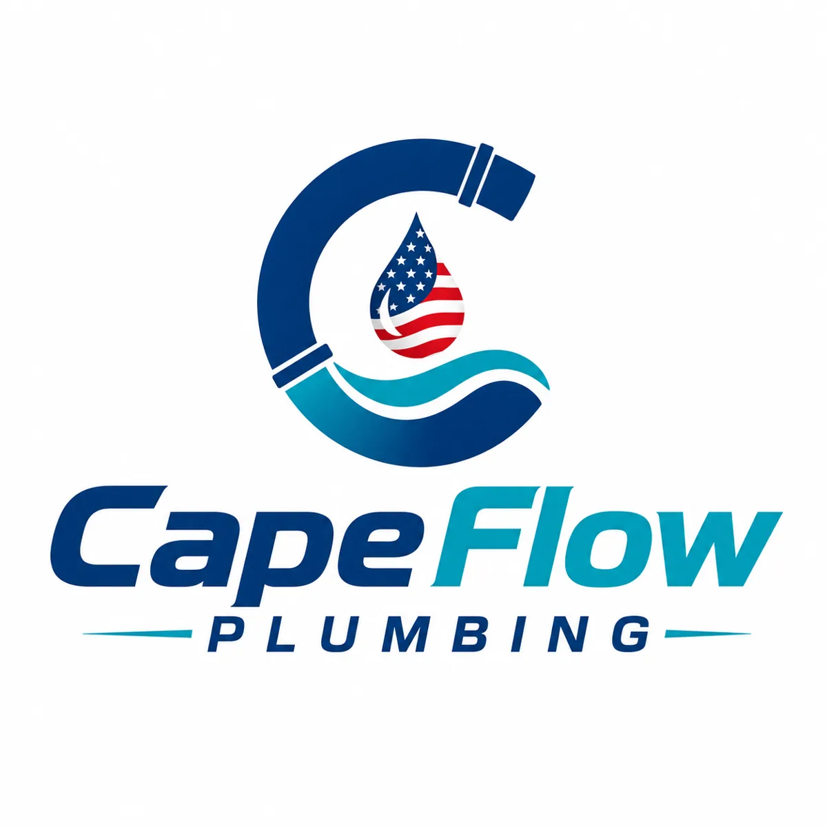
A coherent brand doesn't start with the logo: it starts with a promise people can recognize. CapeFlow was built on three words shown in the brand sheet: fast, clean, local. The C wraps a flag drop and a wave; navy carries trust, aqua speaks to flowing water, and every piece repeats the same idea: fast service, always trustworthy. No surprises.
Every piece speaks
the same language.
The system
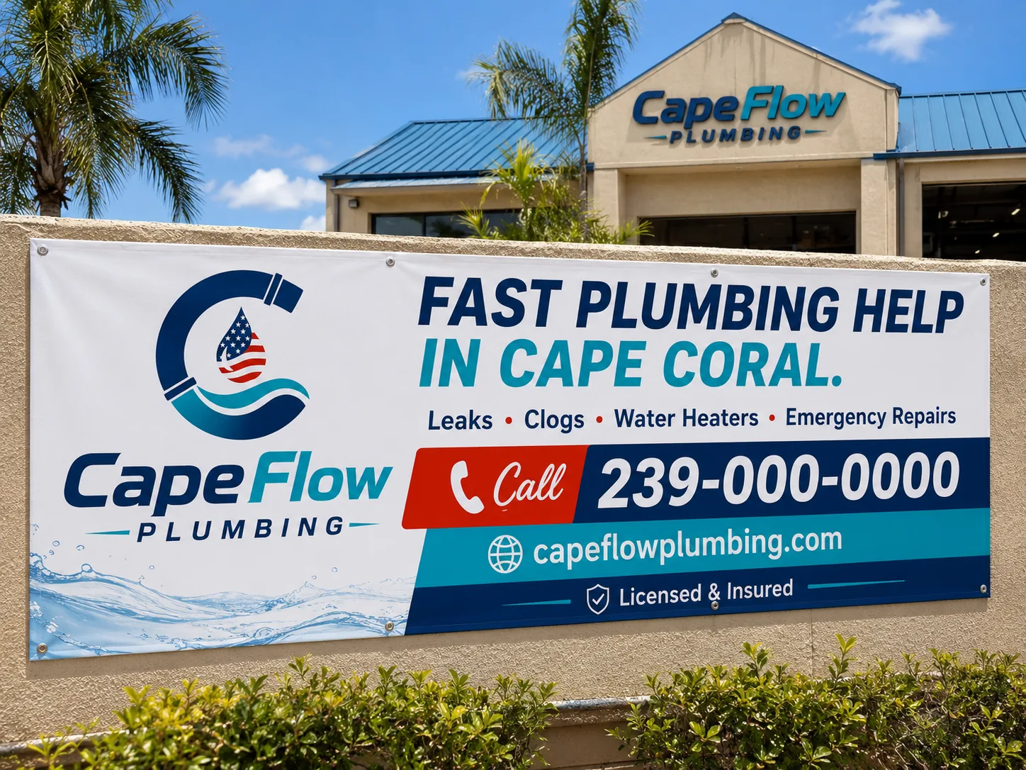
Facade / campaign
Storefront banner
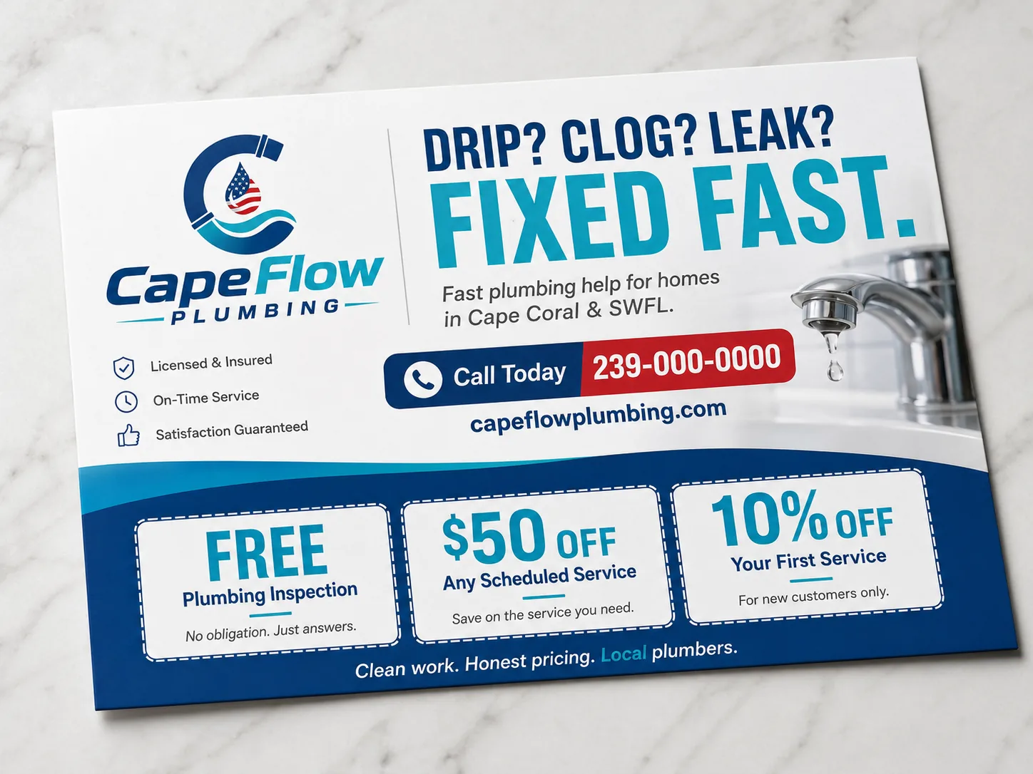
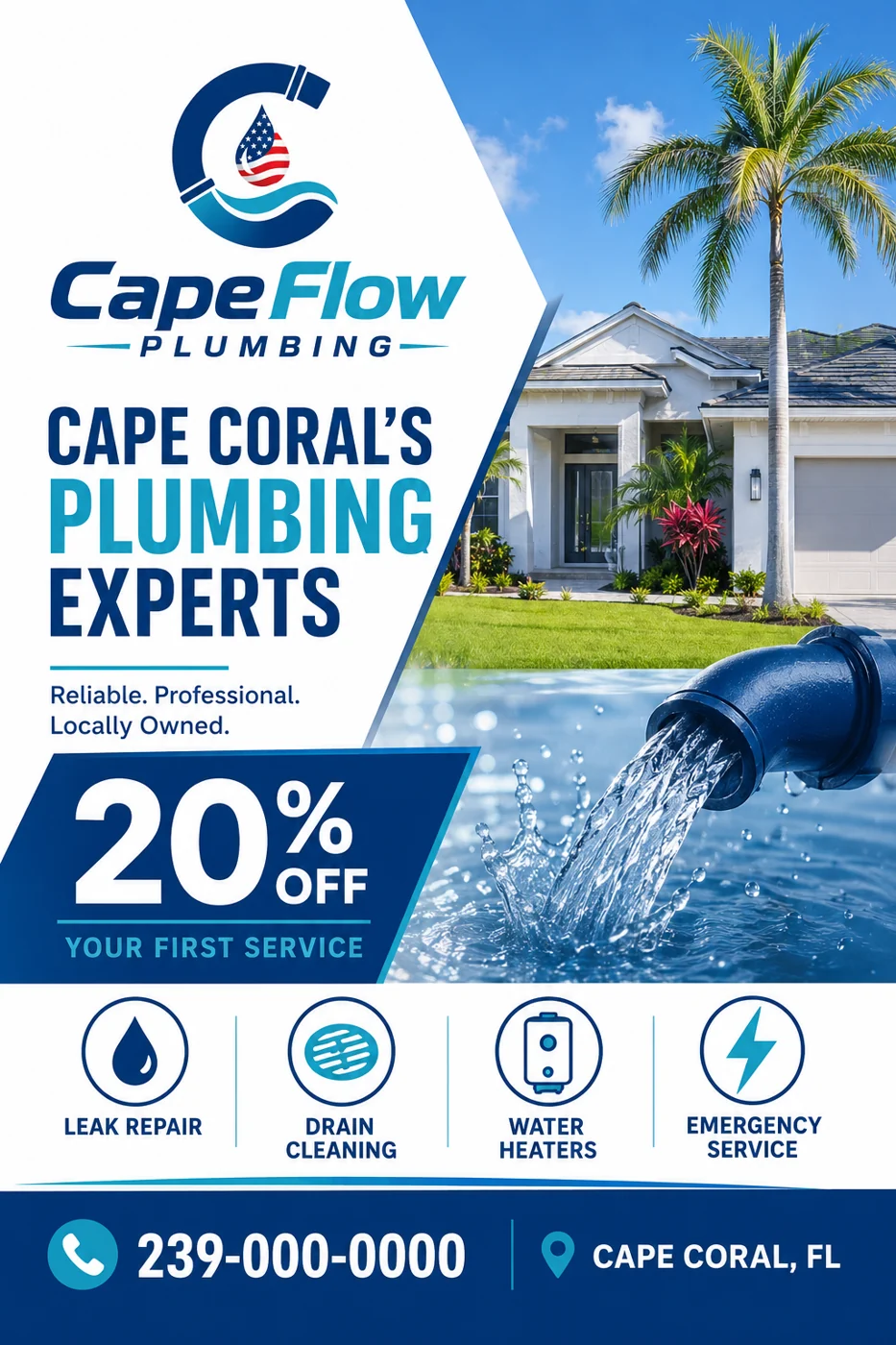
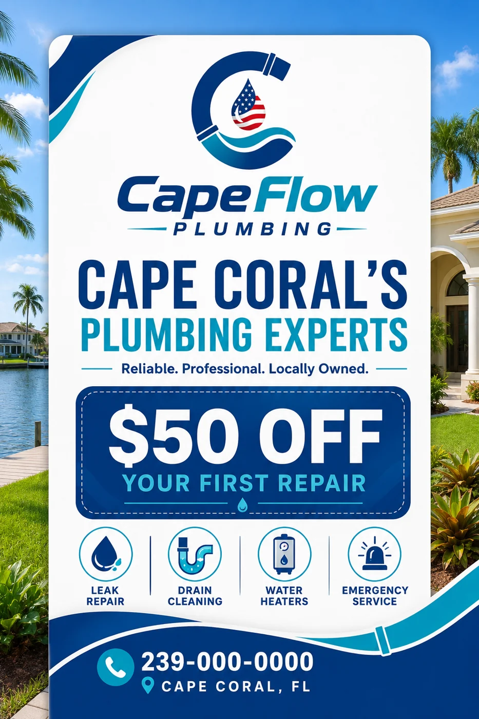
Entry offer
Service flyer
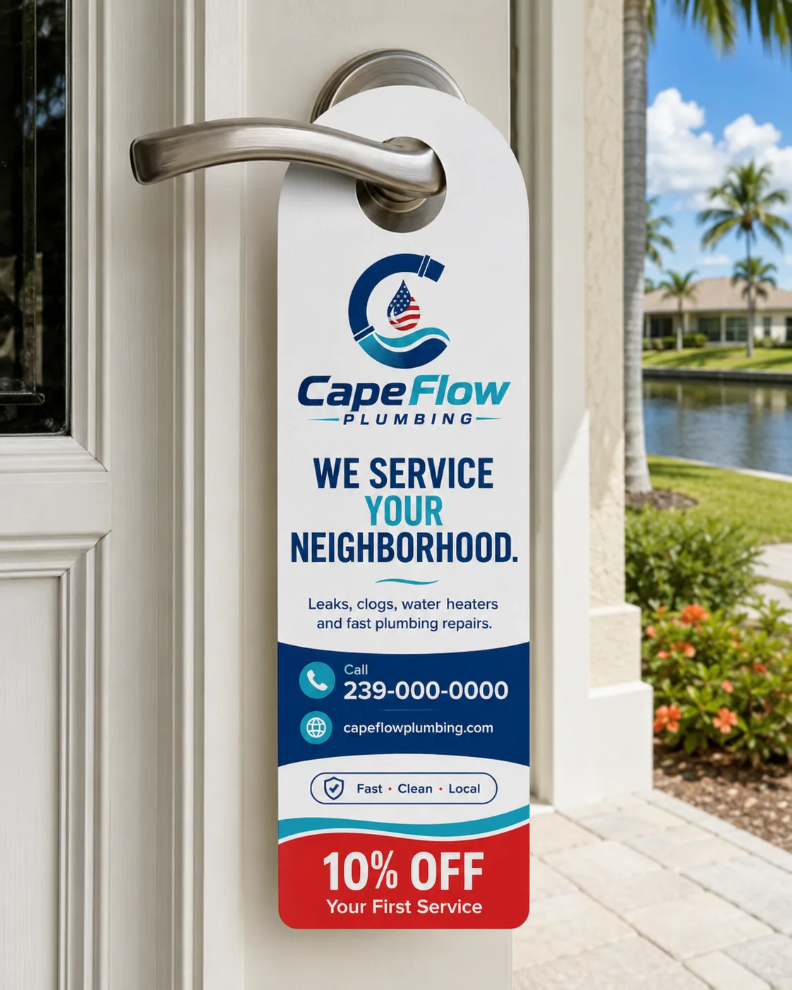
Door to door
Door hanger
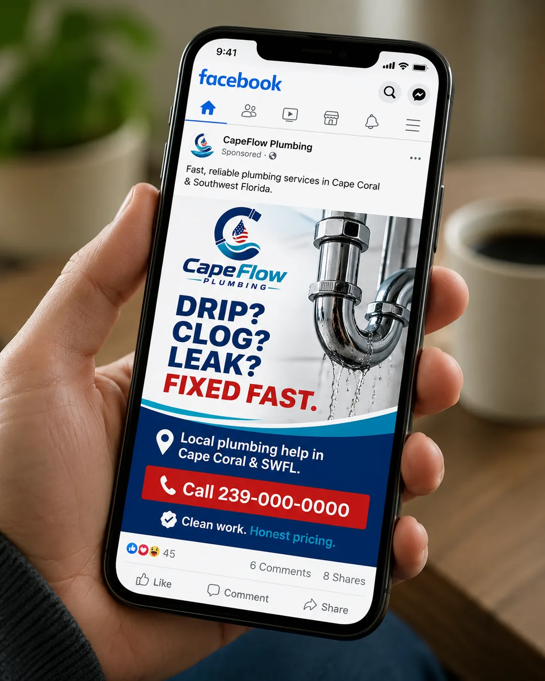
Social media
Social post
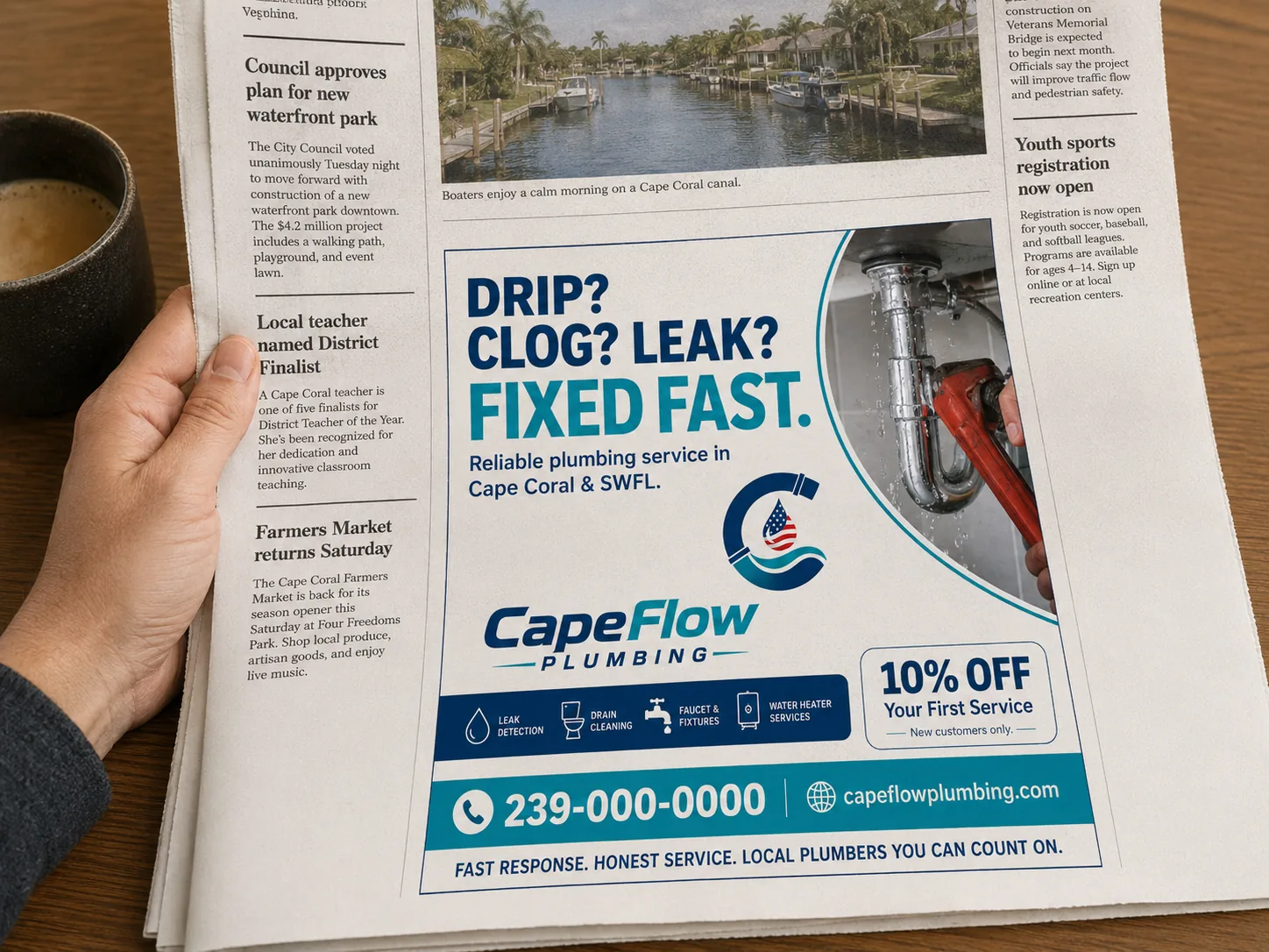
Local media
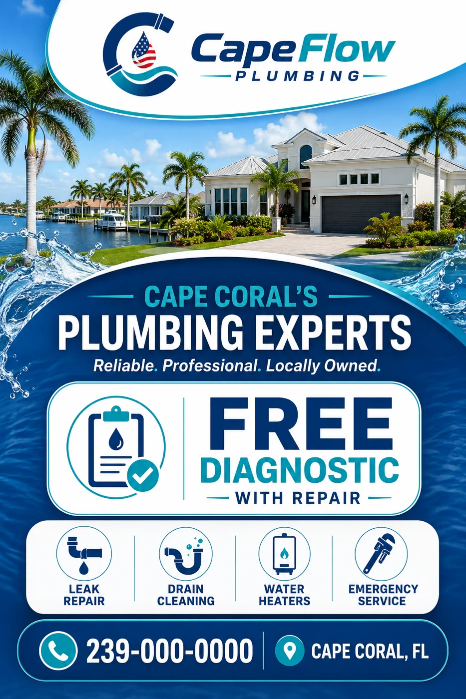
Magazine ad
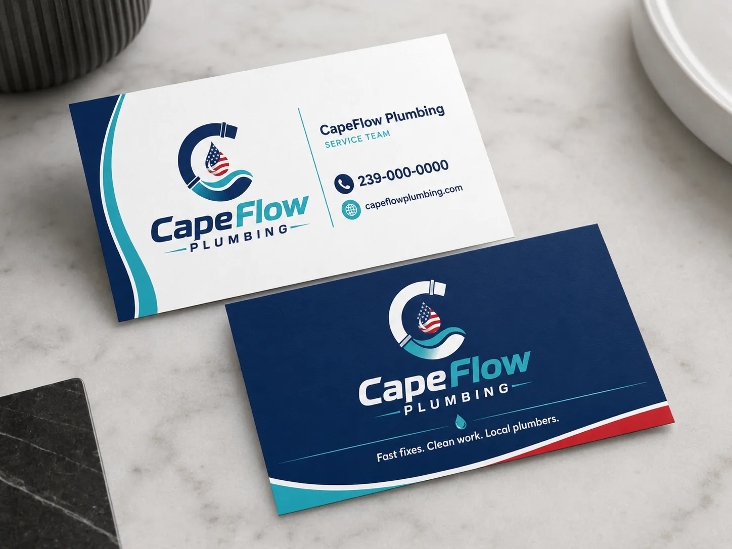
Stationery
Business cards
The system comes to life.
Interactive demo - hover: every piece responds

Fast
Same-day response
No surprises
Clear pricing up front
Clean
We leave everything spotless
Local
Cape Coral and Southwest Florida
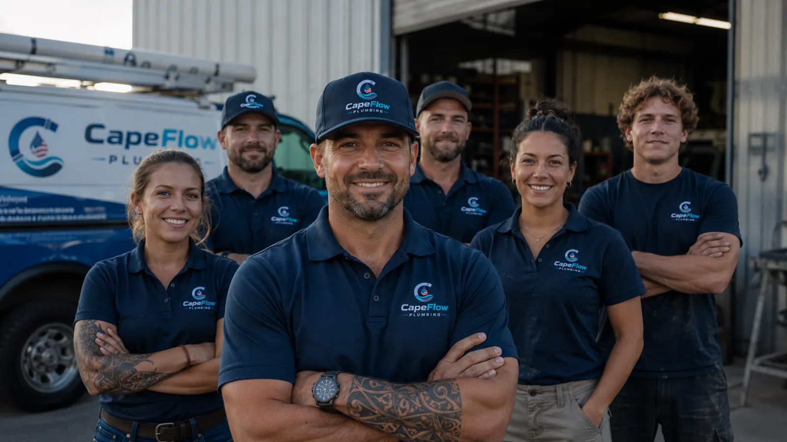
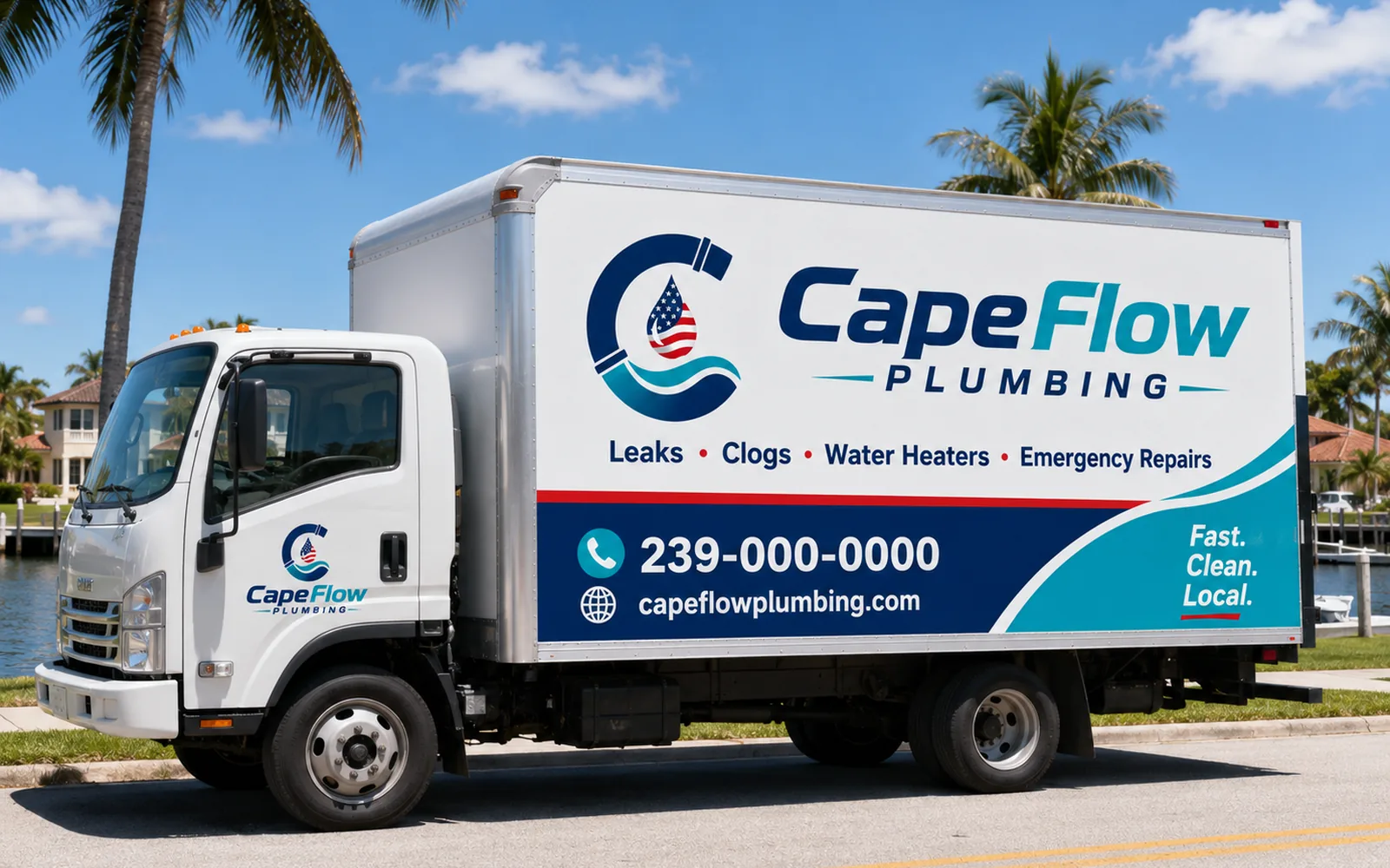
The brandhits
the street.
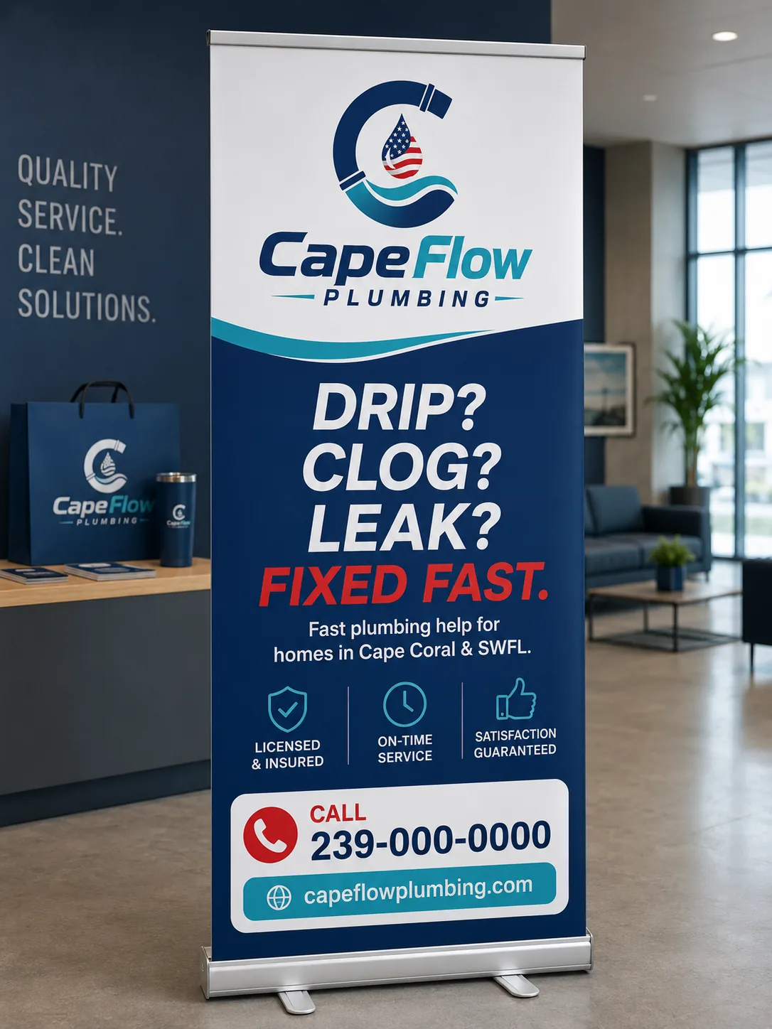
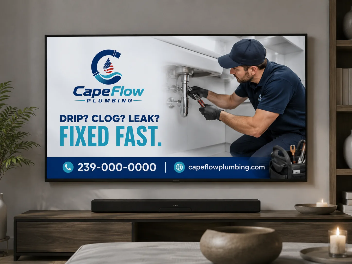
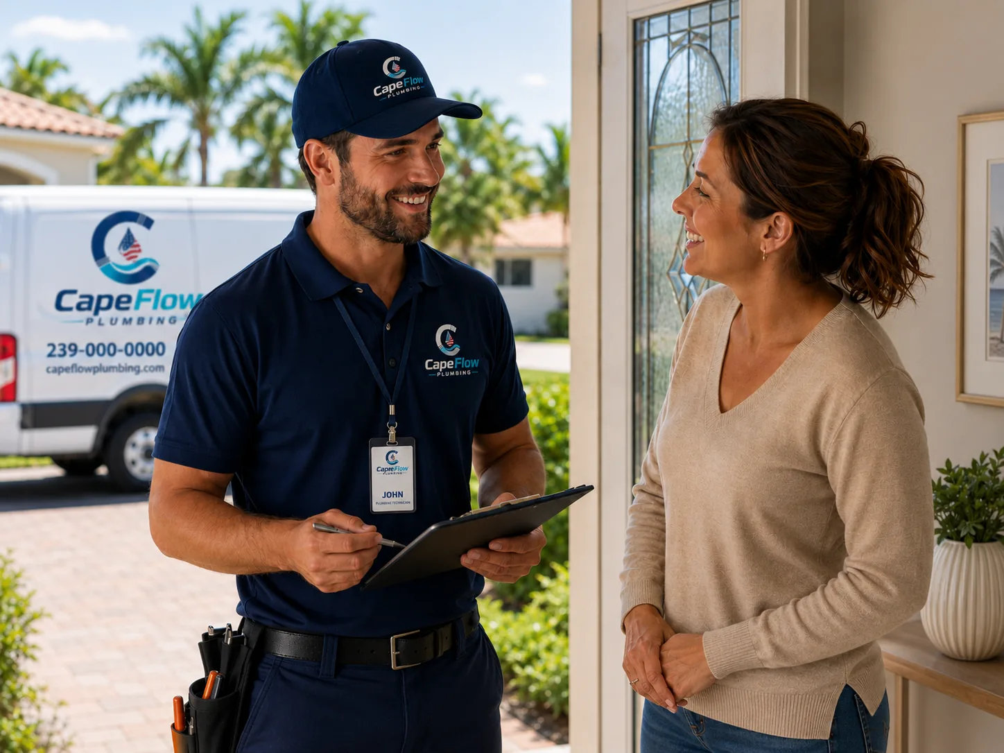
Coherence isn't repeating a logo: it's the yard sign, the van, the uniform, the flyer and the website producing the same signal. The homeowner sees order before calling. And for a service that enters their property with tools and pipes, that trust matters more than any discount.
Core idea
1
Defined colors
5
Type weights
2
Applications
16
When the sign, the van, the uniform and the ad tell the same story, the customer doesn't have to decode whether the plumber is serious: they can see it. That's brand coherence, and it shows before the phone even rings.
The next step
CapeFlow isn't real.
Your business is.
Everything you just walked through is a demonstration of what a coherent brand does for a local business. If yours doesn't exist yet - or no longer looks like who you are - that's exactly what Niseus does.