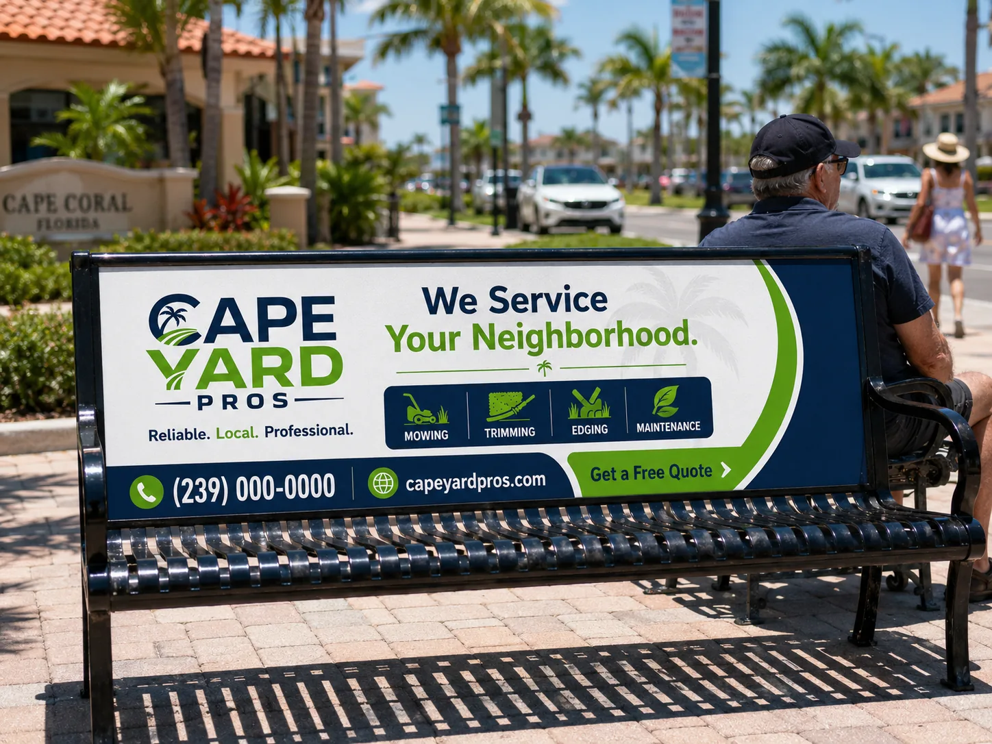
This is what a local business looks like when every piece tells the same story.
From concept to brand.
The process
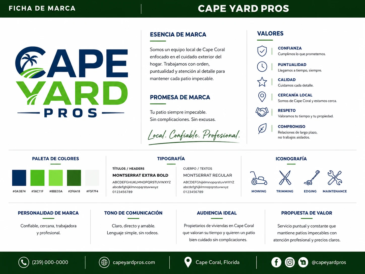
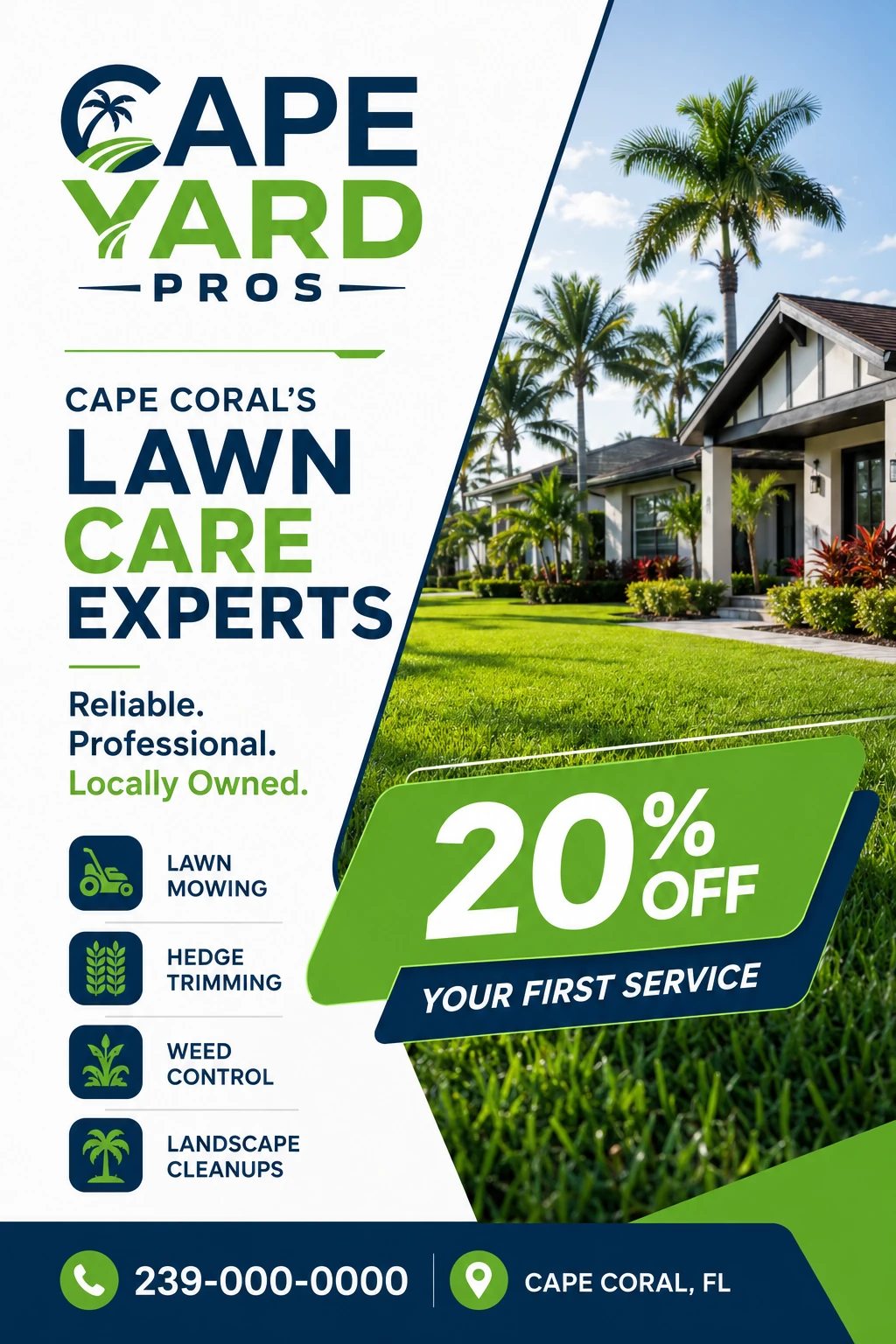
A coherent brand doesn't start with the logo: it starts with a promise people can recognize. Cape Yard Pros was built on three words shown in the brand sheet: local, reliable, professional. The C opens the scene with palm and lawn stripes; blue carries trust, green speaks to the yard, and every piece repeats the same idea: your yard always clean, without complications.
Every piece speaks
the same language.
The system
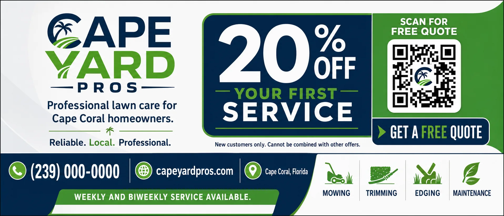
Local campaign
Horizontal ad
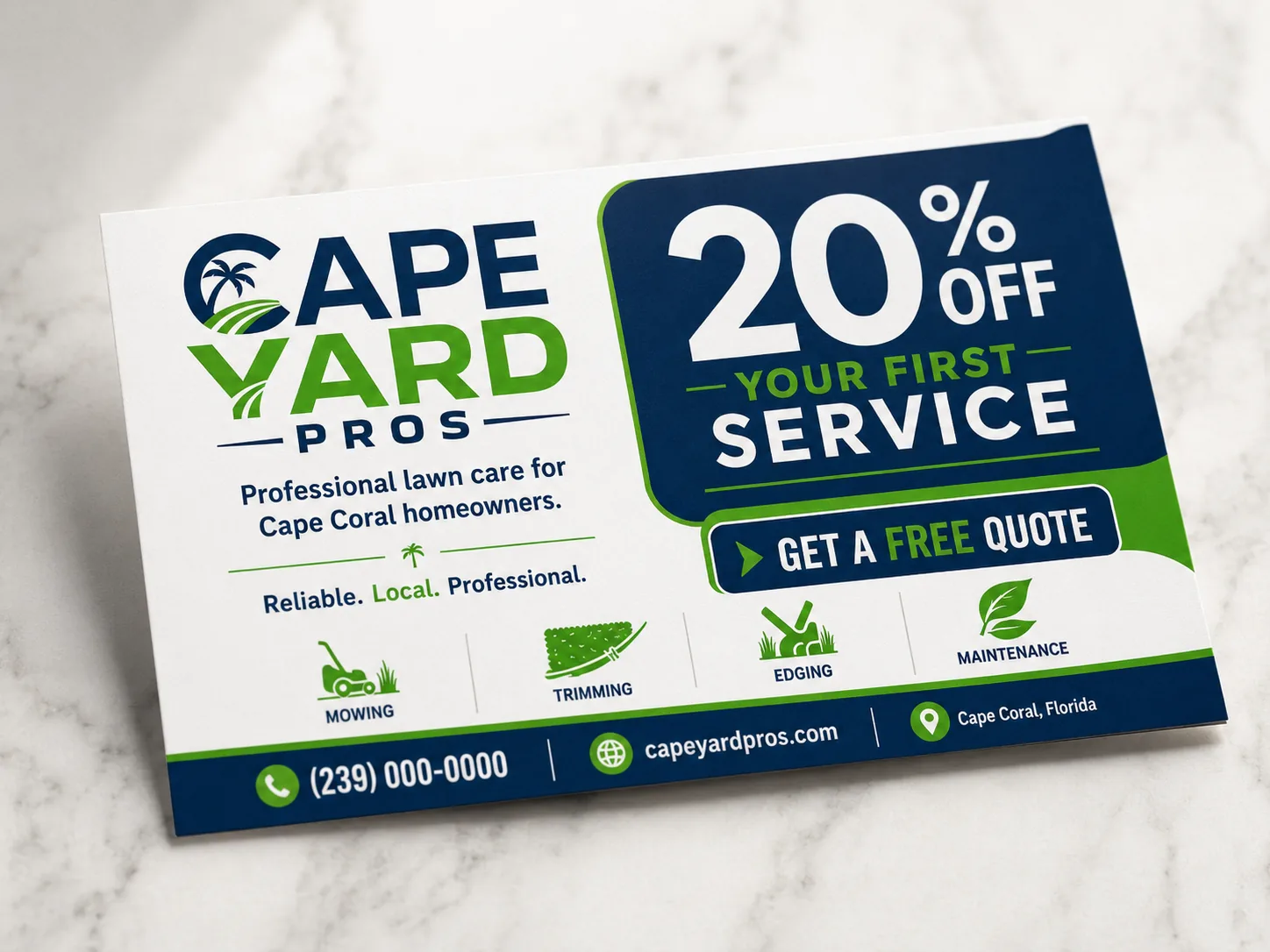
Entry offer
Service flyer
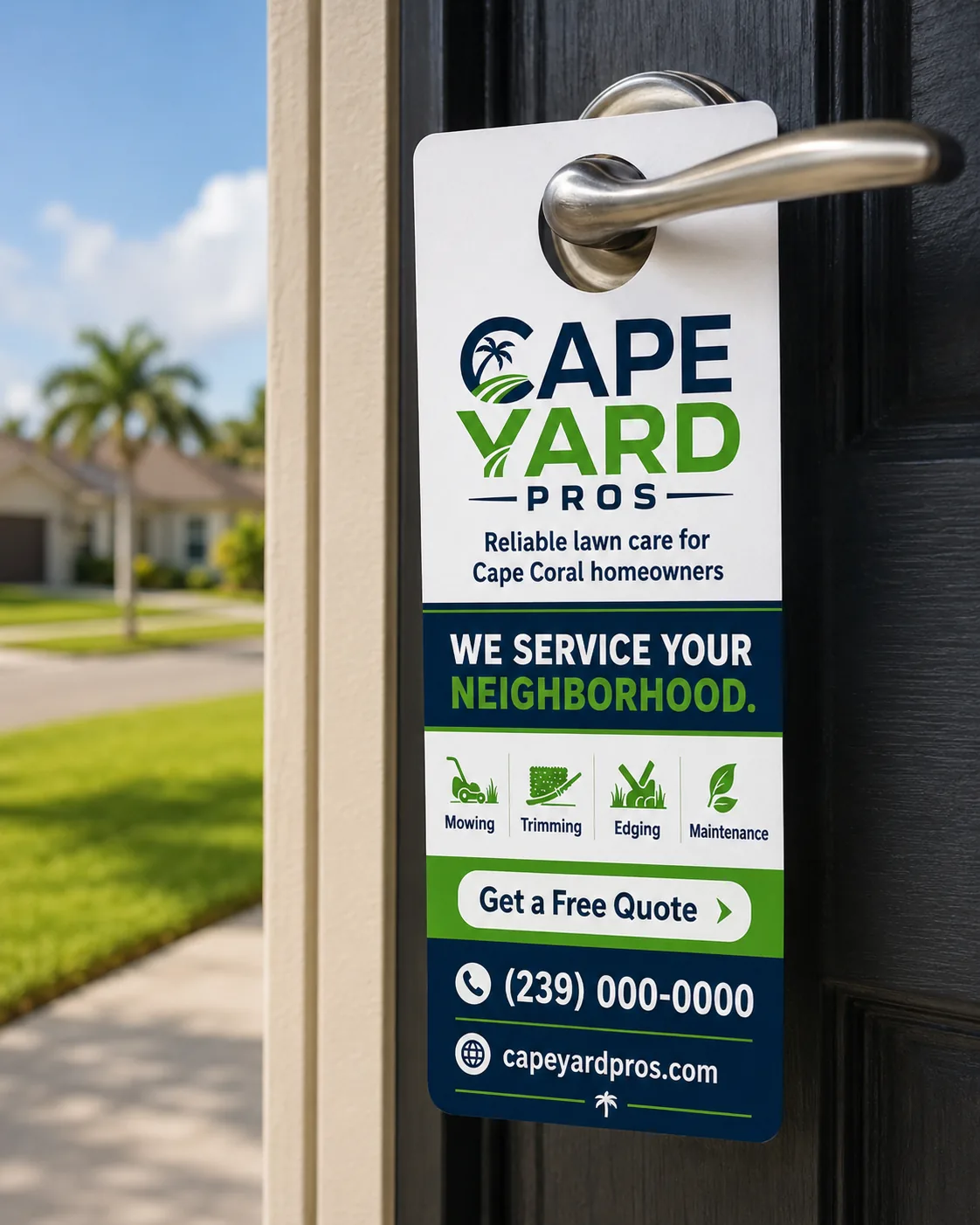
Door to door
Door hanger
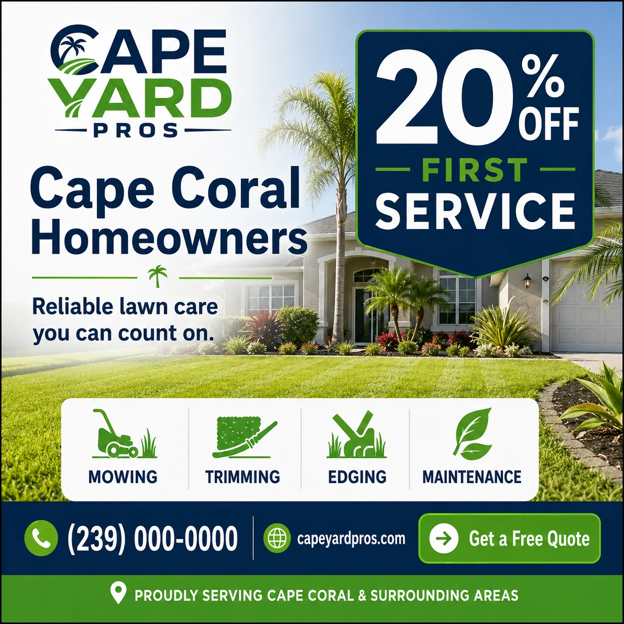
Social media
Social post
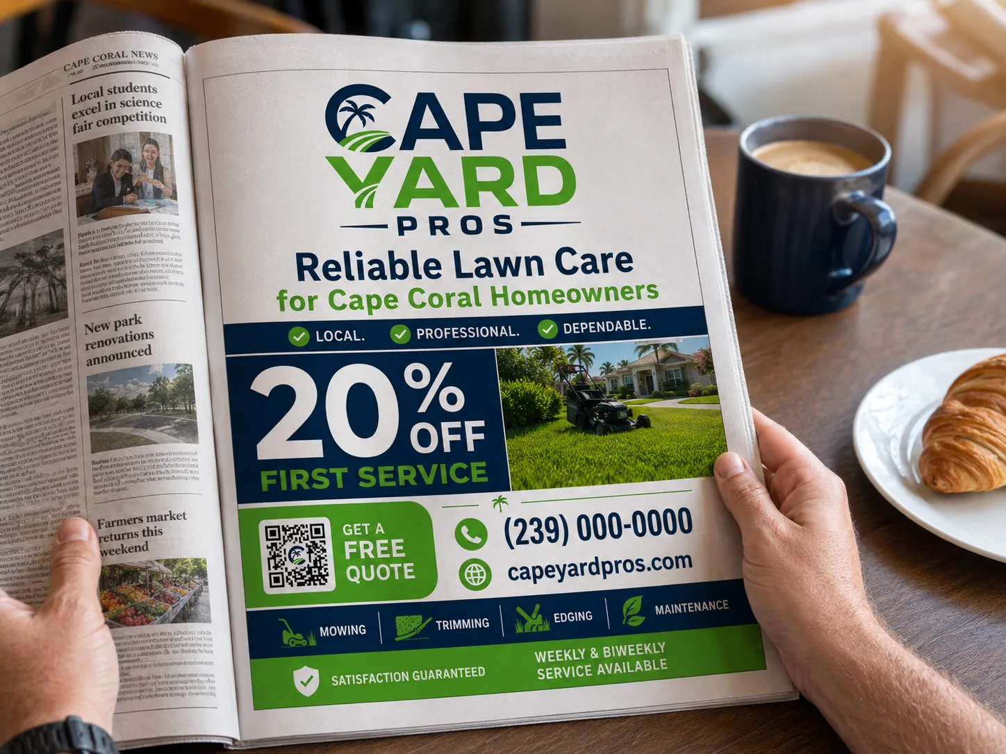
Local media
Magazine ad
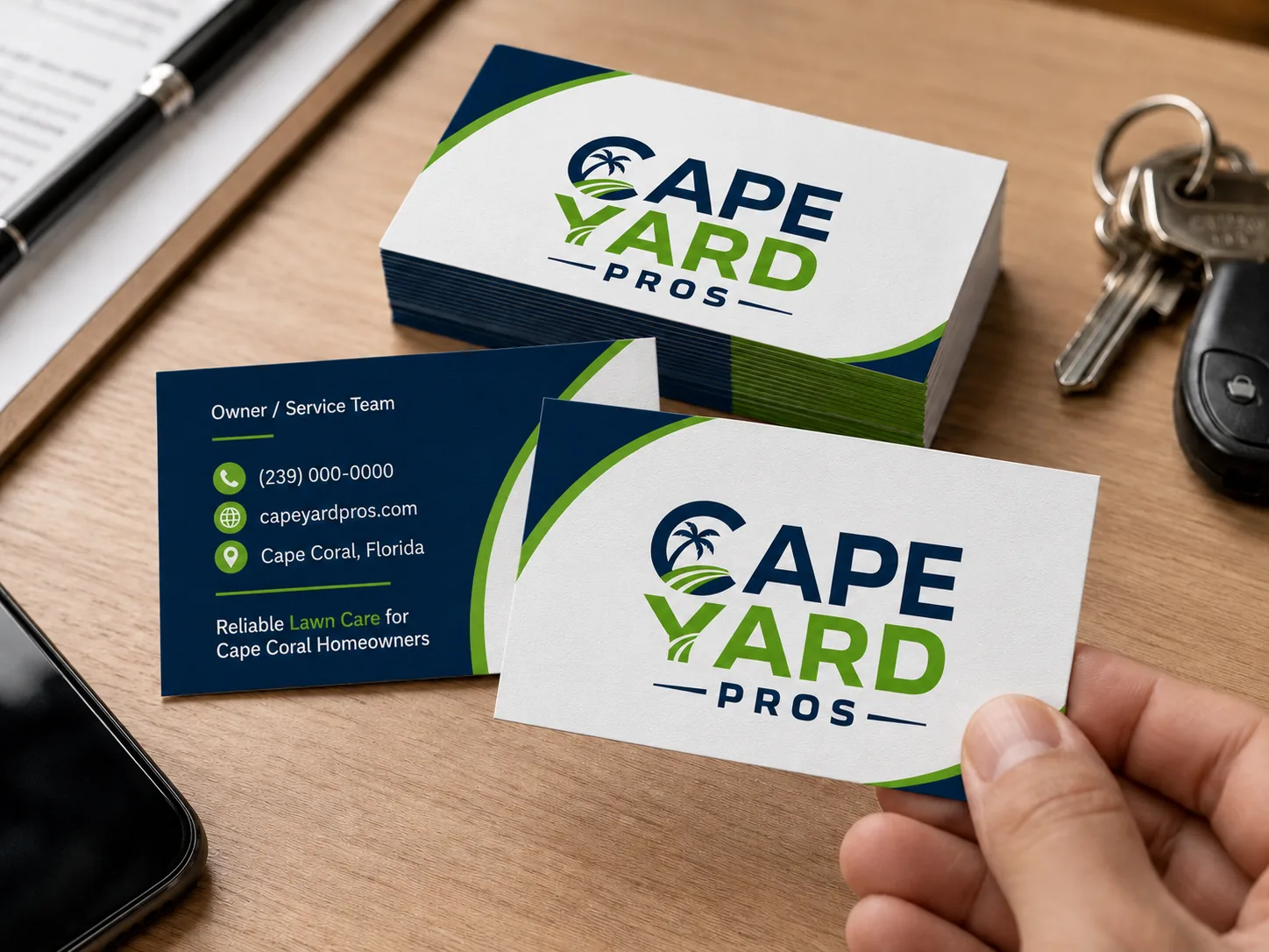
Stationery
Business cards
The system comes to life.
Interactive demo - hover: every piece responds



Punctuality
We arrive on time, every time
Trust
We do what we promise
Quality
We care for every detail
Local proximity
Cape Coral as the natural territory
The brandhits
the street.
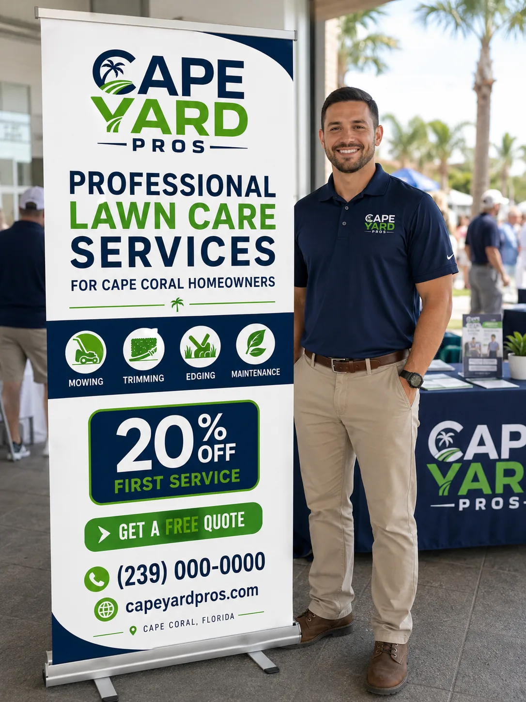
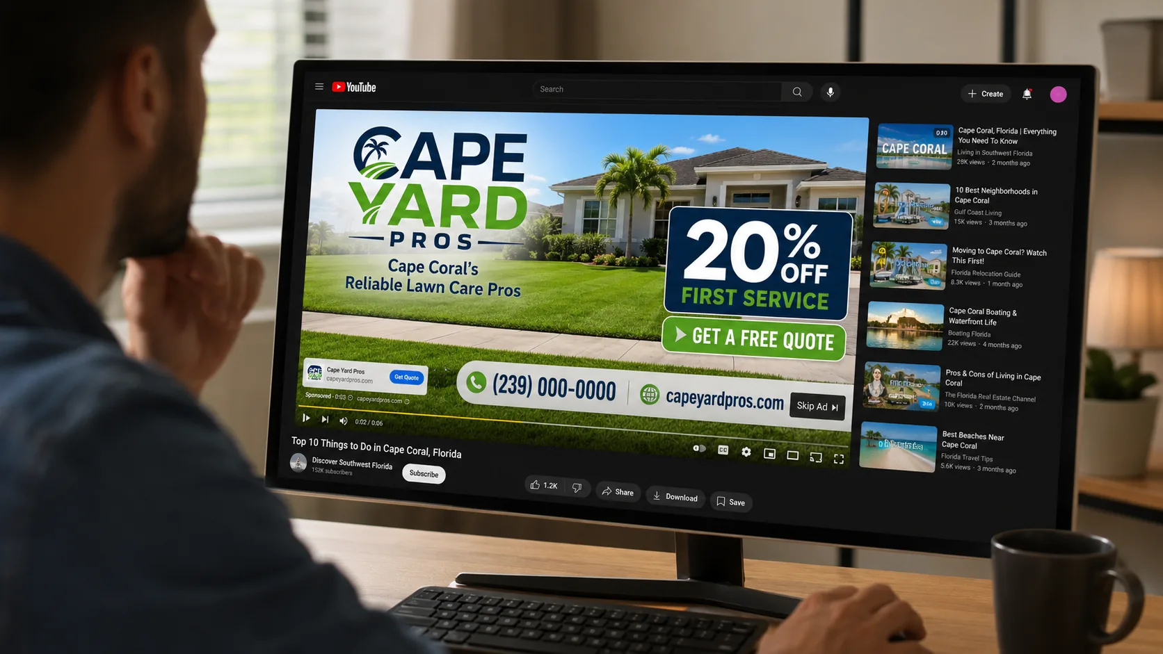
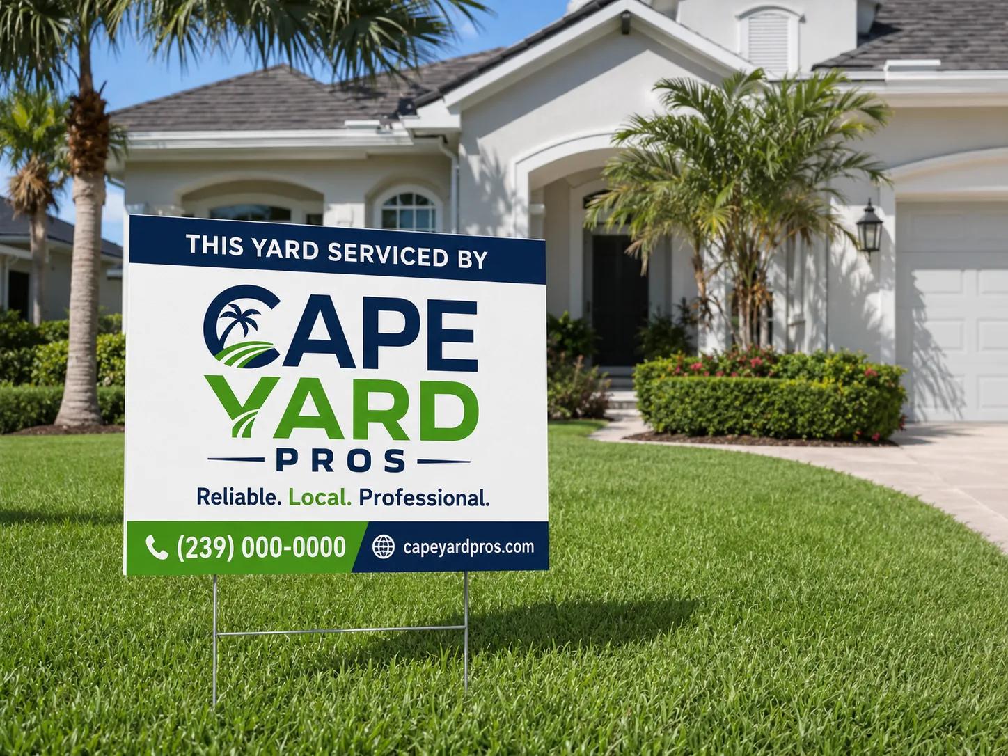
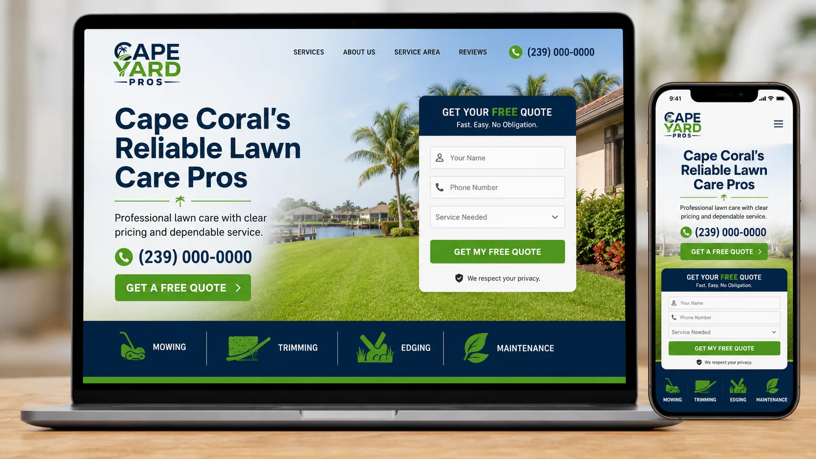
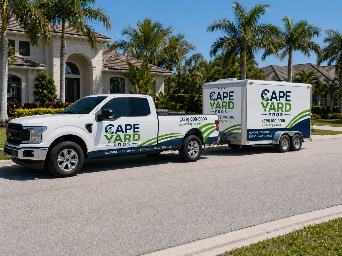
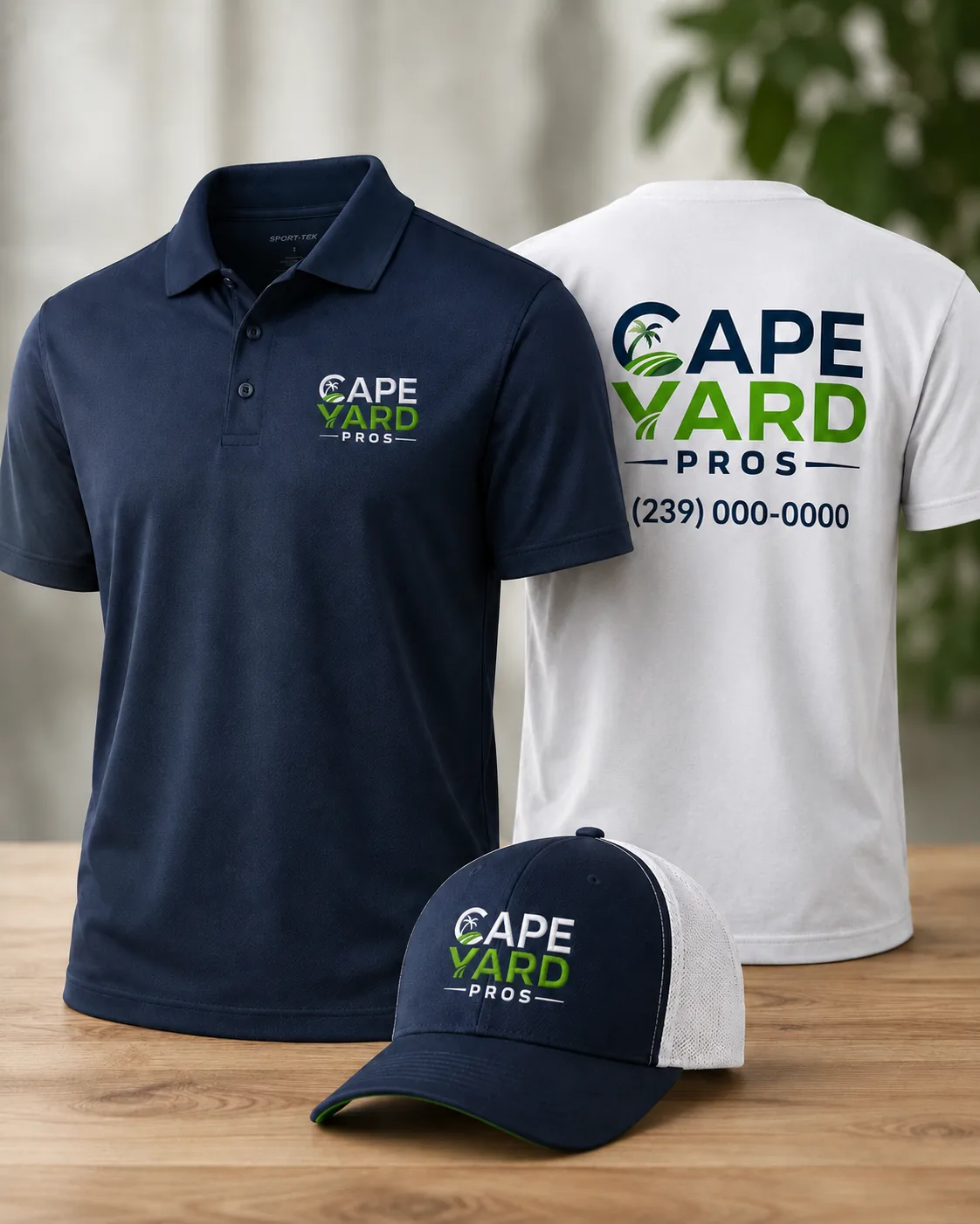
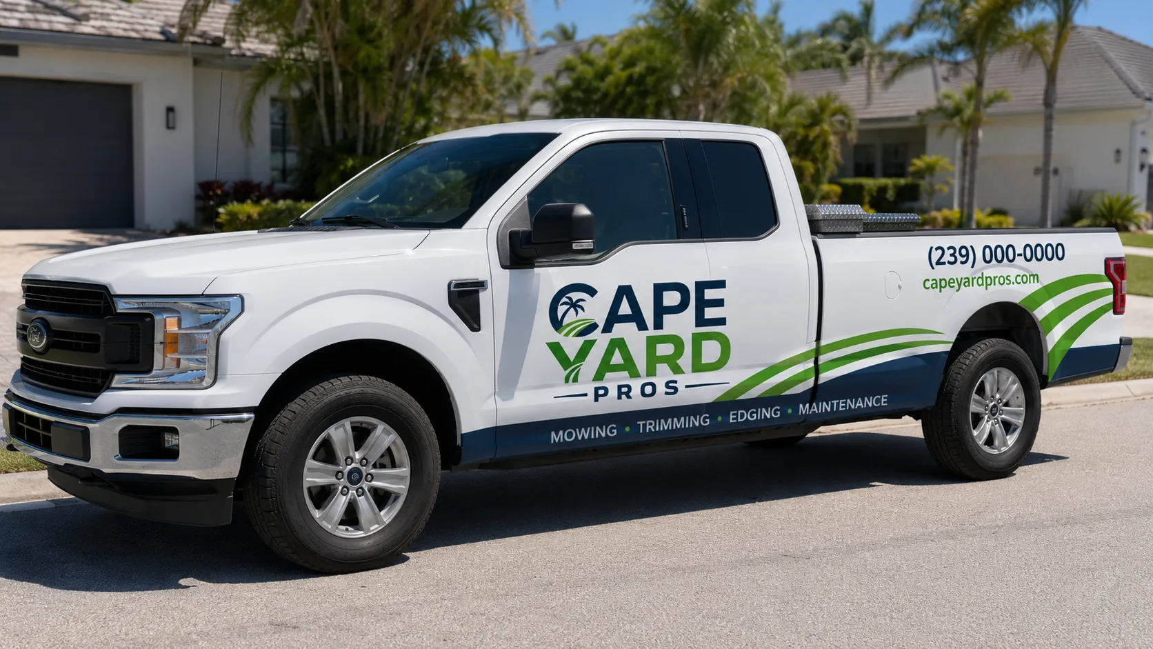
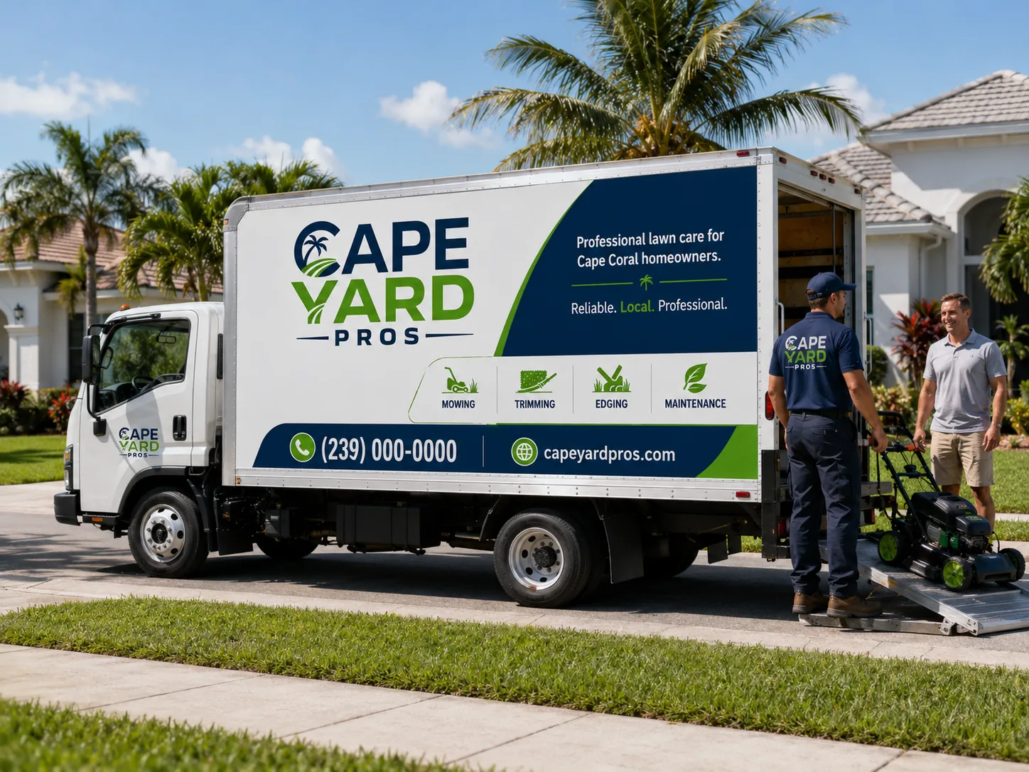
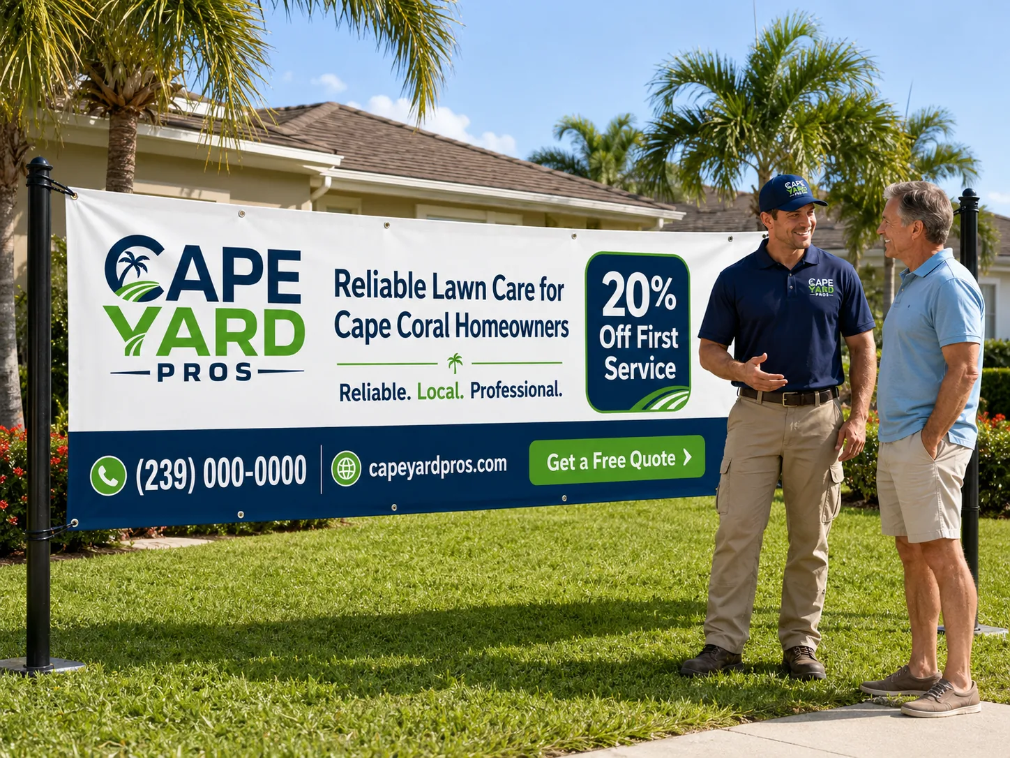
Coherence isn't repeating a logo: it's the yard sign, the truck, the uniform, the flyer and the website producing the same signal. The homeowner sees order before calling. And for a service that enters their property, that trust matters more than any discount.
Core idea
1
Defined colors
5
Type weights
2
Applications
16
When the sign, the truck, the shirt and the ad tell the same story, the customer doesn't have to decode whether the service is serious: they can see it. That's brand coherence, and it shows before they request a quote.
The next step
Cape Yard isn't real.
Your business is.
Everything you just walked through is a demonstration of what a coherent brand does for a local business. If yours doesn't exist yet - or no longer looks like who you are - that's exactly what Niseus does.