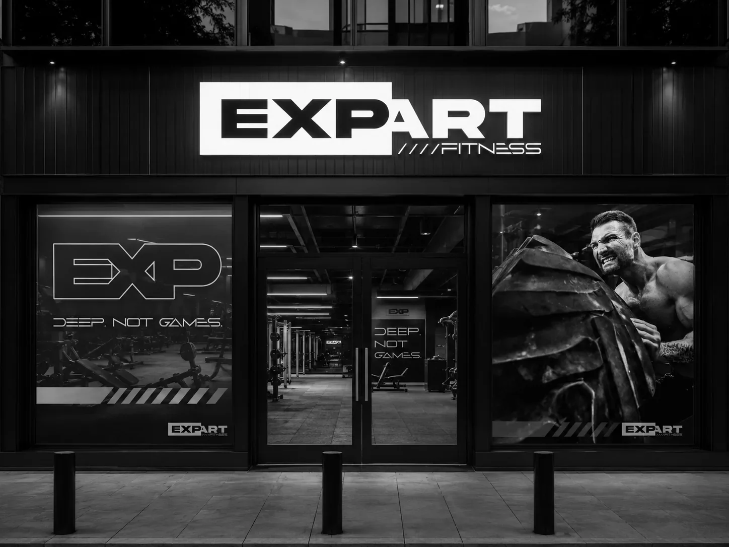
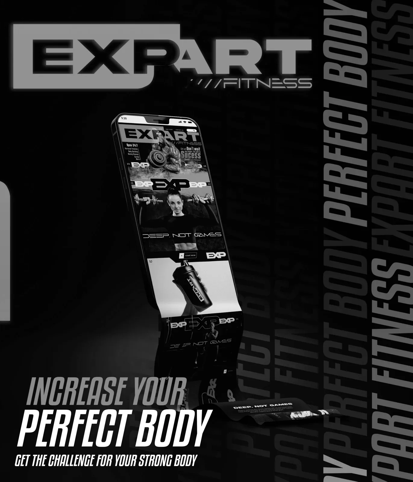
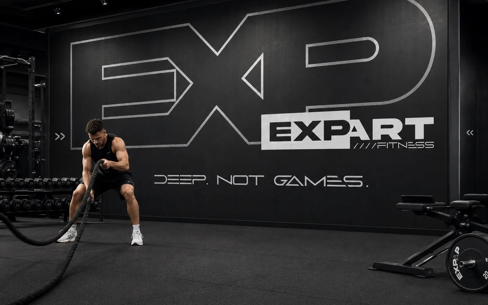

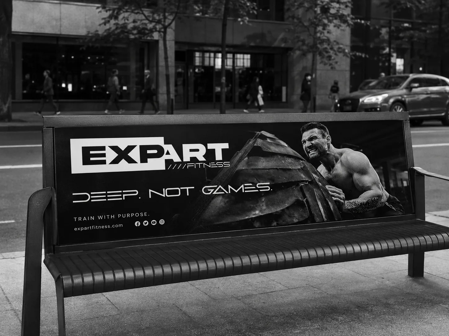
This is what a gym looks like when every piece carries the same intensity.

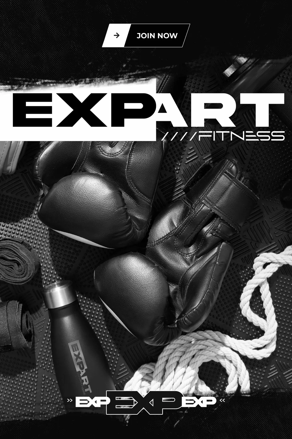
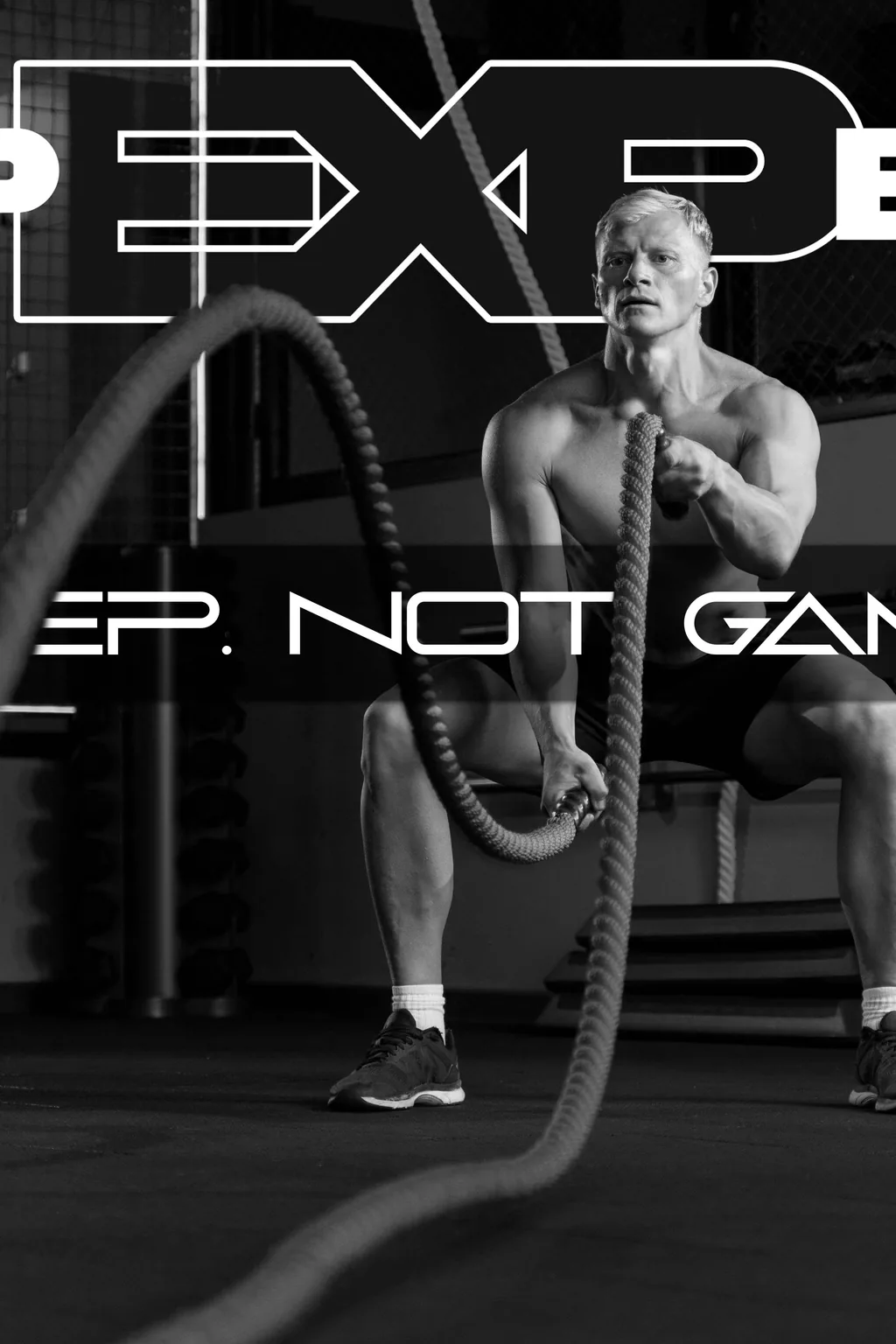
From concept to brand.
The process
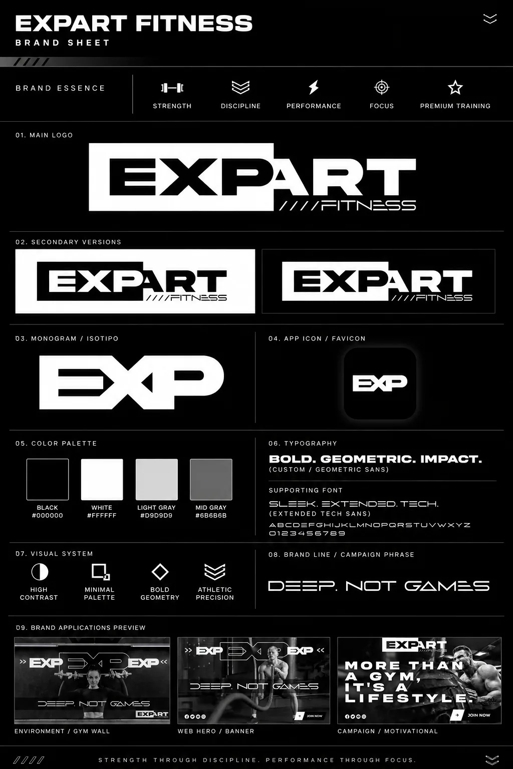
A strong brand doesn't start with the logo: it starts with an attitude you recognize from a distance. EXPART Fitness was built on three ideas shown in the brand sheet: intensity, discipline and community. The EXP monogram hits straight on and everything lives in black and white: black brings the seriousness, white cuts clean. No trendy colors, no noise. Every piece repeats the same message: deep, not games. This is where you train for real.
Every piece speaks
the same language.
The system
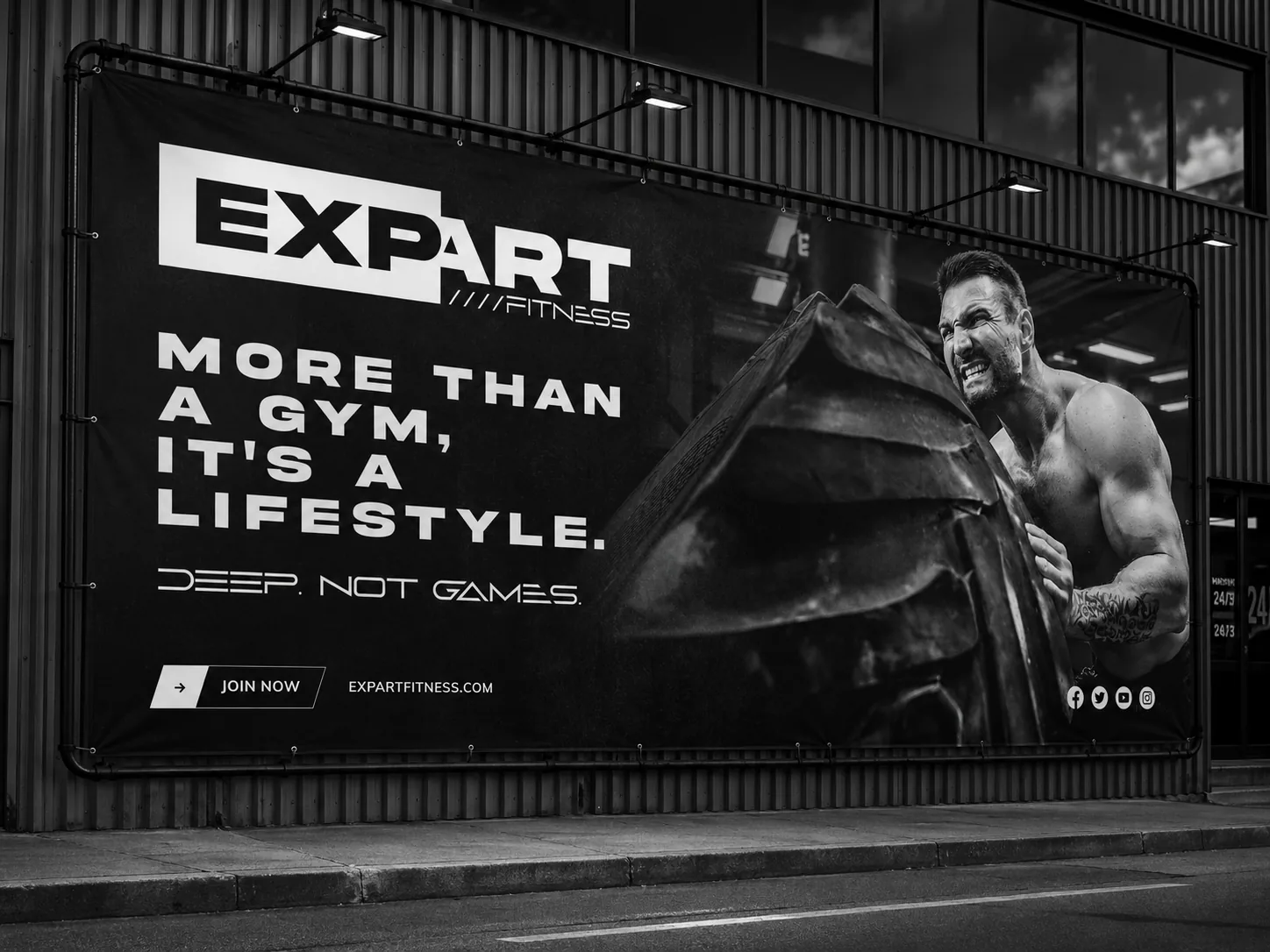
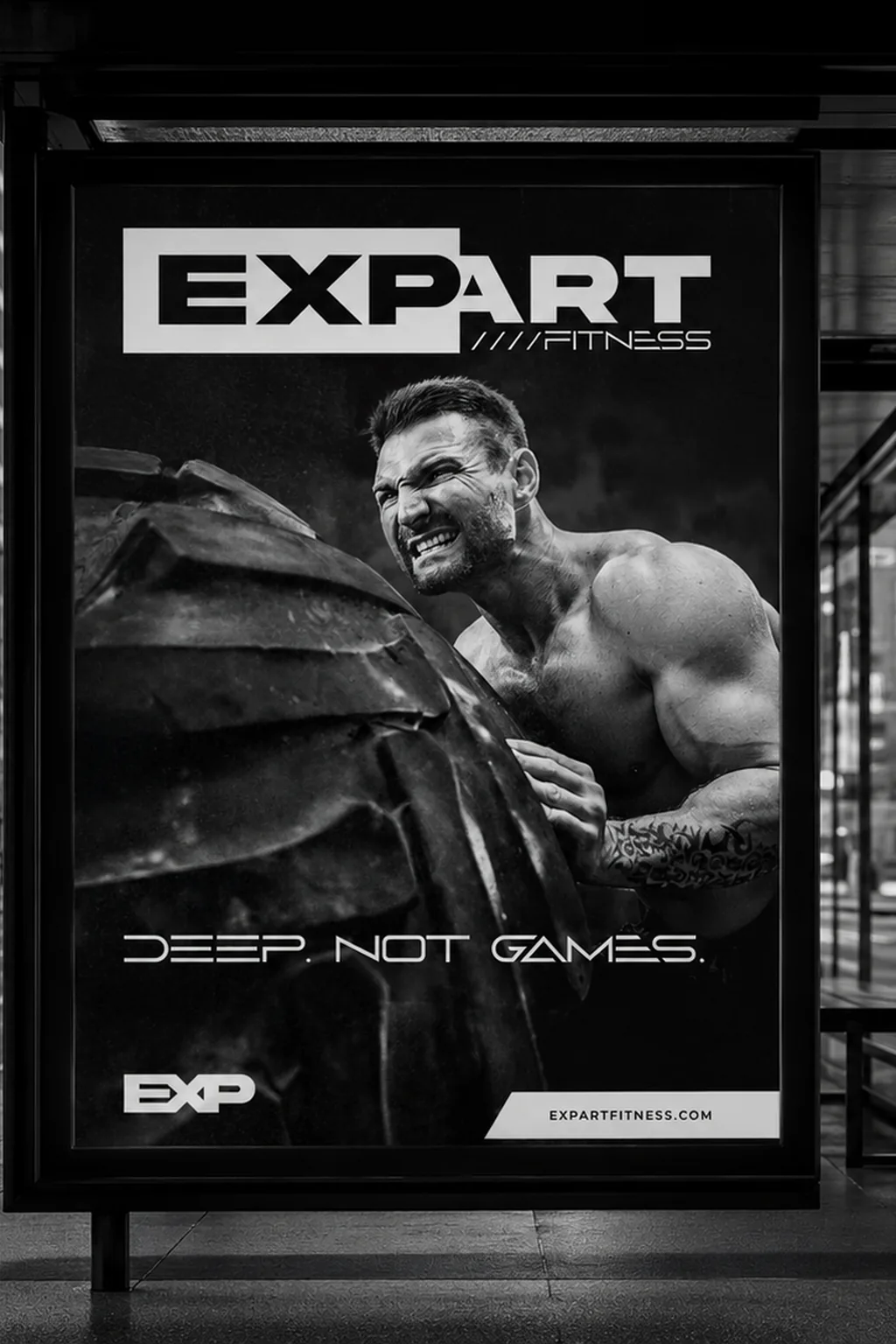
Out-of-home campaign
Billboard
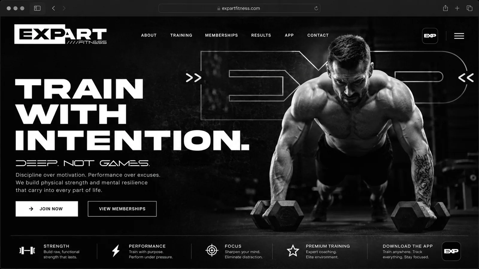
Social campaign
Social piece

Public space
Vertical poster

Social media
Social post

Print media
Magazine ad
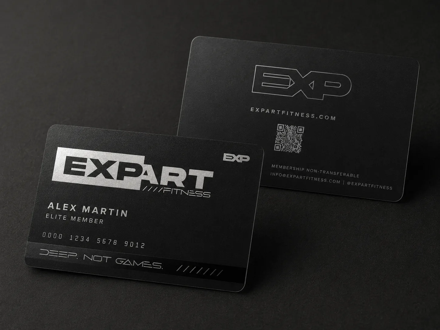
Membership
Member card
The system comes to life.
Interactive demo - hover: every piece responds

Open 24/7
Train on your schedule, no excuses
Expert coaches
Real guidance, no filler
Community
A team that pushes with you
Results
Discipline you can see

The brandhits
the street.
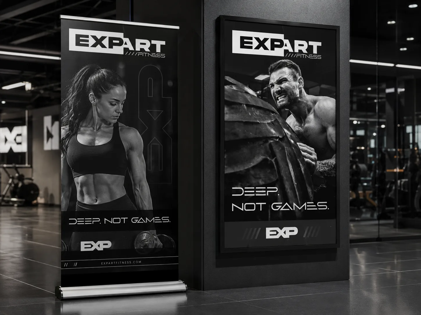
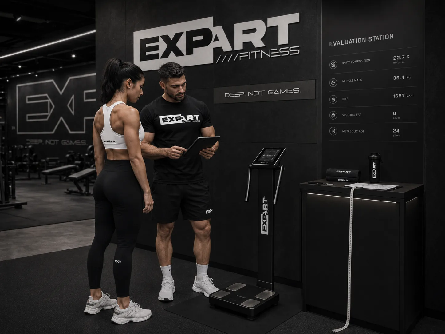
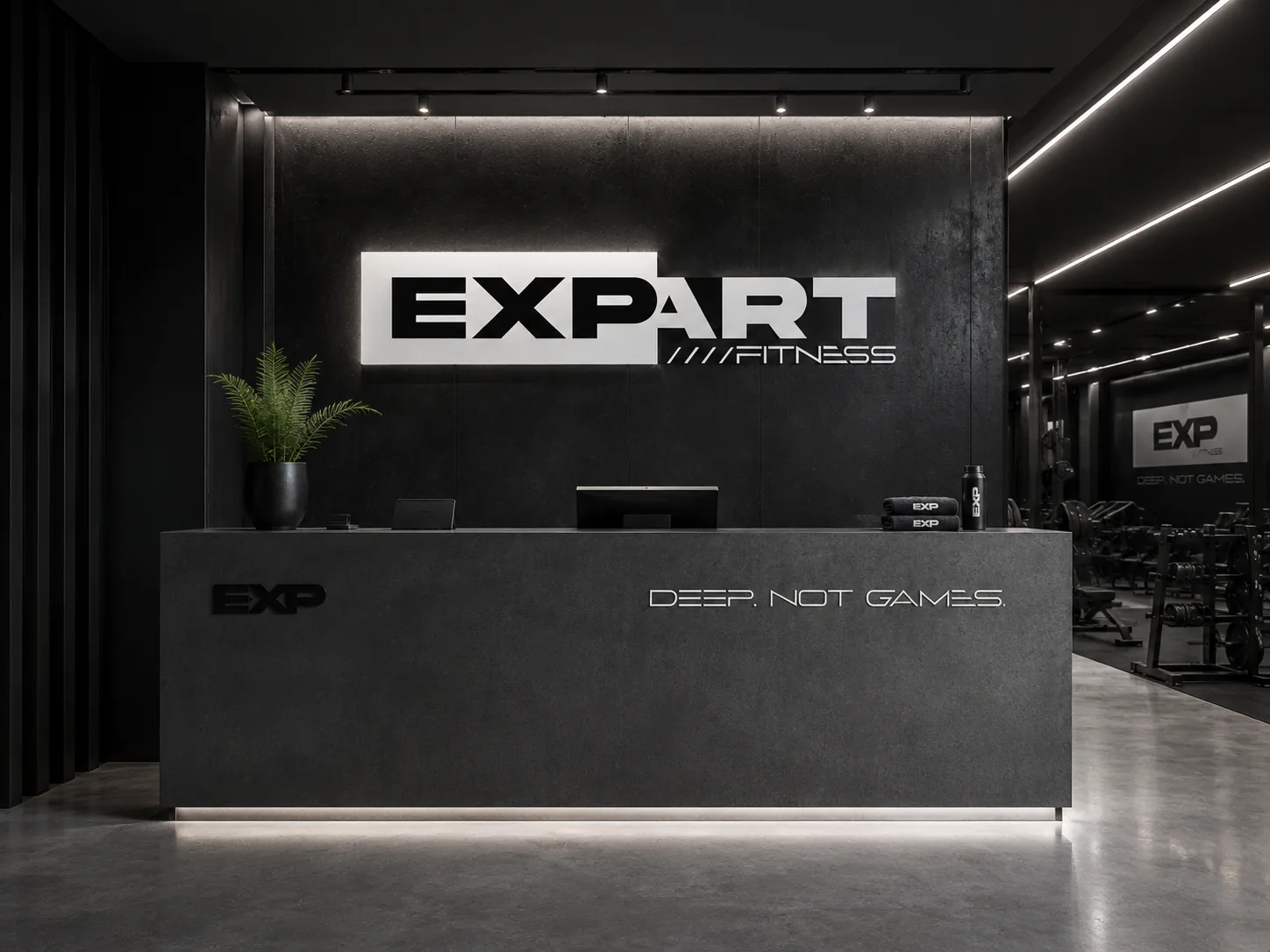
Coherence isn't repeating a logo: it's the storefront, the wrapped vehicle, the apparel, the billboard and the app producing the same signal of intensity. Before lifting a single weight, the prospect already knows this is where you train for real. And in fitness, that perception is what sells the membership.
Core idea
1
Colors
B&W
Type weights
2
Applications
18
When the storefront, the vehicle, the apparel and the app tell the same story, the prospect doesn't have to wonder whether the gym is serious: they can feel it. That's brand coherence, and it shows before they sign the membership.

The next step
EXPART isn't real.
Your business is.
Everything you just walked through is a demonstration of what a coherent brand does for a business. If yours doesn't exist yet - or no longer looks like who you are - that's exactly what Niseus does.