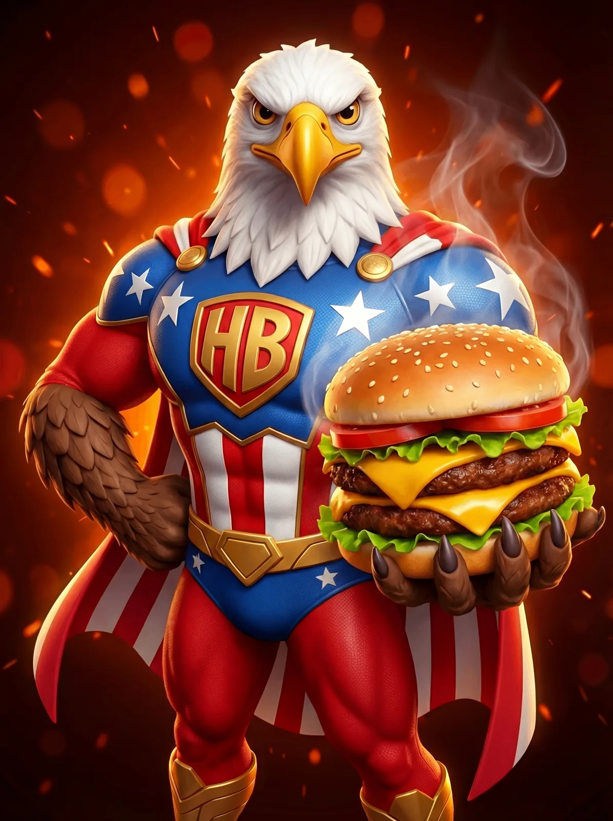
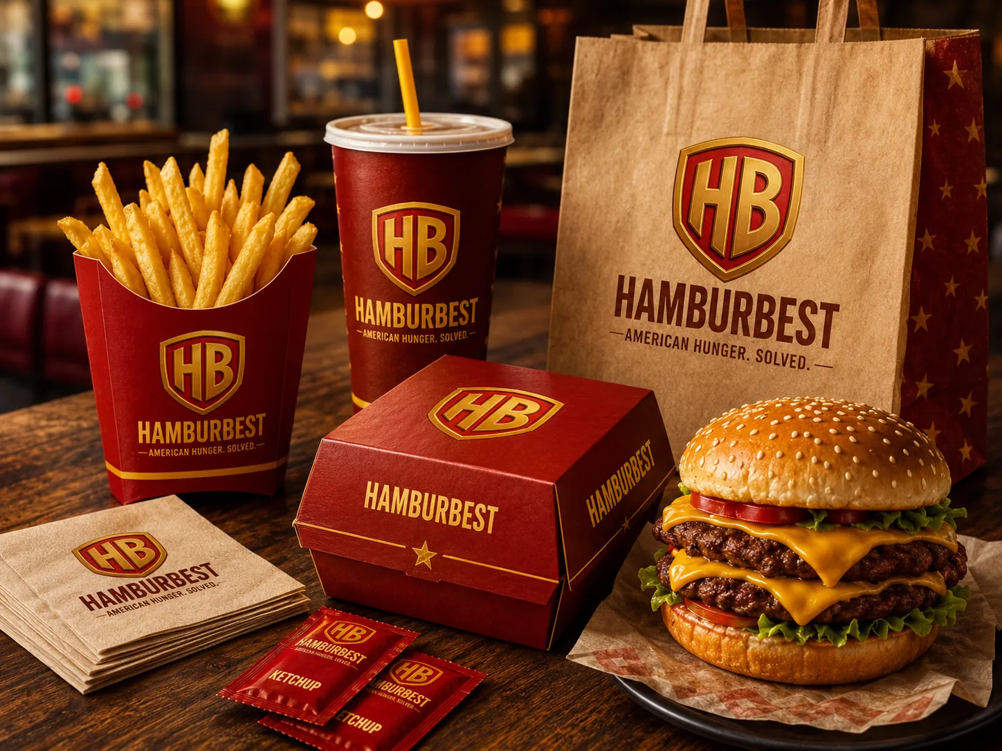
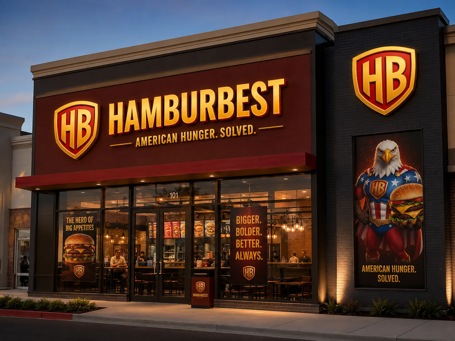
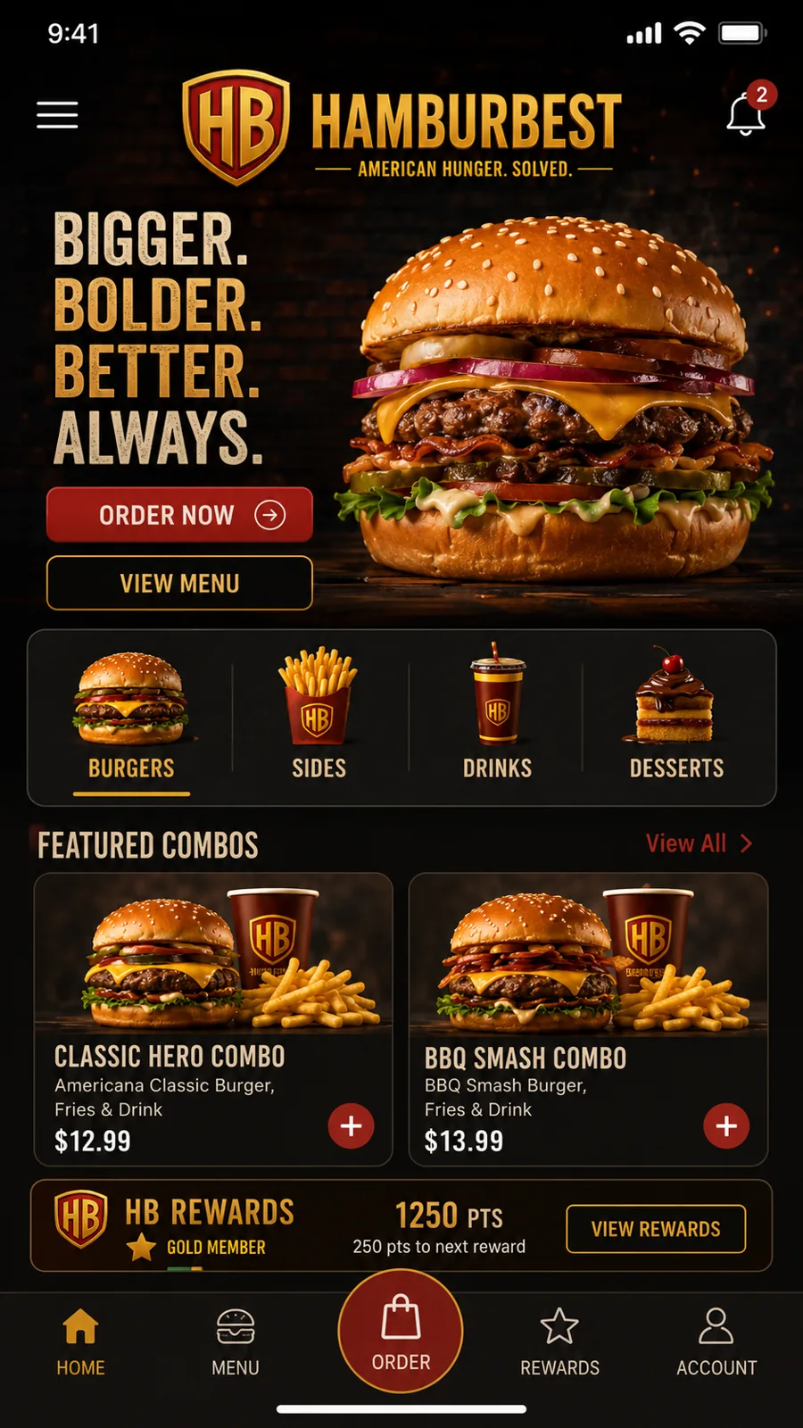
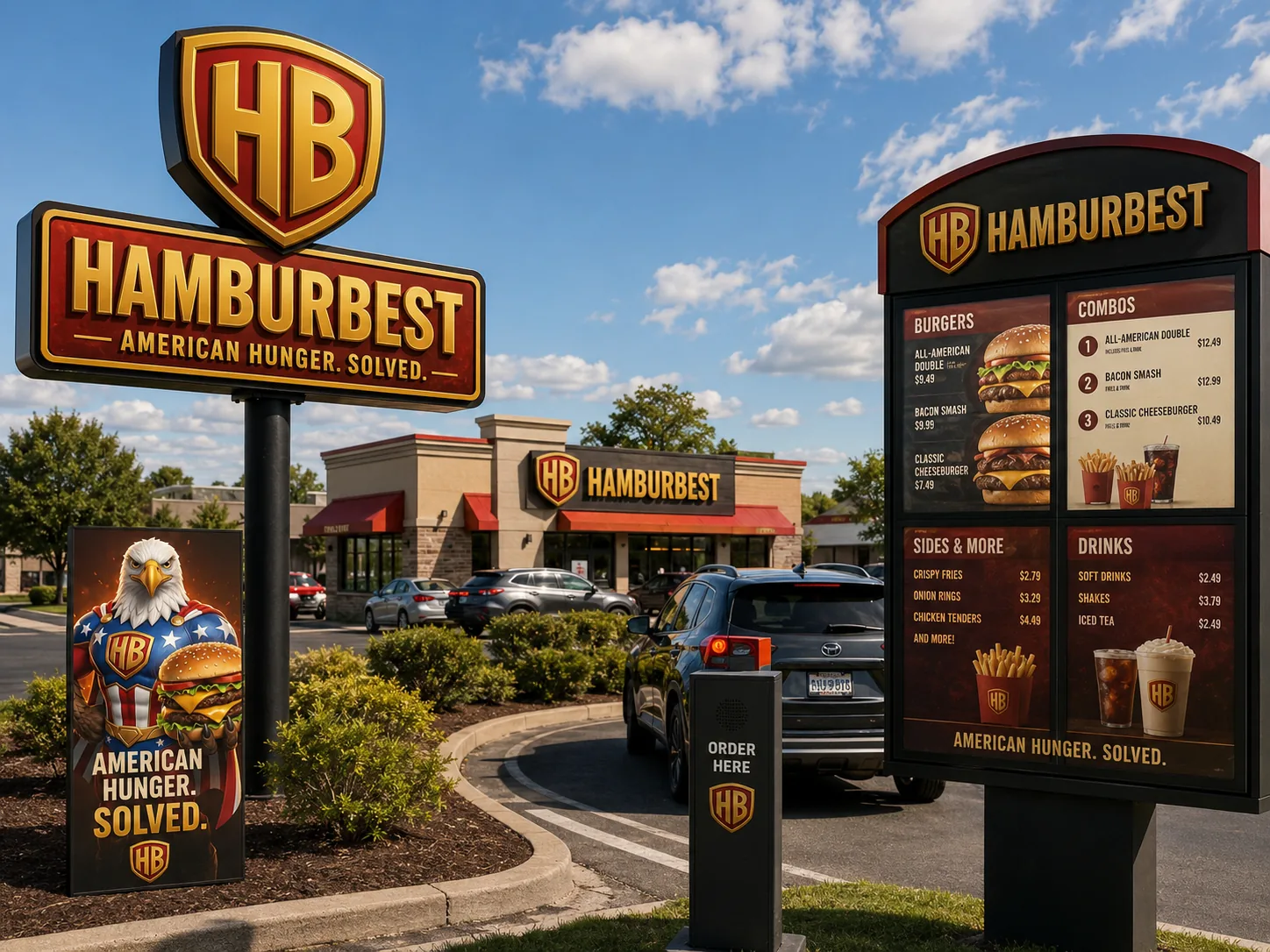
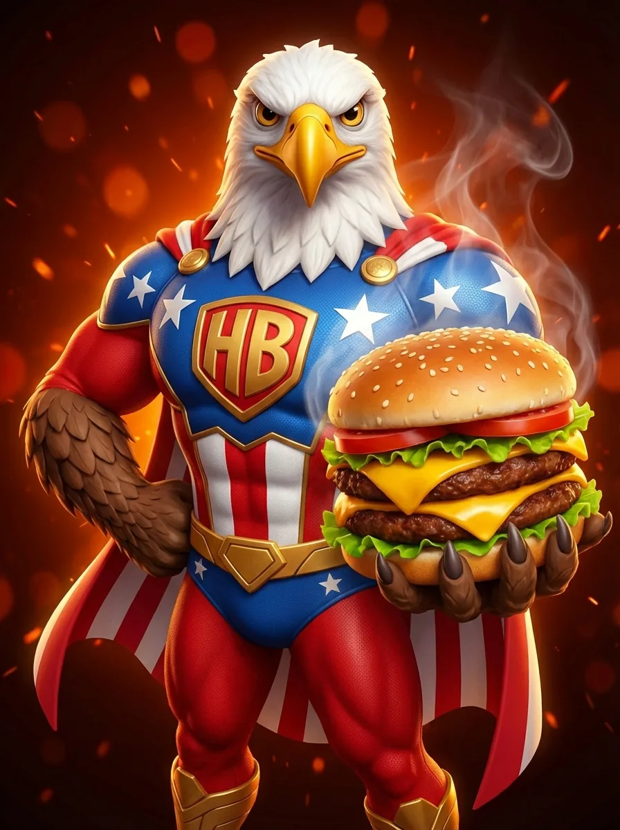
This is what a burger joint looks like when every piece says the same thing: bold, American, memorable.
From concept to brand.
The process
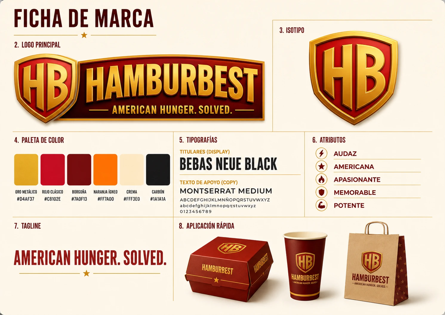
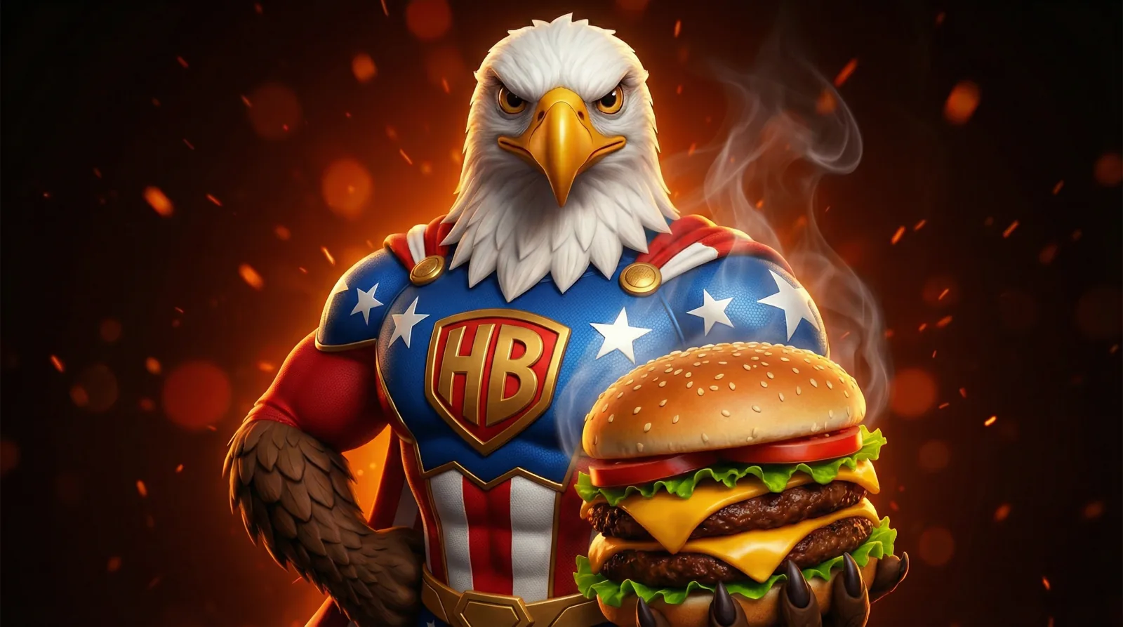
A coherent brand doesn't start with the logo: it starts with a promise people can recognize. Hamburbest was built on three words shown in the brand sheet: bold, American, memorable. The shield and the eagle mascot speak of a hero of hunger; gold carries the premium feel, red fires up the appetite, and every piece repeats the same idea: American Hunger. Solved. Bigger, bolder, better — always.
Every piece speaks
the same language.
The system
Box, cup, bag
Combo packaging
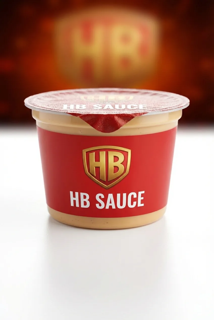
Brand product
HB Sauce
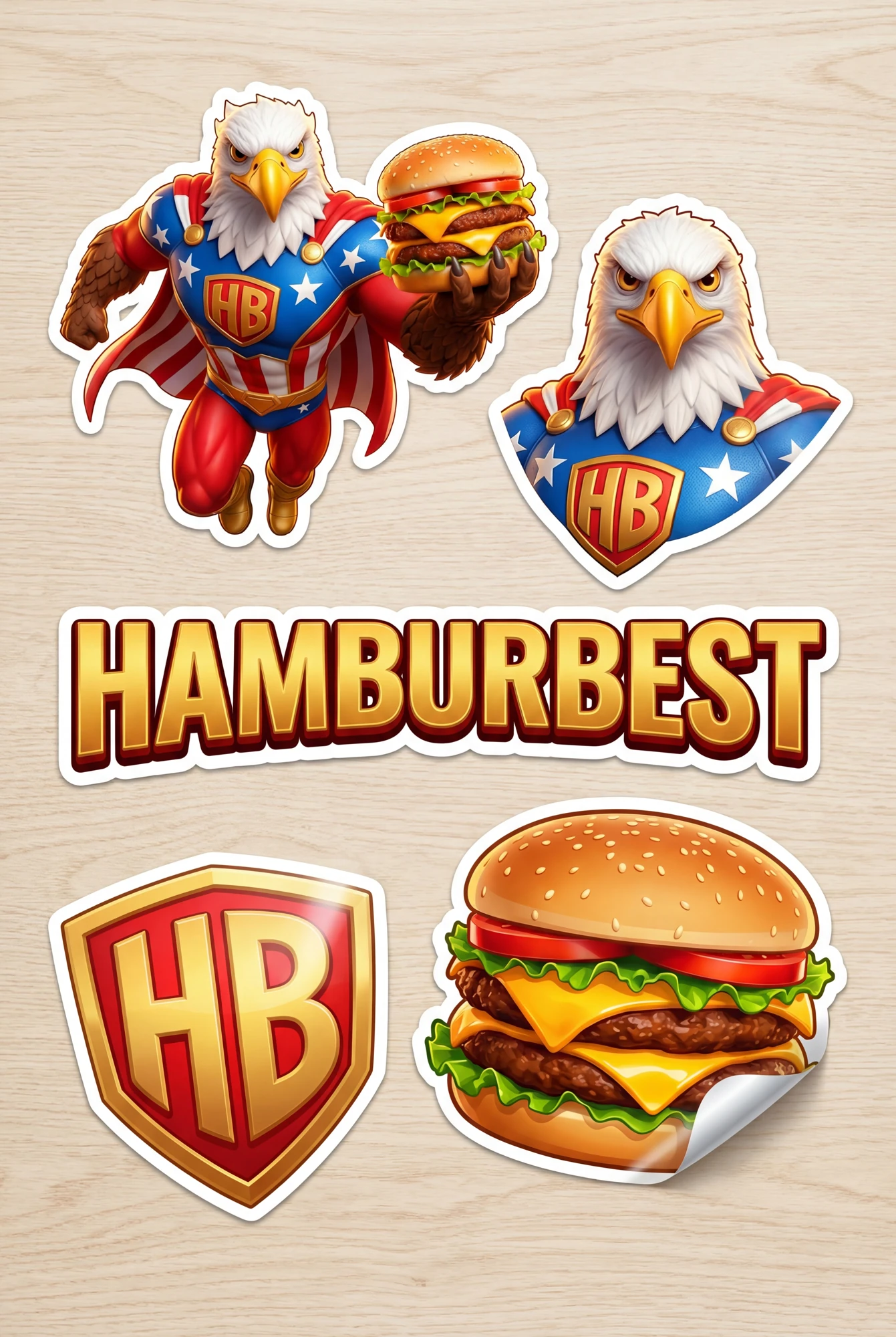
Brand details
Sticker sheet
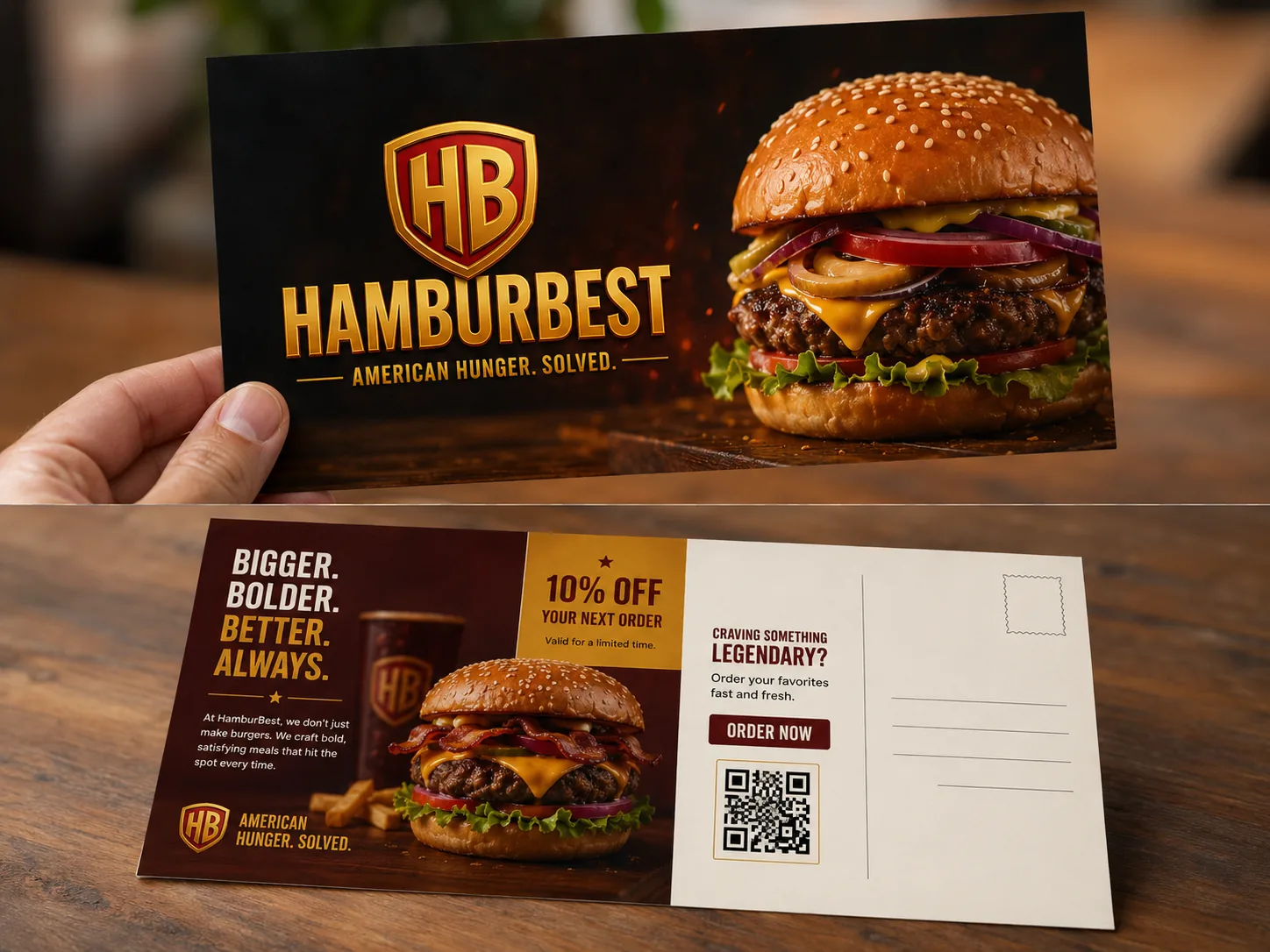
Direct to customer
Promo postcard
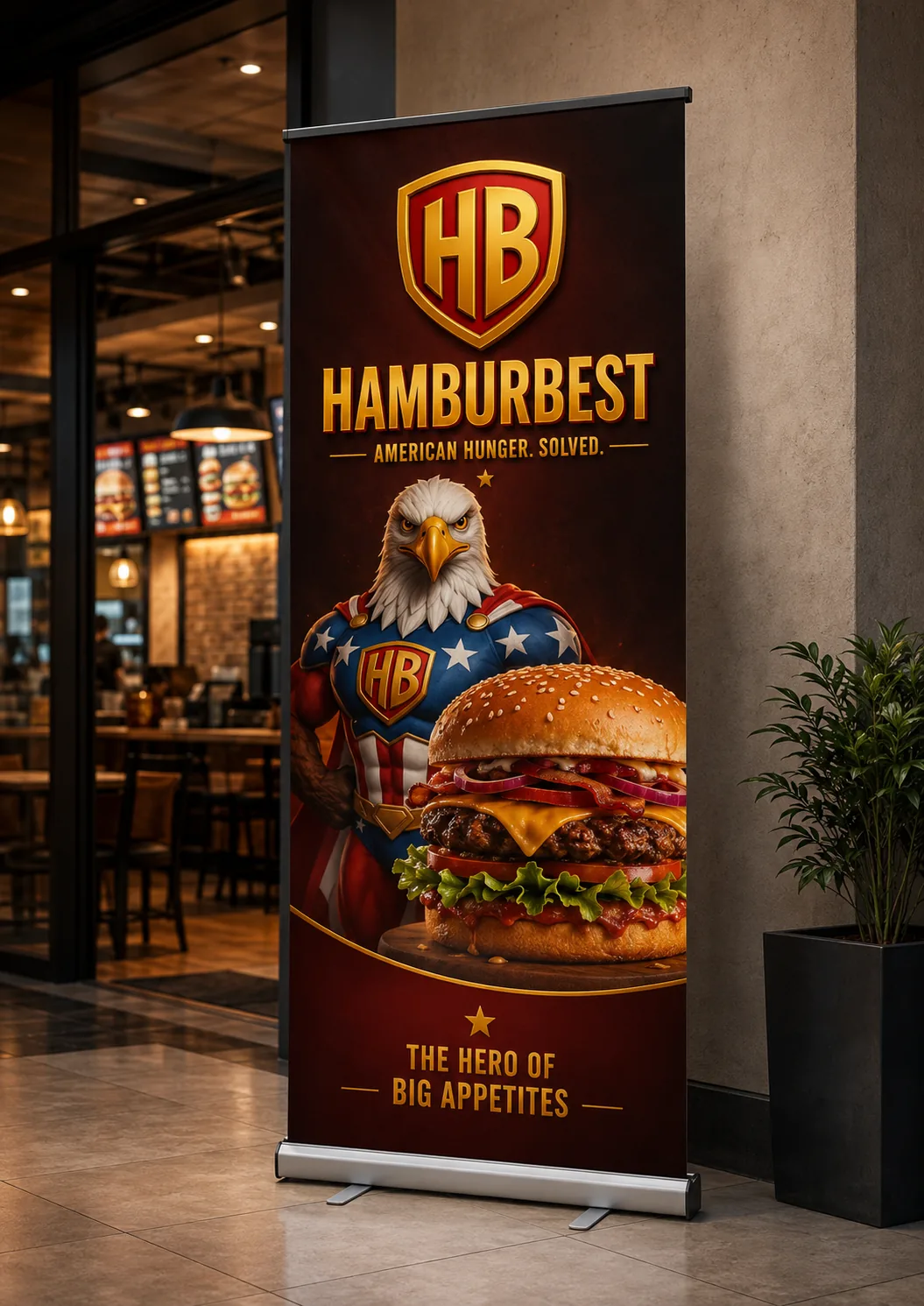
In-store
Roll-up banner
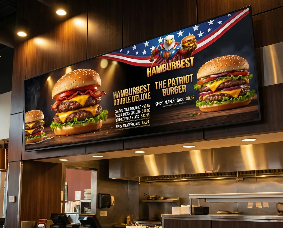
Point of sale
Menu board
The system comes to life.
Interactive demo - hover: every piece responds
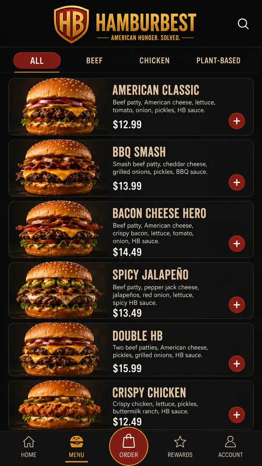
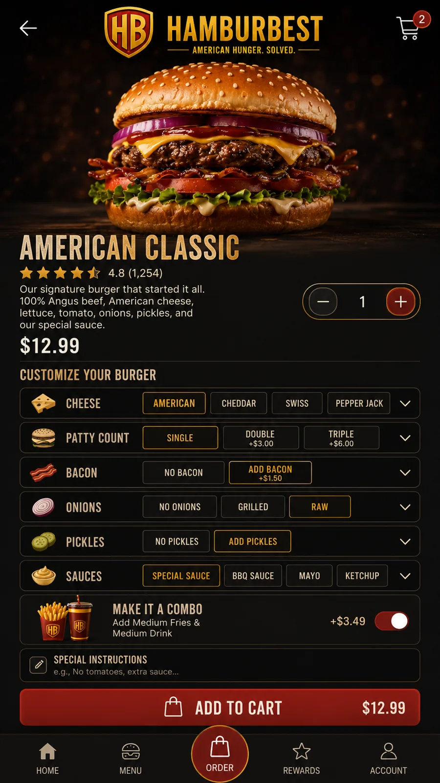
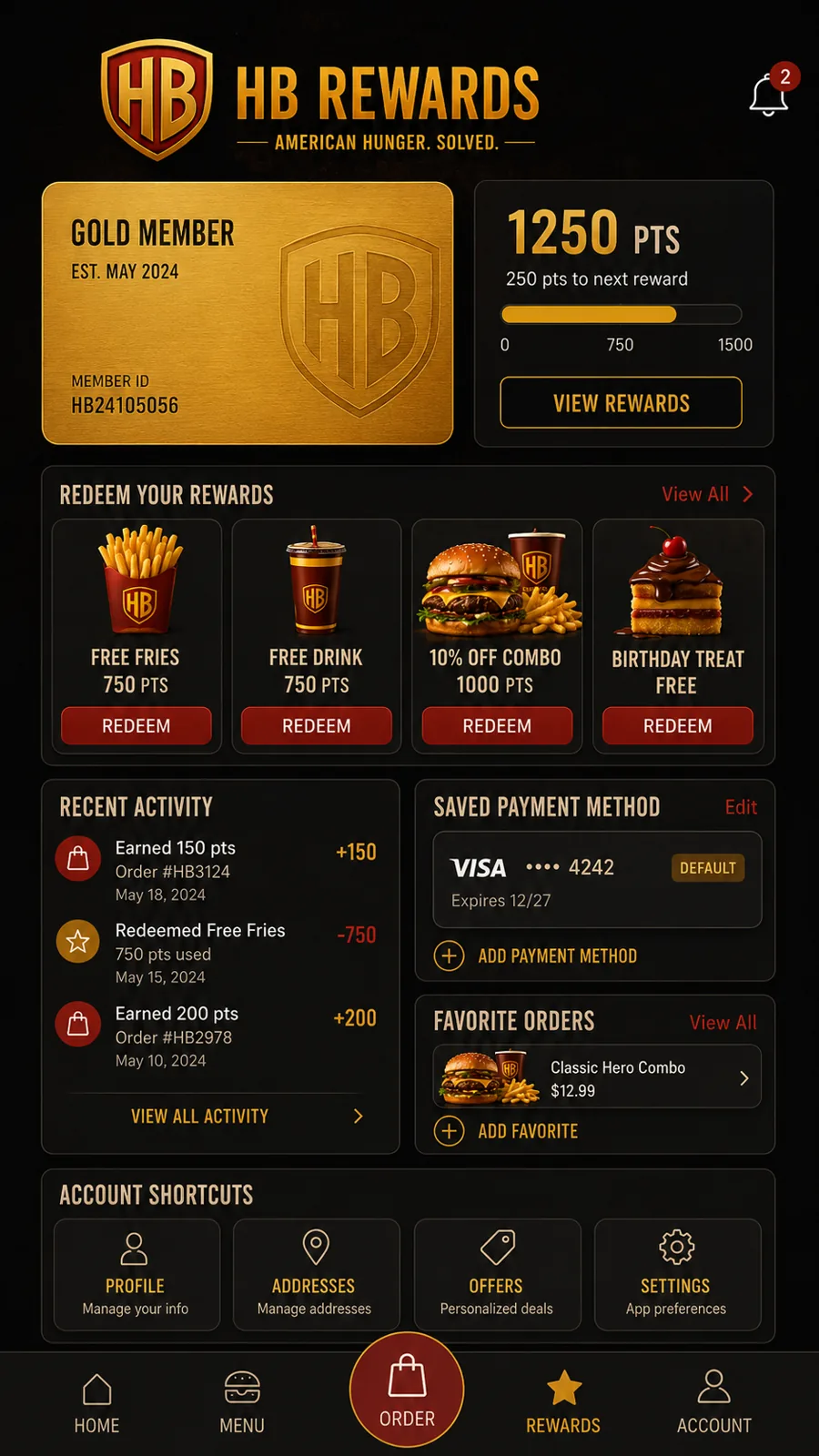

100% American beef
Quality and bold flavor
Made to order
Never frozen
Bold ingredients
Maximum flavor
Made for you
Your craving, our mission
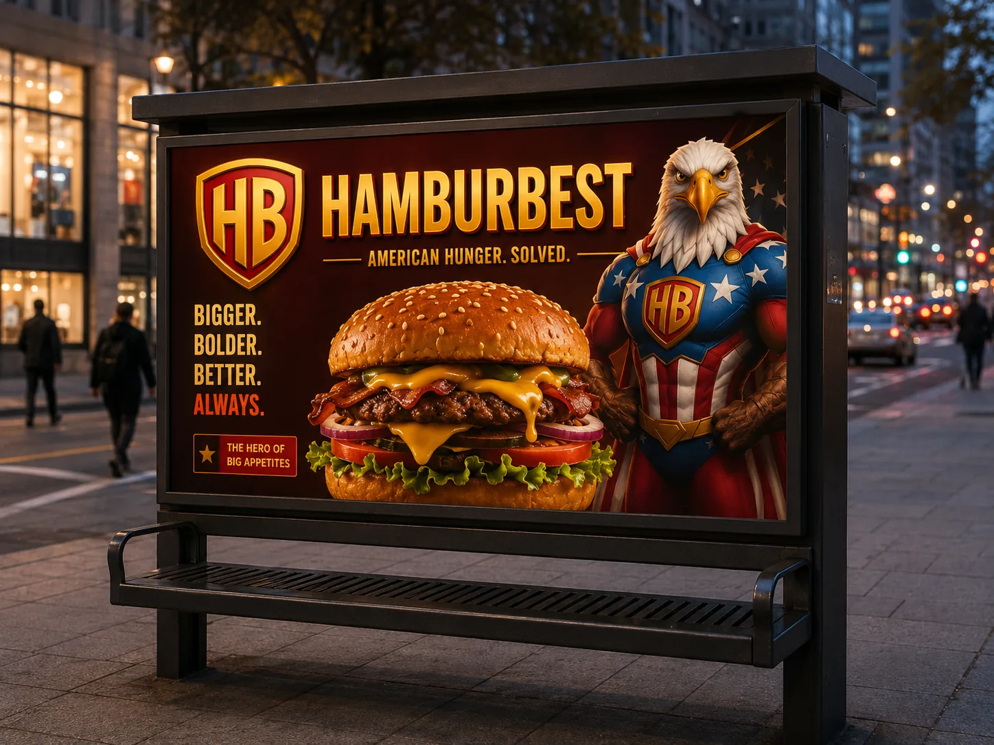
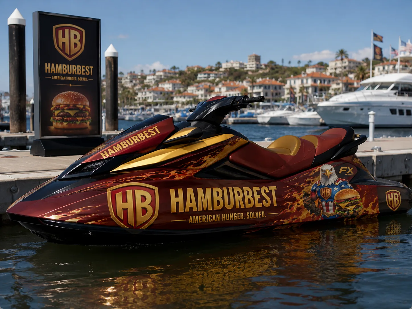
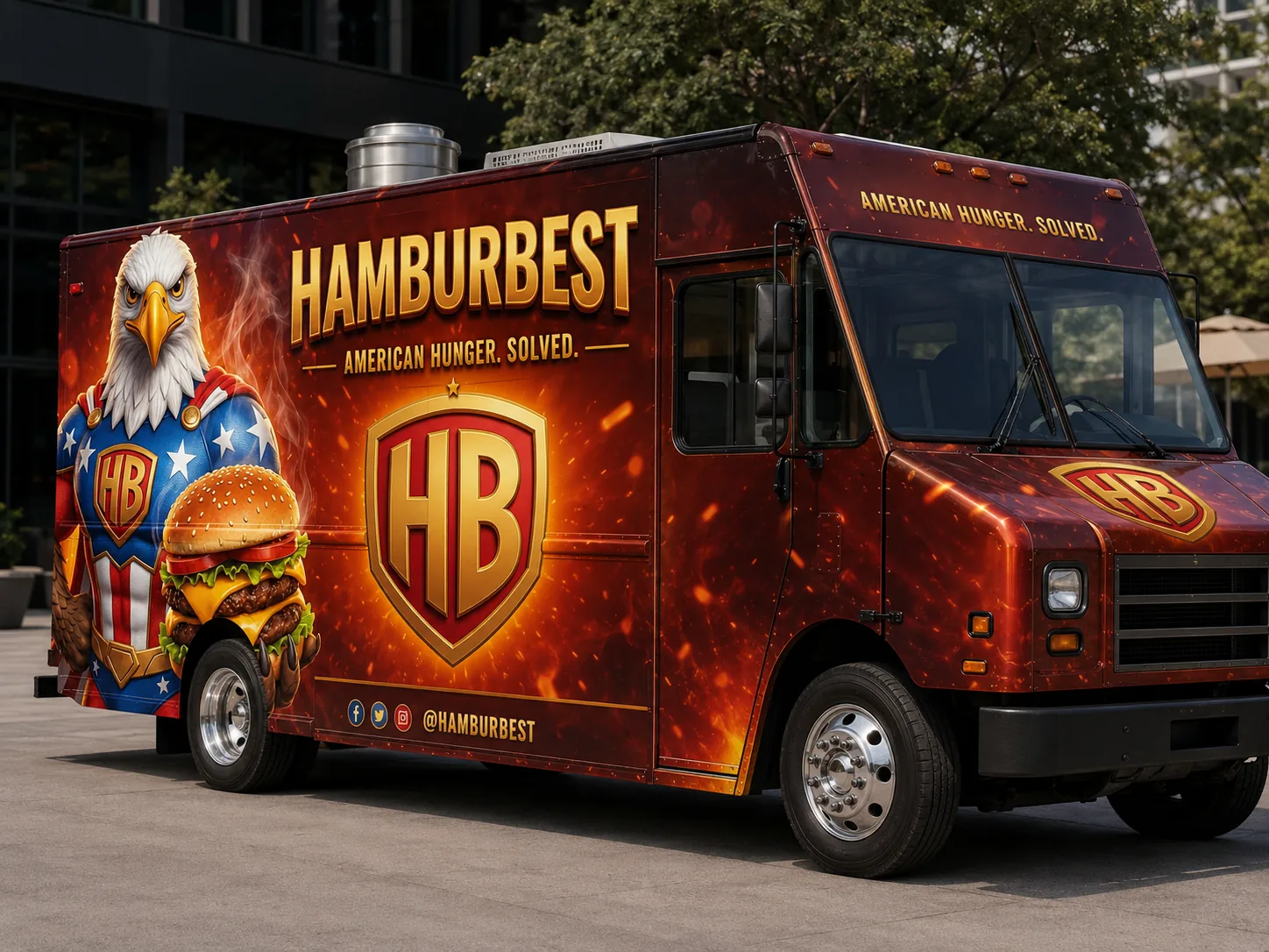
The brandhits
the street.
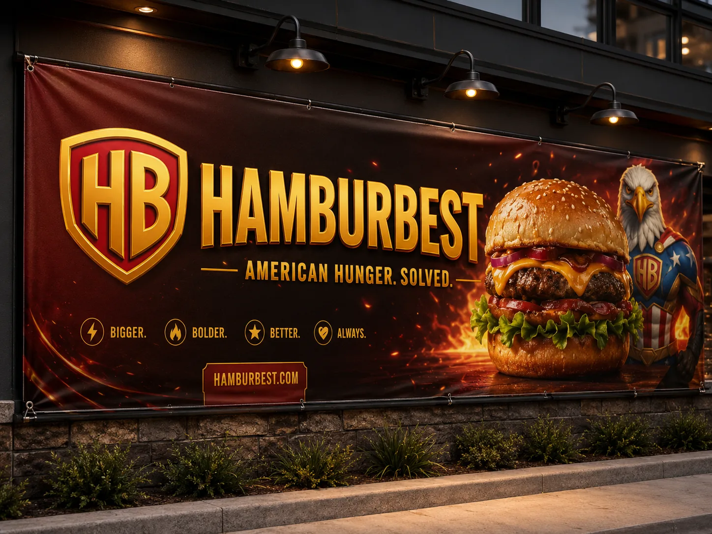
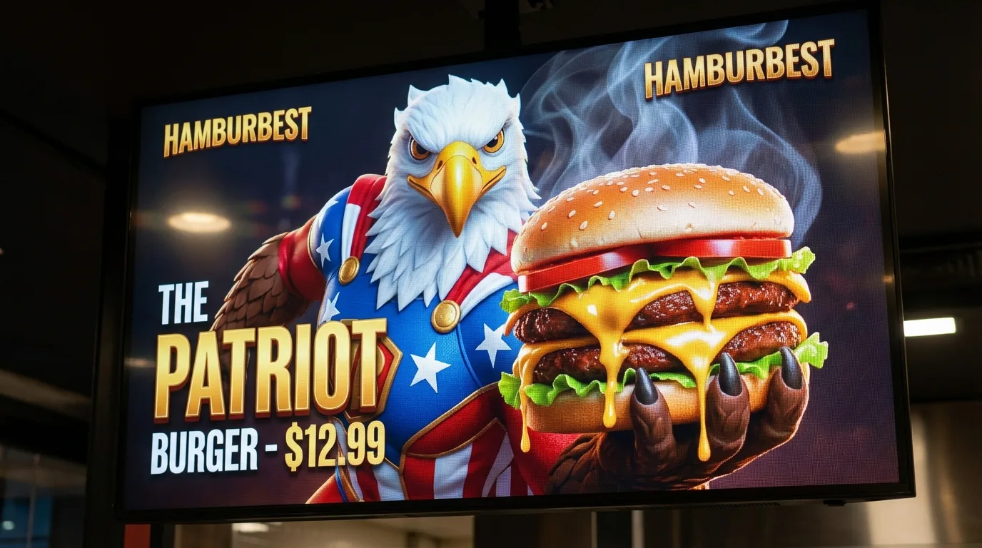
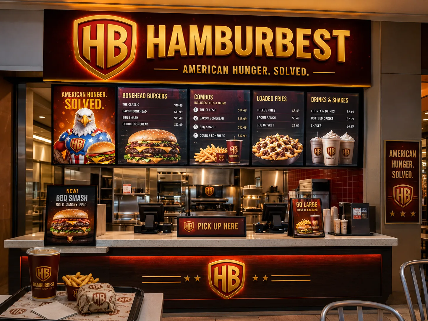
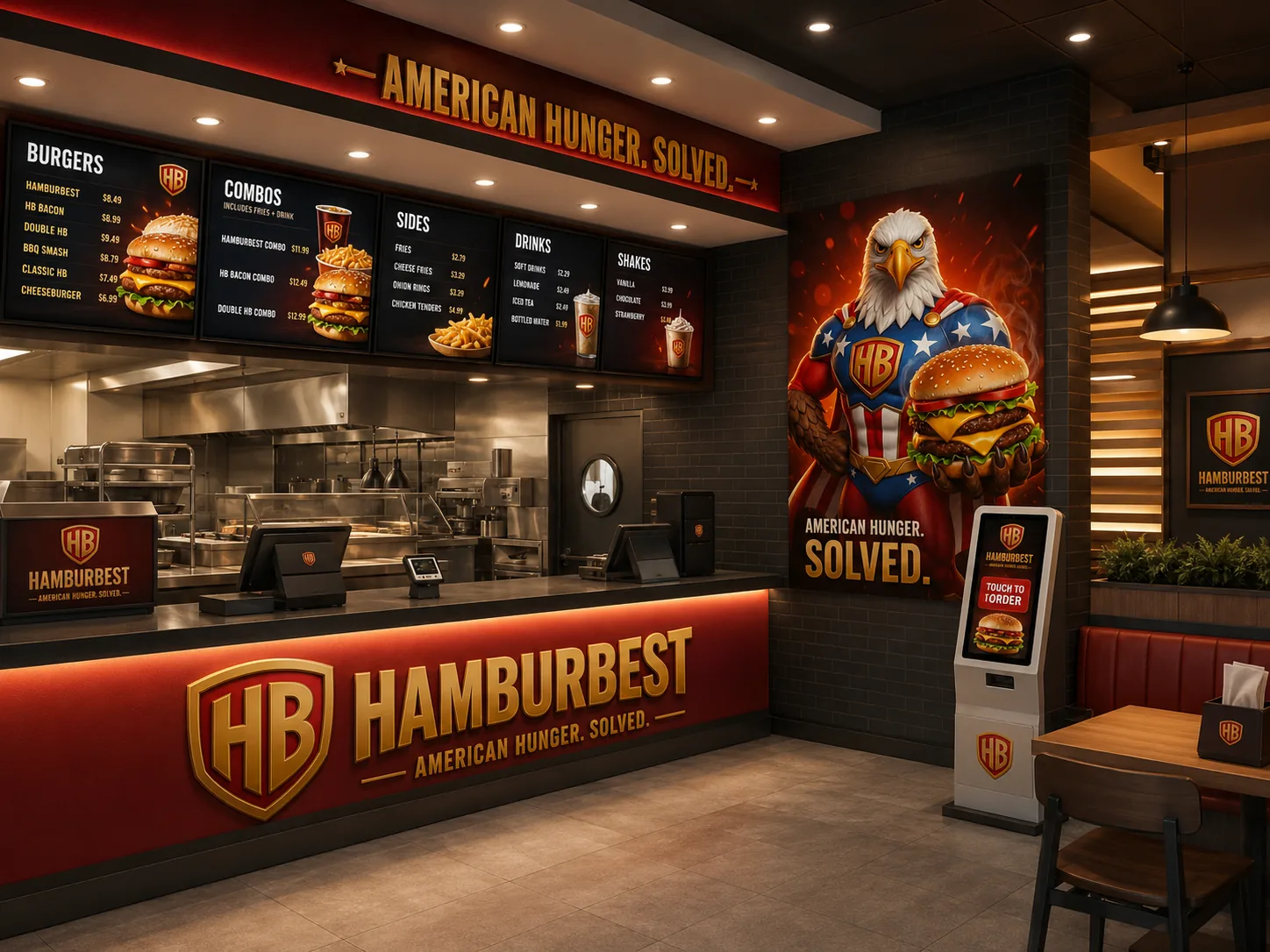
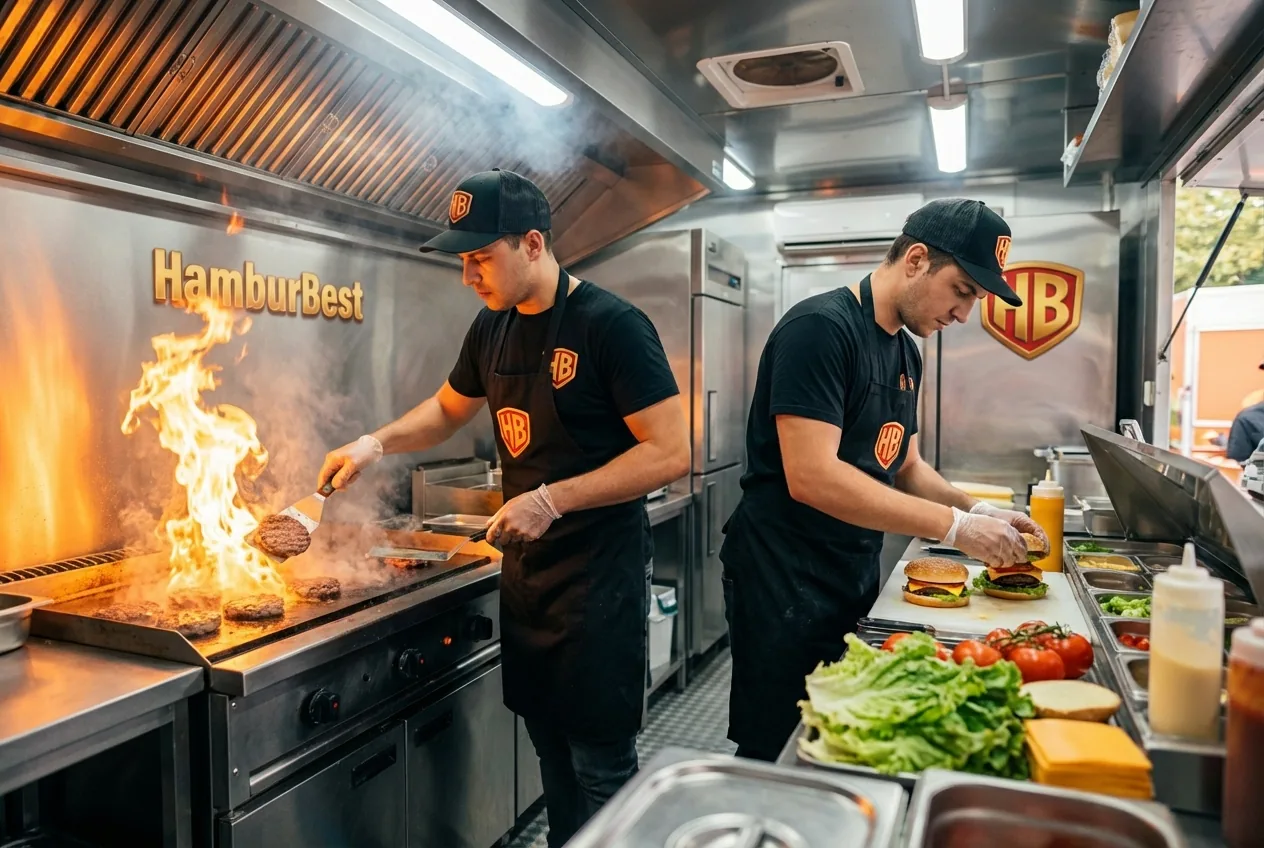
Coherence isn't repeating a logo: it's the food truck, the drive-thru, the billboard, the sign and the website producing the same signal. The customer feels the brand before the first bite. And in a food business, that trust opens the appetite more than any discount.
Core idea
1
Defined colors
6
Typefaces
2
Applications
24
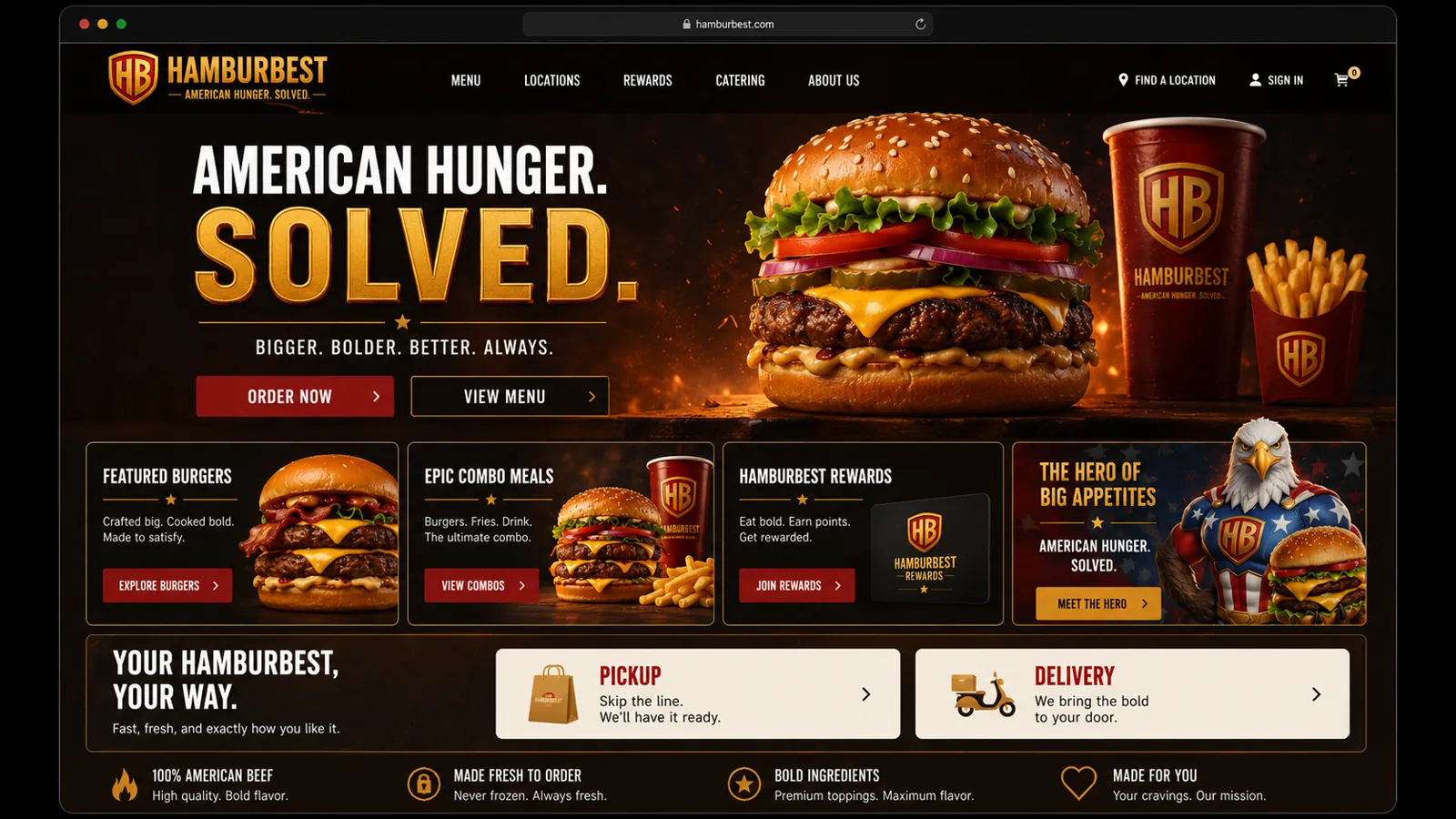
When the storefront, the food truck, the packaging and the ad tell the same story, the customer doesn't have to decode whether the food is worth it: they can see it. That's brand coherence, and it shows before the first bite.
The next step
Hamburbest isn't real.
Your business is.
Everything you just walked through is a demonstration of what a coherent brand does for a local business. If yours doesn't exist yet - or no longer looks like who you are - that's exactly what Niseus does.