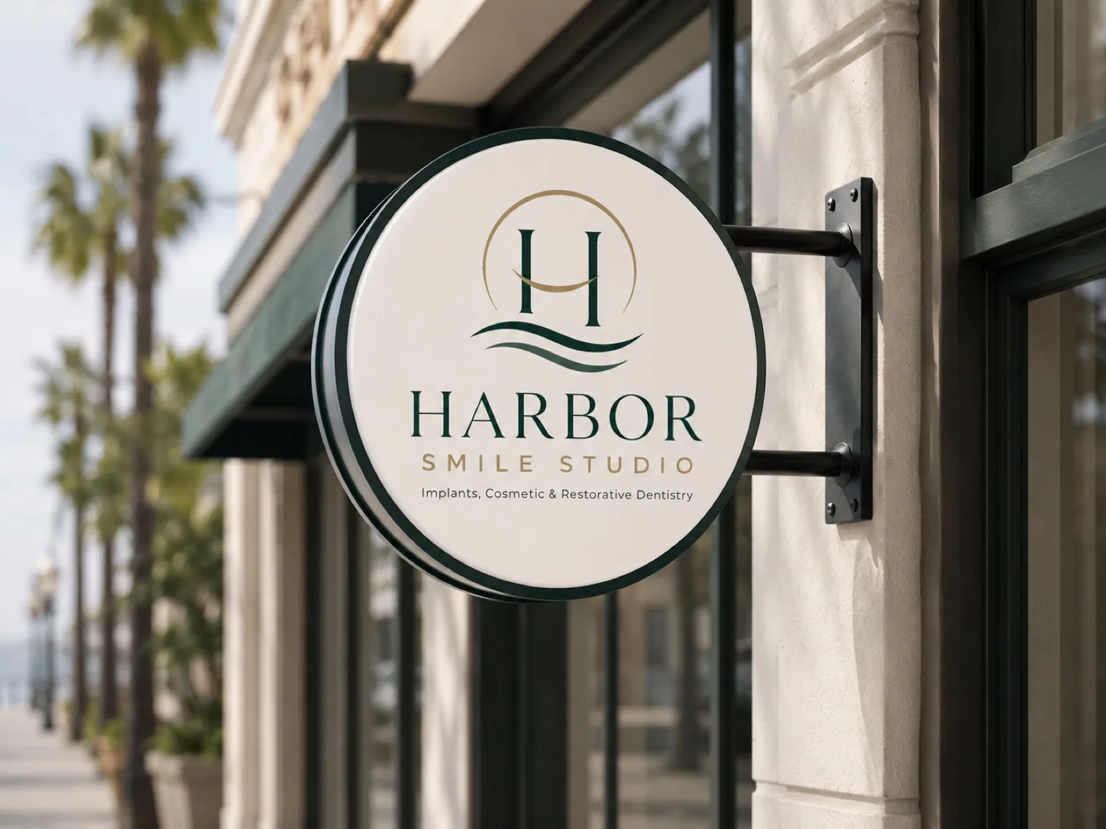
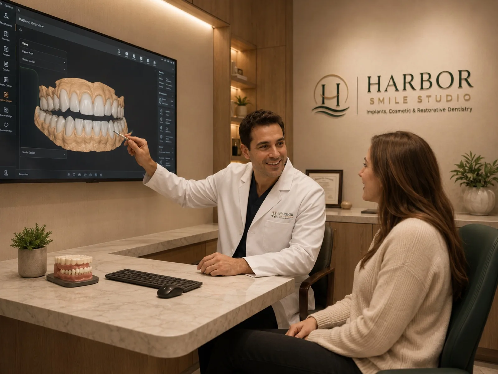
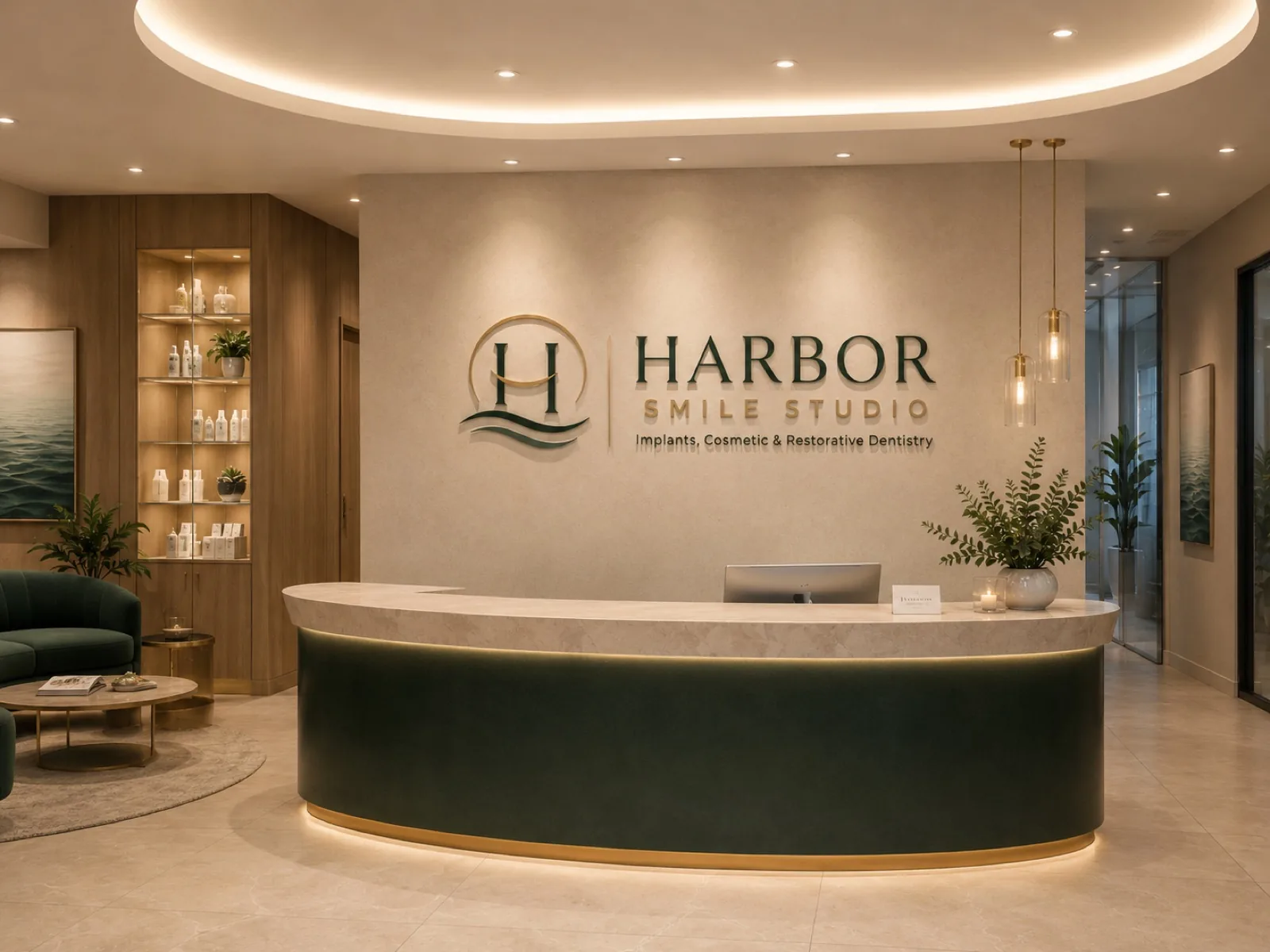
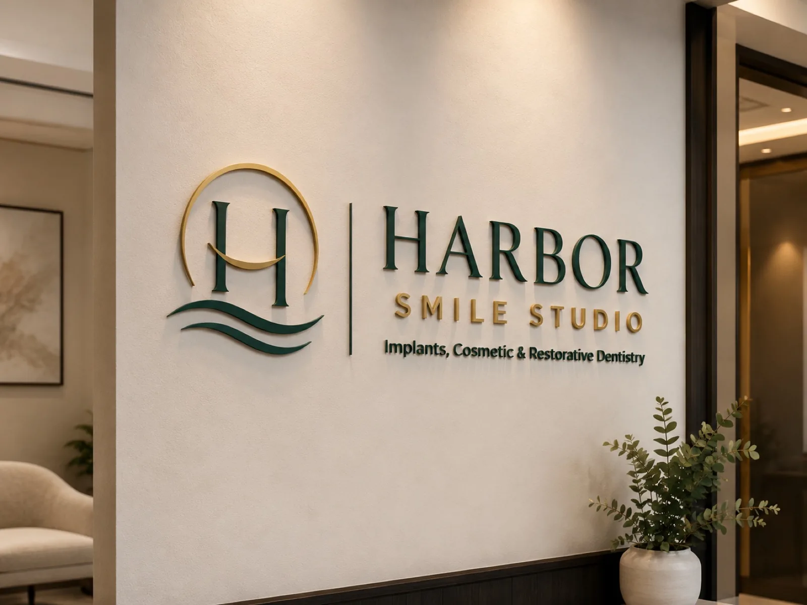
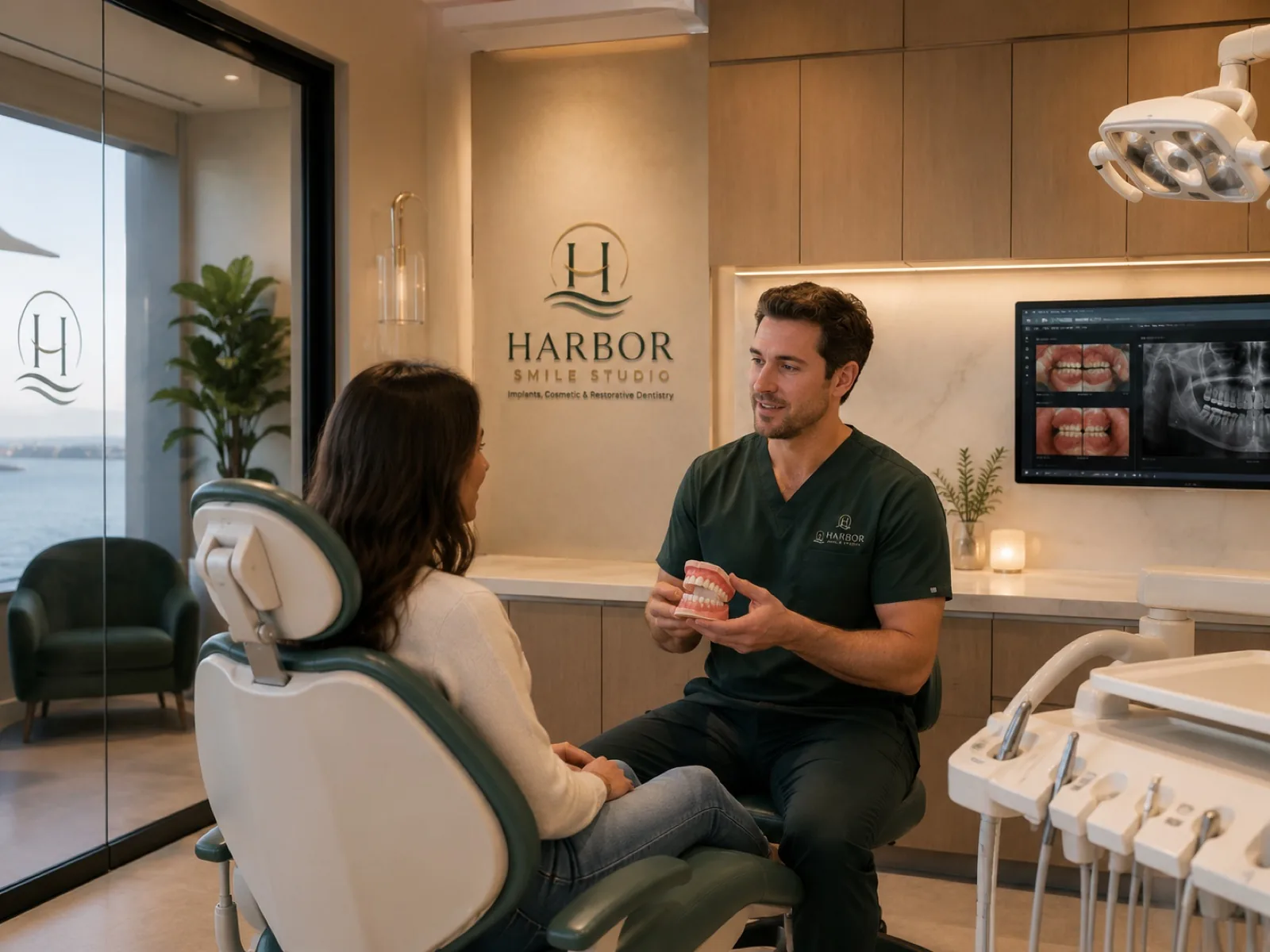
This is what a local business looks like when every piece tells the same story.
From concept to brand.
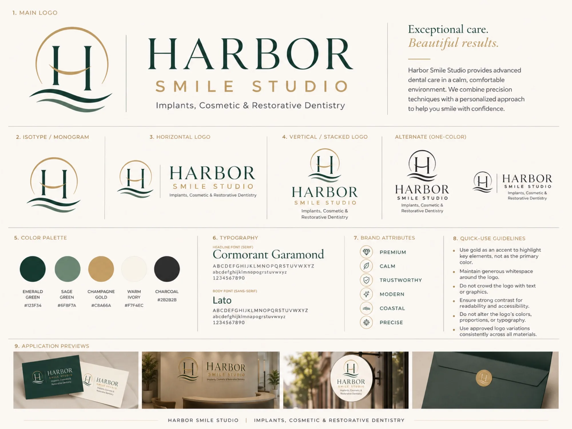
The process
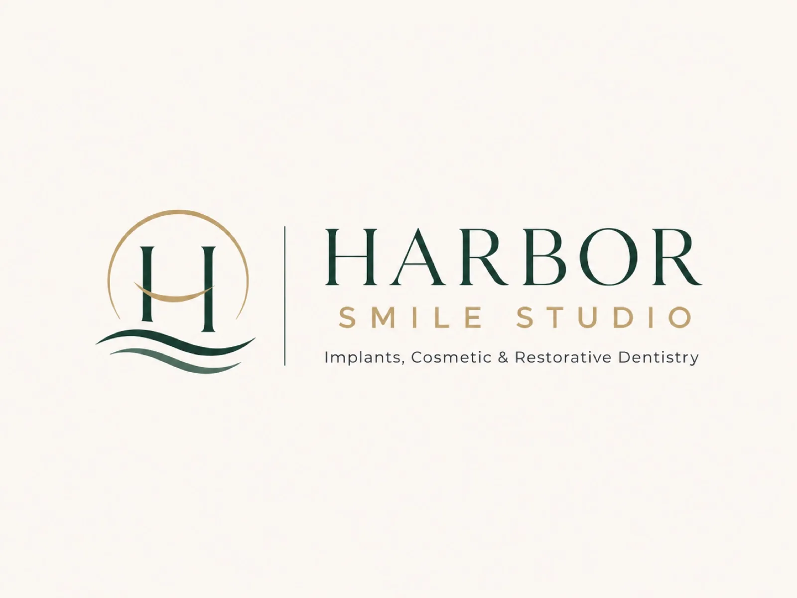
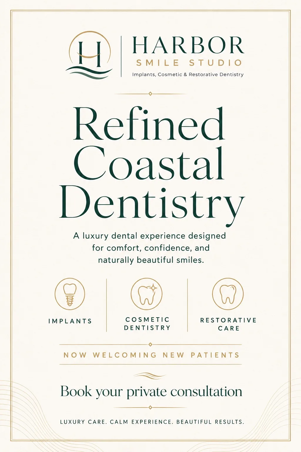
A coherent brand doesn't start with the logo: it starts with an idea. Harbor was built on three words: calm, care, coast. The golden arc is the warmth of the care, the H melts into the waves, and everything conveys the same thing: reaching safe harbor. Everything else flows from there.
Every piece speaks
the same language.
The system

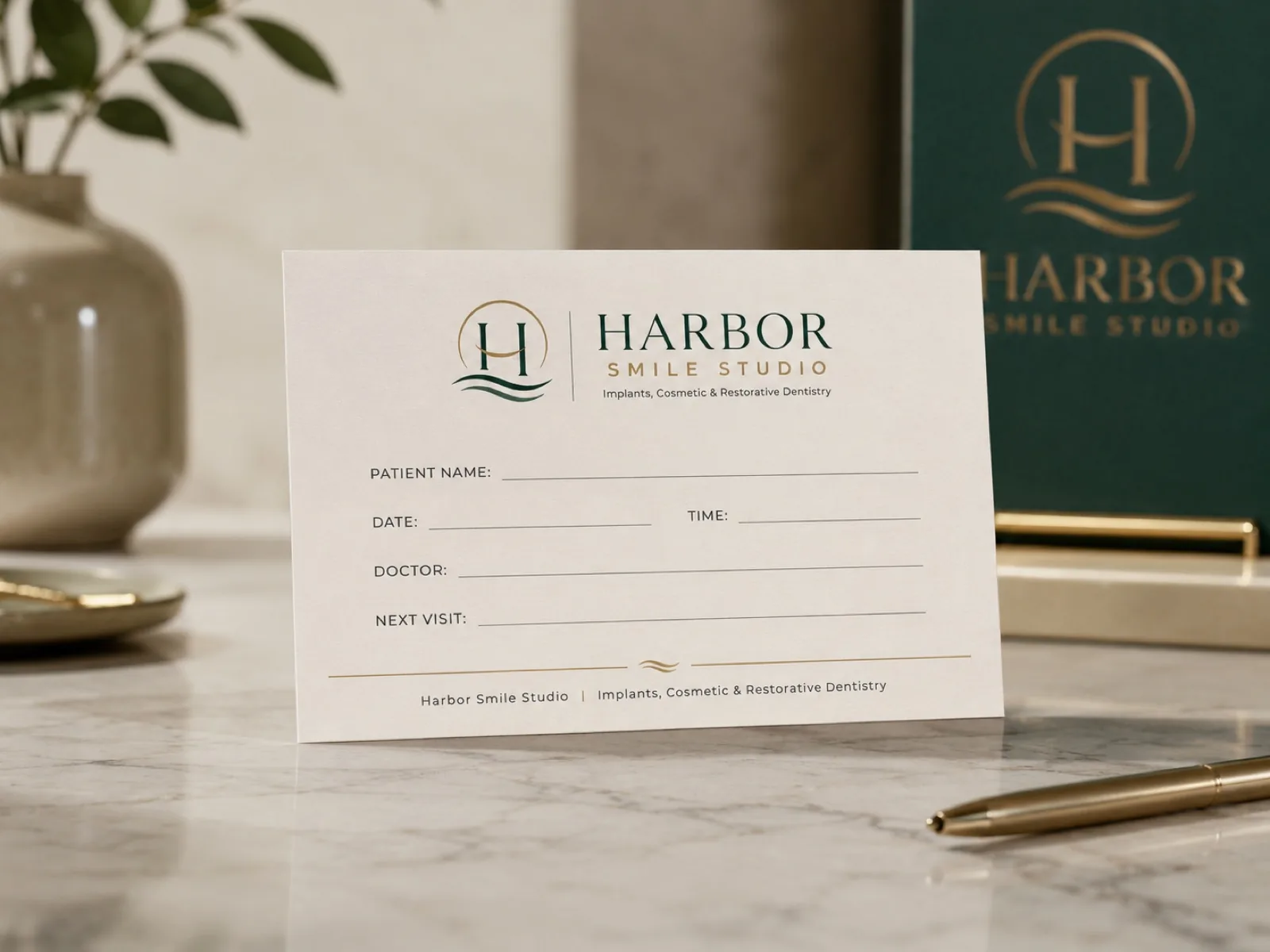
Stationery
Business cards
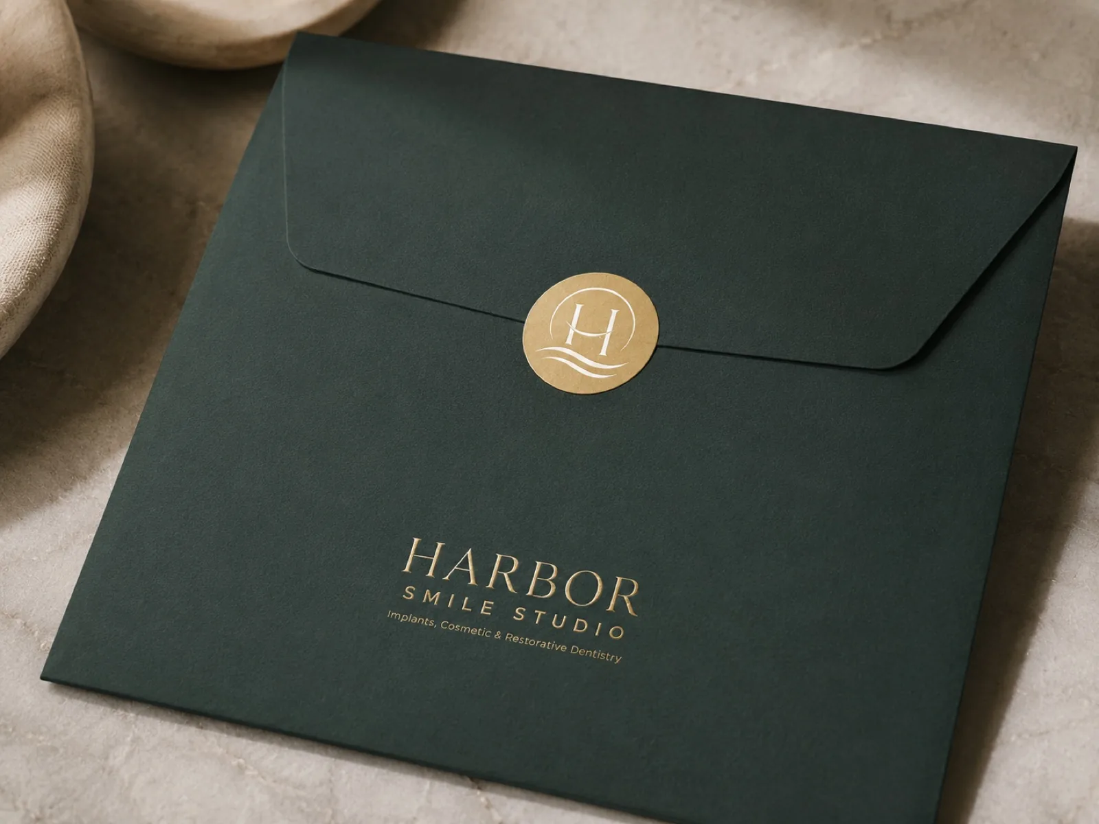
Stationery
Envelope with gold seal
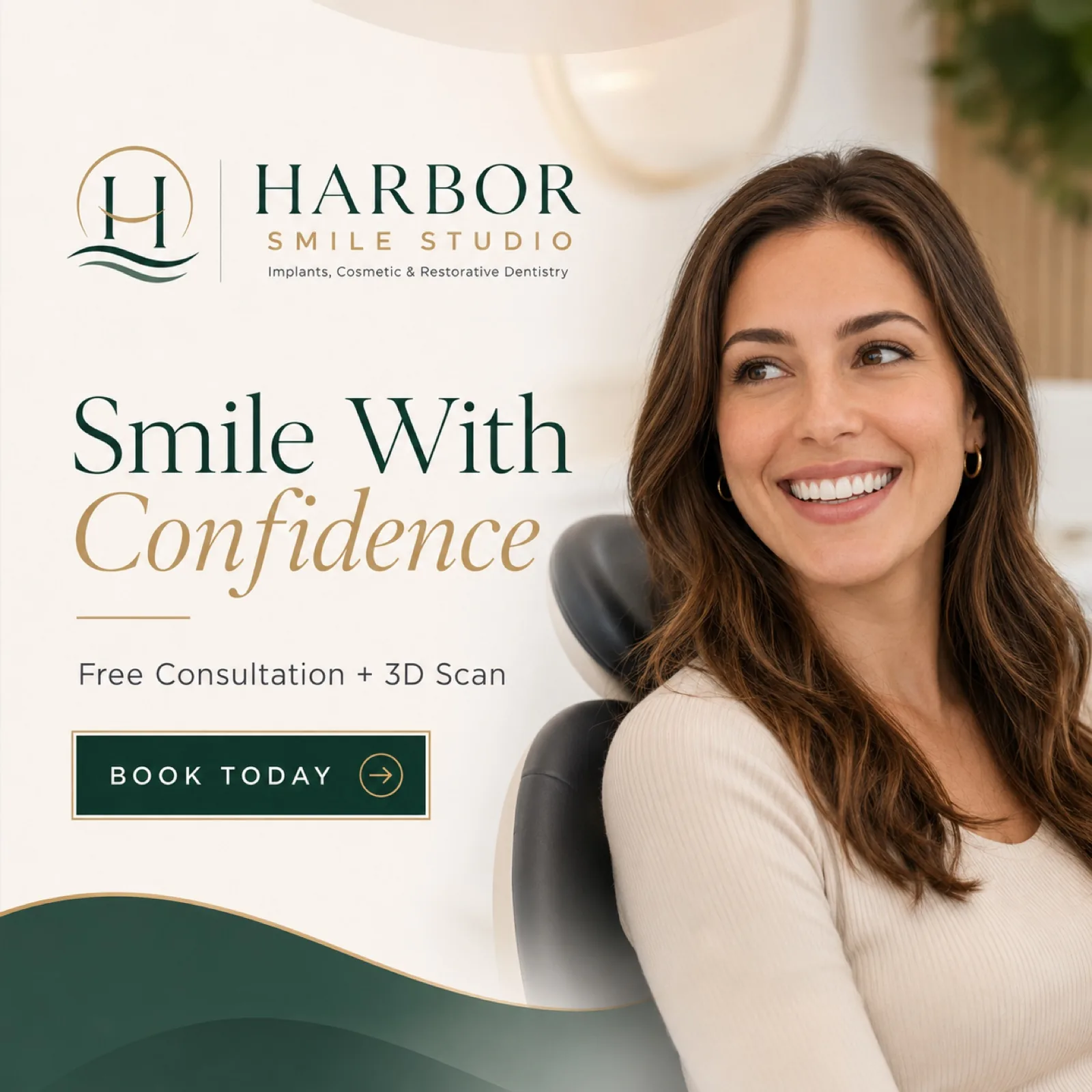
Social media
Social media post

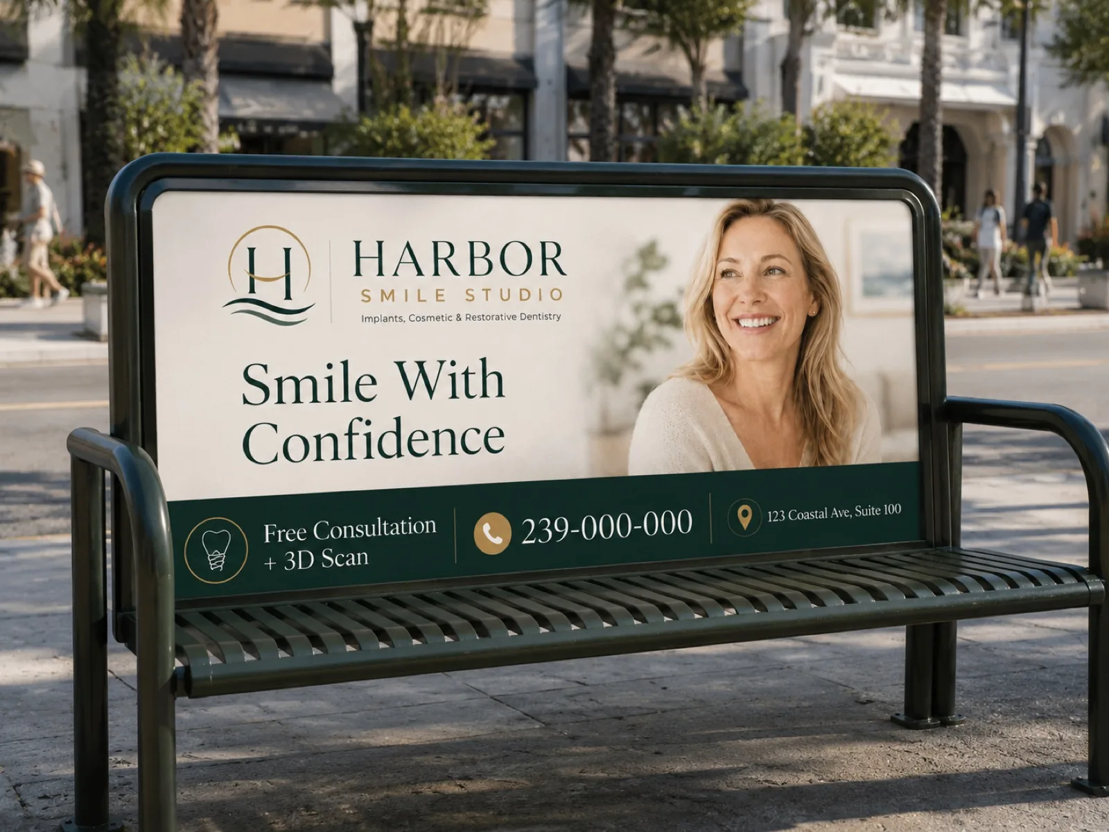
Local media
Press ad
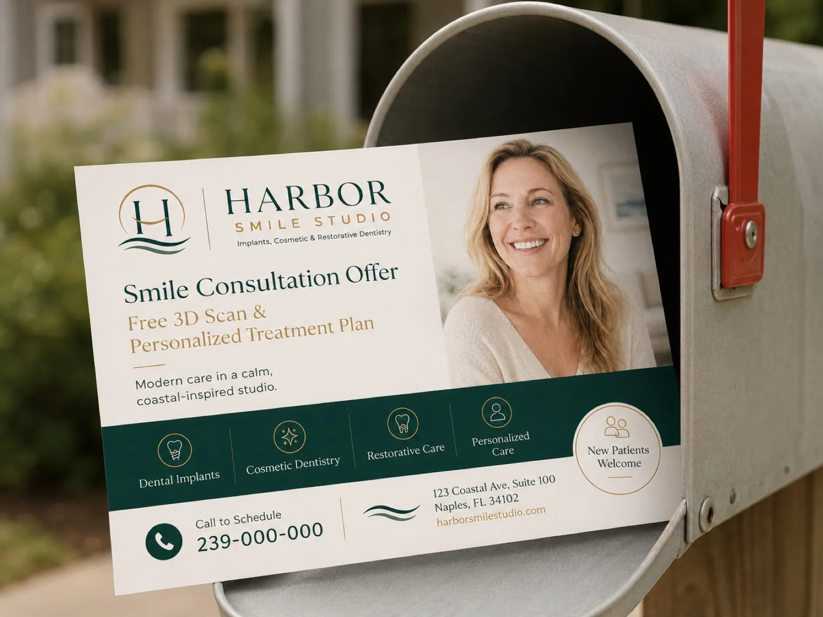
Direct mail
Direct mail postcard
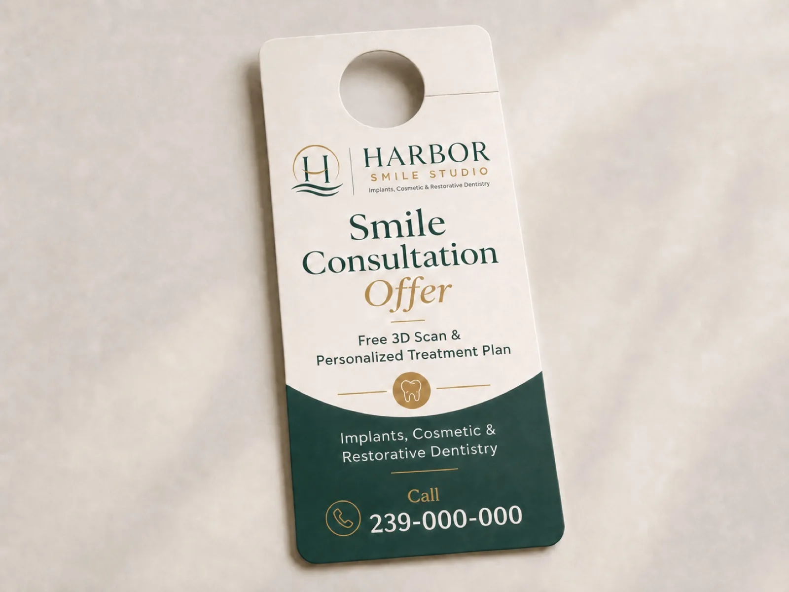
Door to door
Door hanger
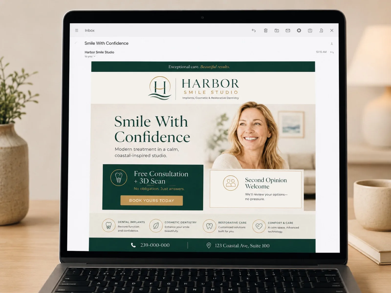
The system comes to life.
Interactive demo — hover: every piece responds
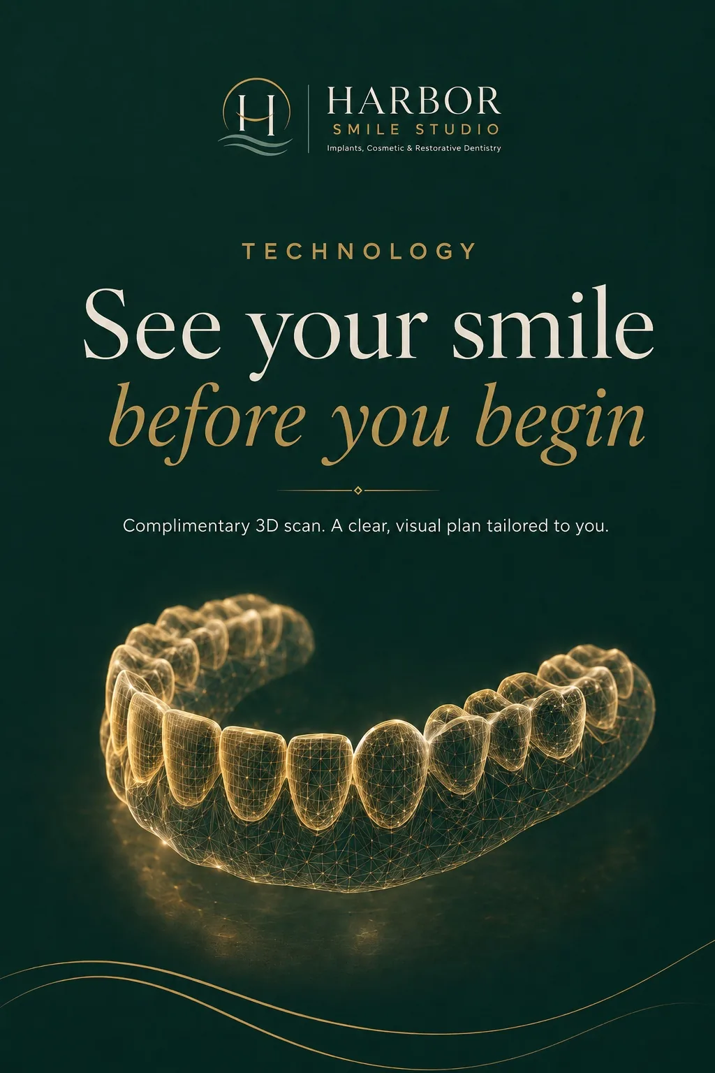
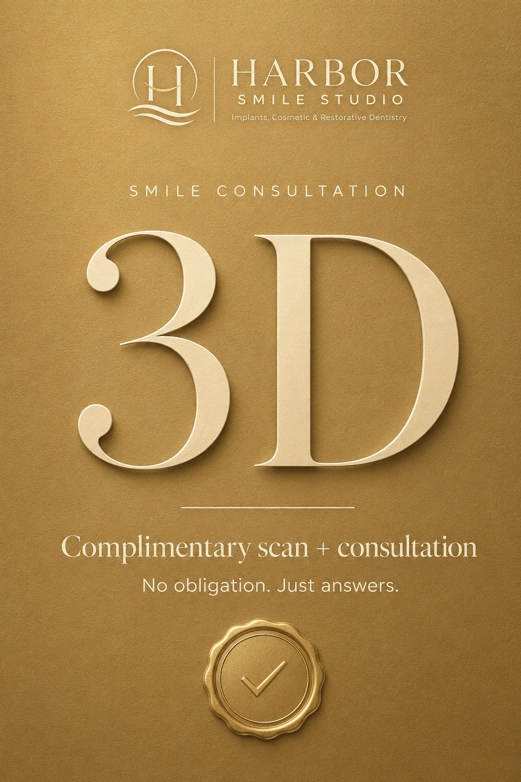
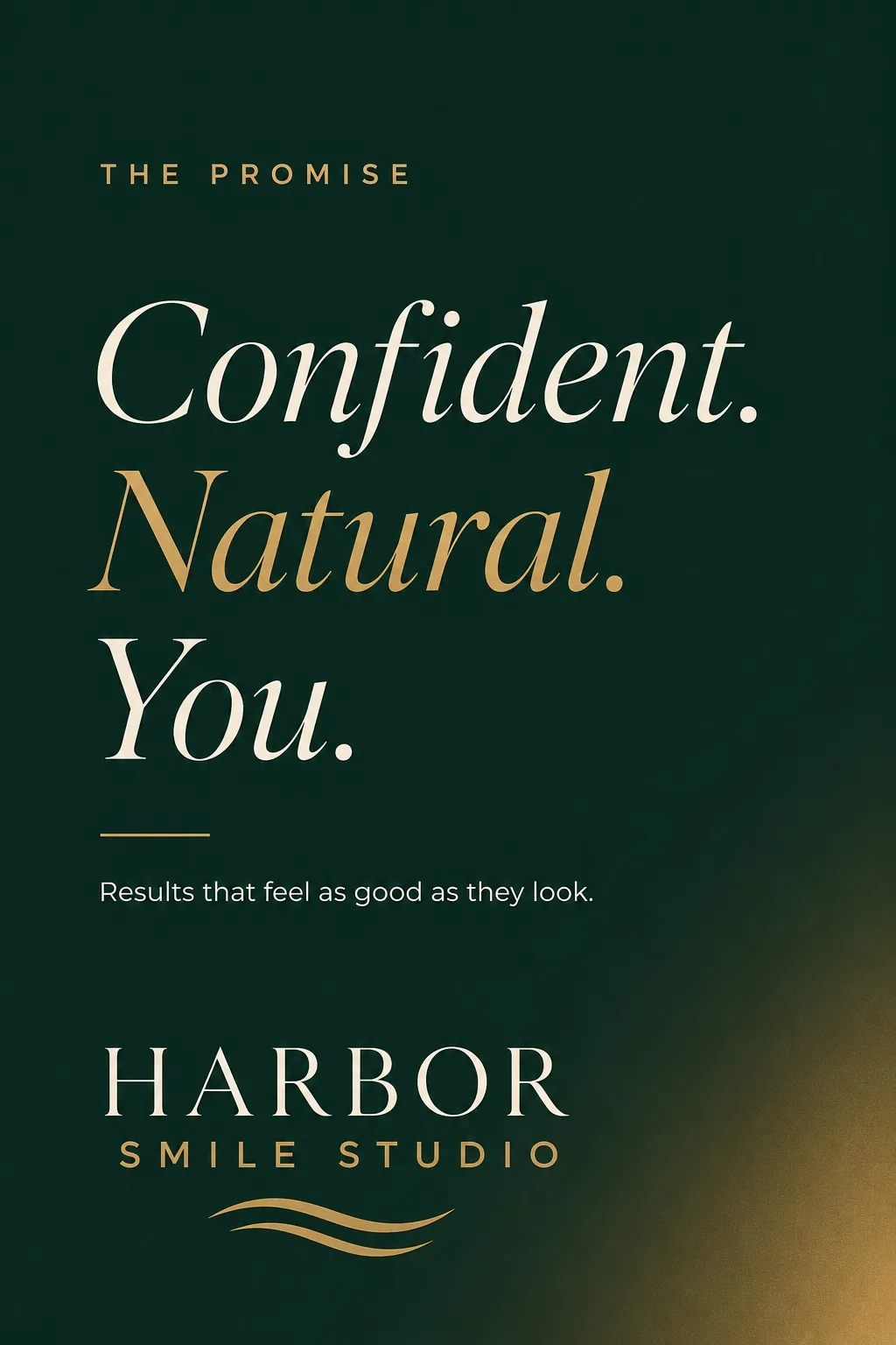
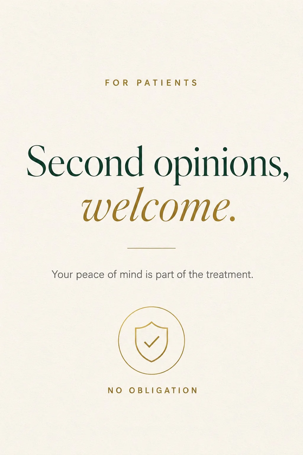
Fast appointments
Frictionless scheduling
Advanced implants
3D guided planning
Cosmetic excellence
Natural results
Trusted local care
Serving our community
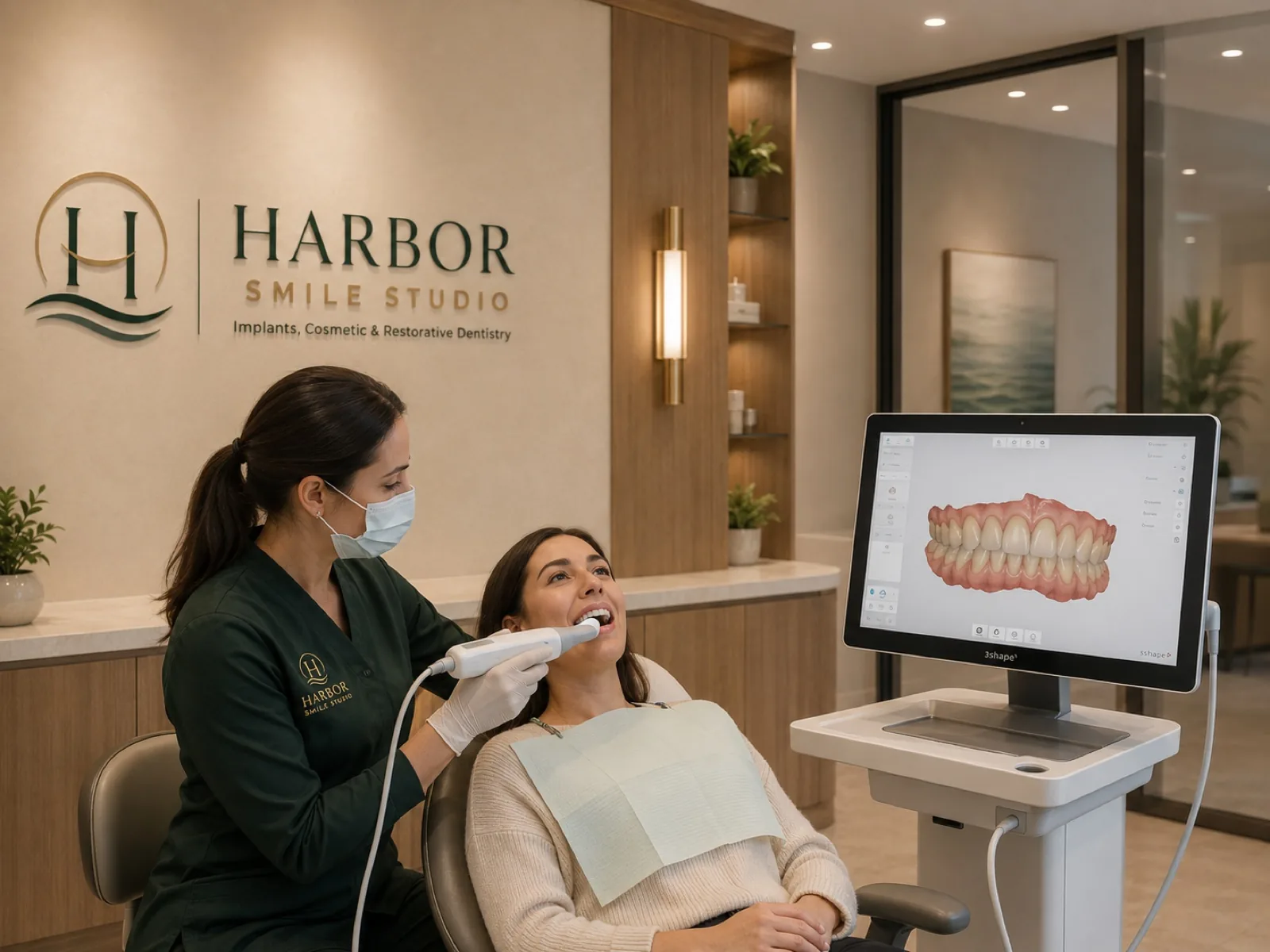
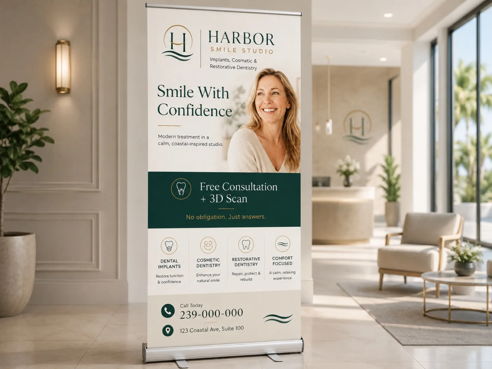

The brandhits
the street.
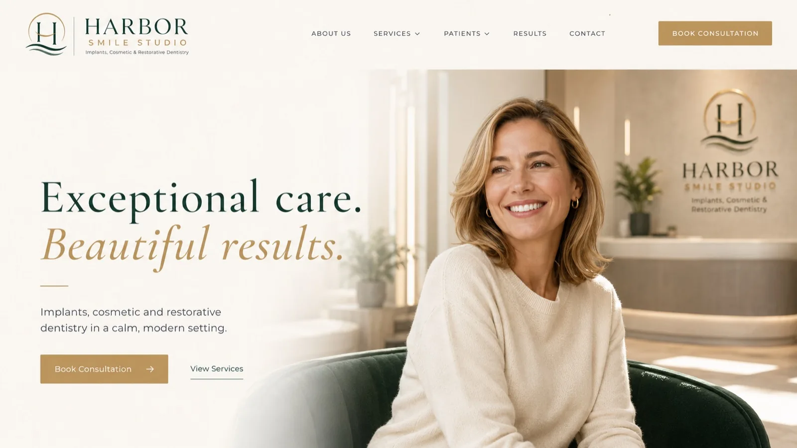
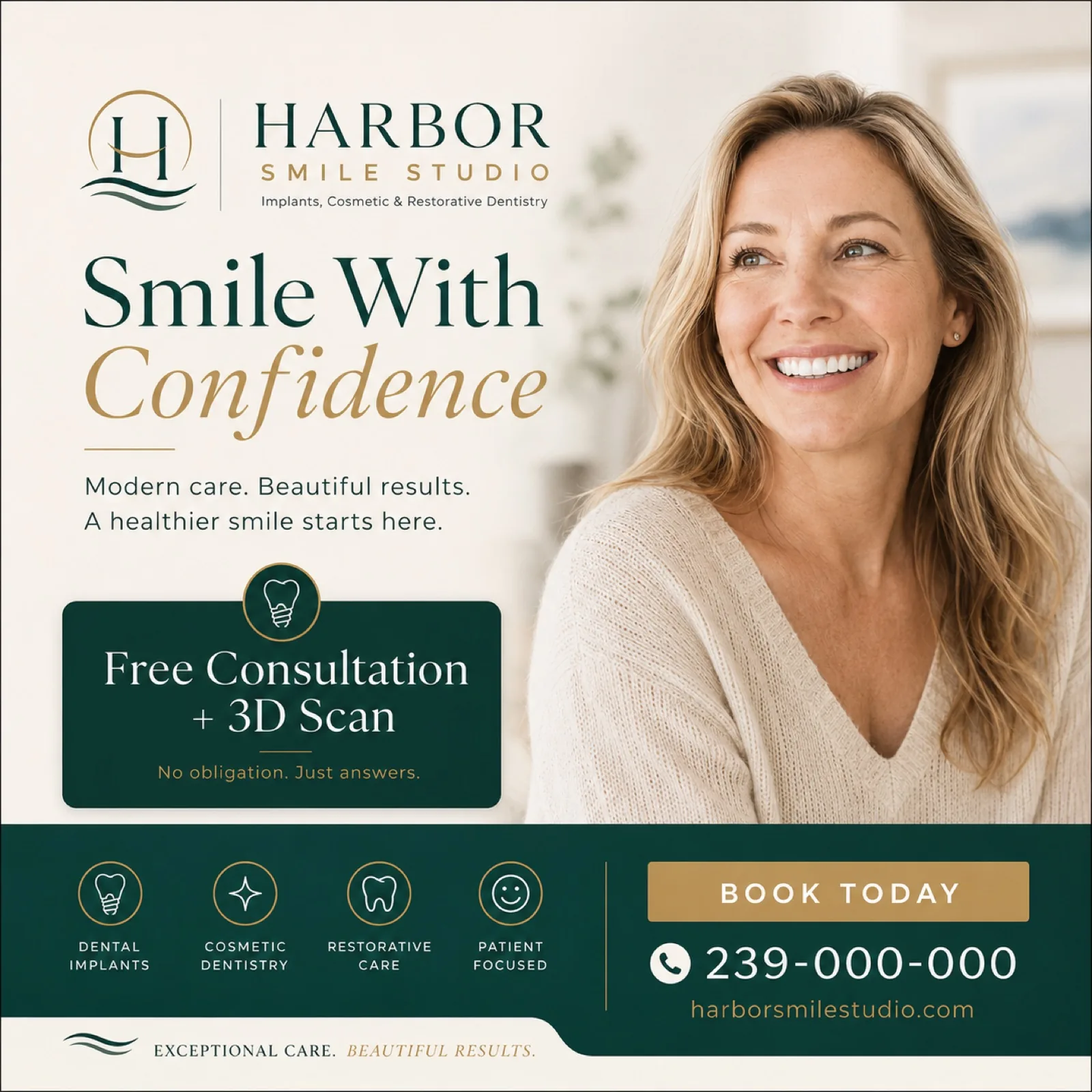
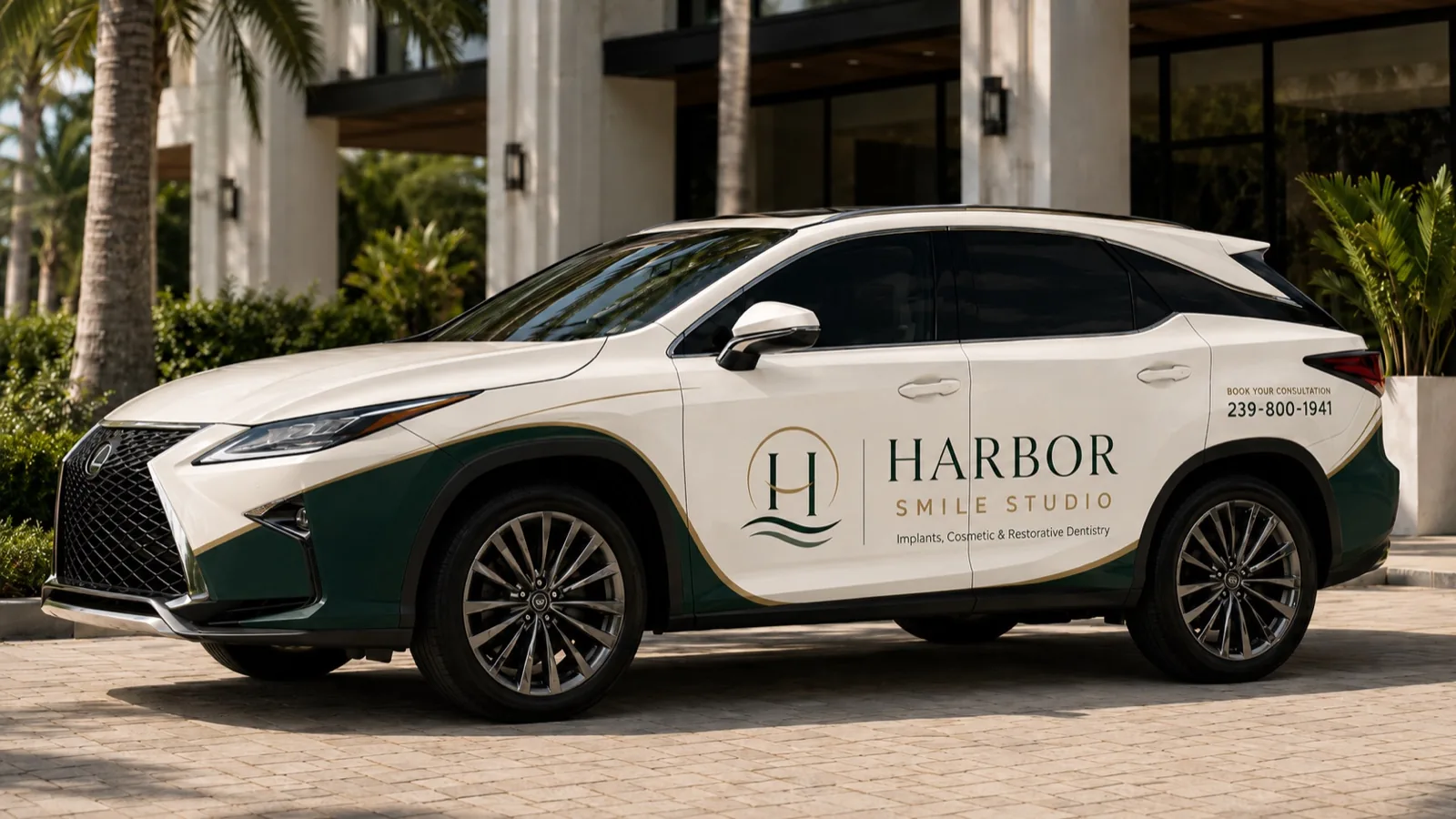
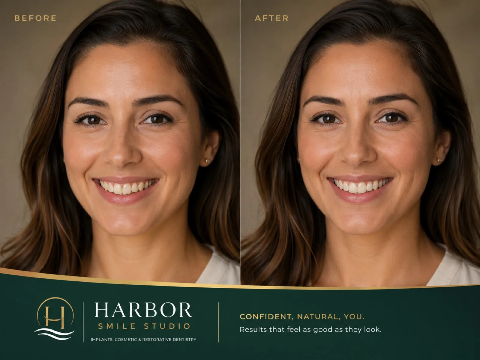
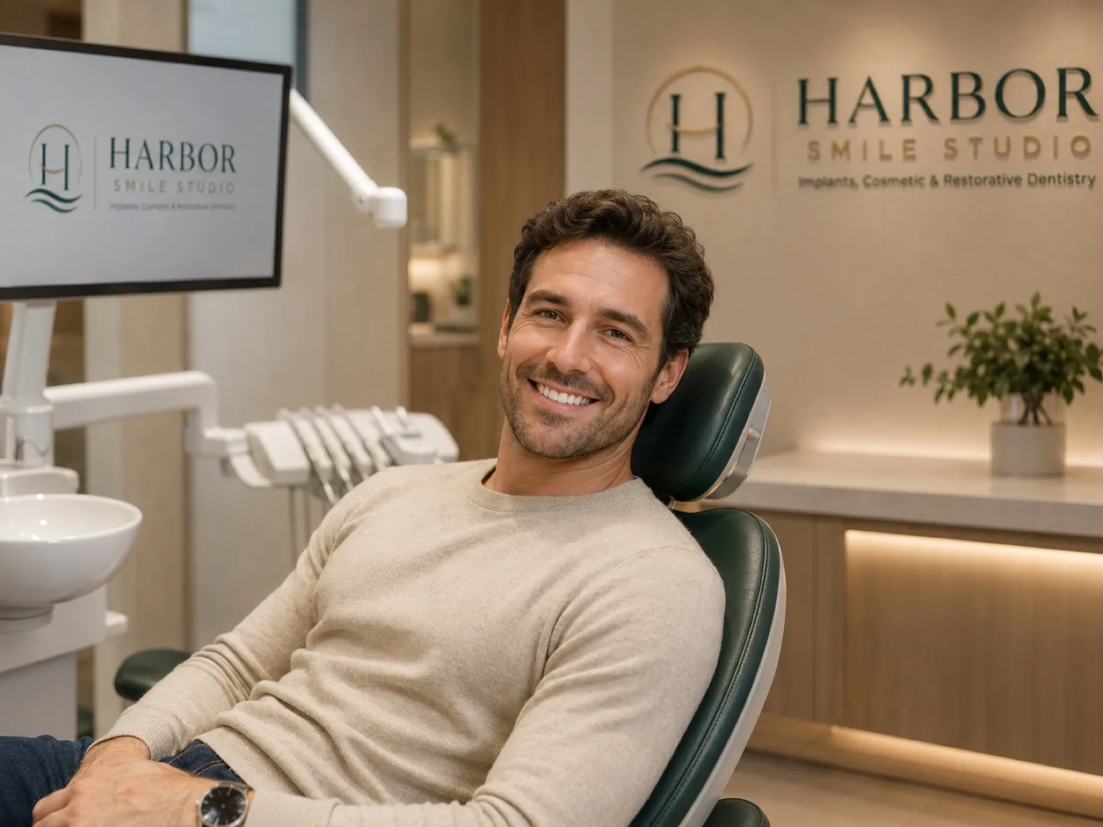
Coherence isn't repeating a logo: it's the studio, the vehicle, the front desk and the website producing the same feeling. Patients see order and think: they care about the details here. And if they take care of their own brand, they'll take care of my smile too.
Core idea
1
Defined colors
5
Typefaces
2
Applications
20
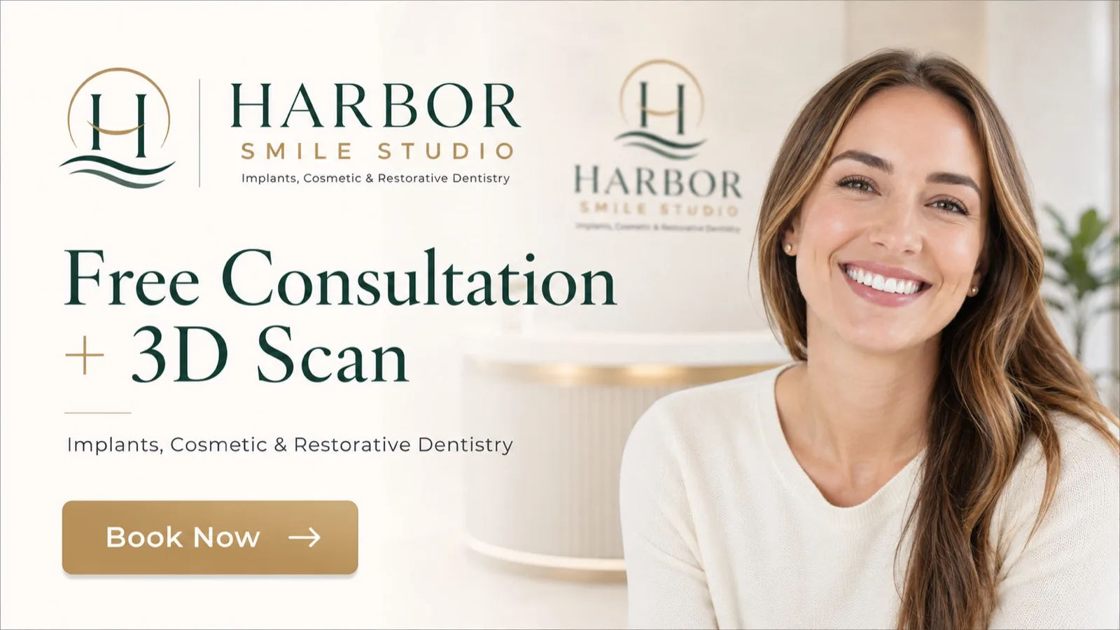
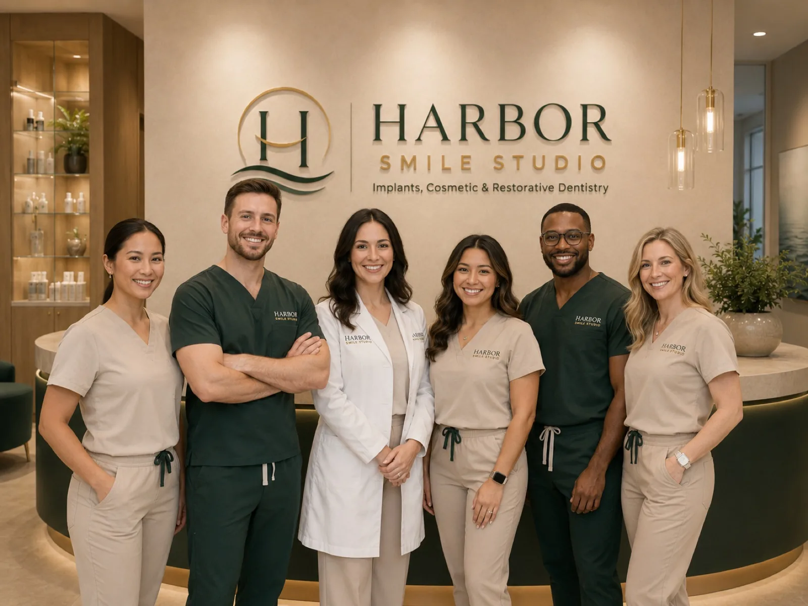
When the street sign, the card, the front desk and the uniform tell the same story, patients don't need convincing: they recognize and trust. That's brand coherence — and it shows before they read a single word.
The next step
Harbor isn't real.
Your business is.
Everything you just walked through is a demonstration of what a coherent brand does for a local business. If yours doesn't exist yet — or no longer looks like who you are — that's exactly what Niseus does.